Thanks for playing!
squizout
Creator of
Recent community posts
Simple but fun, a cute game with great music! I think the difficulty could have increased a lot faster because it felt like it took ages to get to the second turret. I also probably would have limited one button press to one tower being placed, mostly because I had to stay still to place a turret otherwise I'd accidentally place multiple. Other than that a great start!
Thanks for taking the time to give such detailed feedback!
I did try inverting some of the colours to make different bits stand out but unfortunately it gave everything less of the 'colouring book' vibe that I was going for. I'll definitely try making it less busy, or maybe flip the background as you suggested.
The font is definitely a pain, I was hoping splitting the sentences would make it easier but clearly not! Making a more dynamic dialogue system was originally planned for (resizing speech bubbles and a more dynamic placement of them to begin with) but unfortunately had to cut it in favour of finishing the story completely. Flipping it isn't something I thought of though so I'll add that in next time.
Animations were a bit out of my league for this but I'll continue to work on it and hopefully next time I do my own art I can add it in! I'll also increase the player speed for sure; I guess I got so used to the speed I didn't realise it would feel slow to others haha.
Player feedback is something to work on for this, I struggled a bit because of the two colour limitation and I'm not skilled enough yet to play with it properly. I should have made it clearer what can and can't be clicked on, if I'd had the time I probably would have added reactions to different items to give the player a flavour of what items can do.
Thanks for bringing the button not clicking bug to my attention, it looks like I messed up the layering of different colliders so part of the signpost is being blocked by the door.
The double fullscreen button is a pain but I've noticed on some resolutions it doesn't show properly so I always add both for safety. It's probably a scaling thing so I'll try and figure out a solution to that.
Thanks again for playing, your feedback has been really helpful!
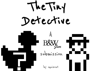
You did great with the time you had! If you're planning on continuing I'd definitely start by putting the case generation to one side (don't remove it, just ignore it for the time being) and focus on making an easy to use game. That doesn't mean easy to play, just make it a bit more intuitive. Once you have the UI nailed and you're sure of the mechanics/how you want players to interact with your game, you can focus fully on the algorithm stuff. If you do end up releasing this, let me know, I'd love to play the finished version :)
If you're planning on doing more game jams, I'd definitely recommend stripping out extras next time (like the shop and money) and focus on your core features more. Then if you have time you can add all those bits in. Quality > quantity when it comes to jams.
Wow this was great! Moving felt really crisp and I was impressed with how tight everything felt. The only thing that might have made an improvement was resetting health on death and doing a small period of invincibility after getting hit; I found myself not being able to get off long stretches of spikes in time, and sometimes I'd be down to half a heart with not enough skill to get passed the more armoured enemies and not die again. Balancing needs a little fixing too, otherwise great job, it's a neat little game.
I like the concept of this, and making randomly generated cases is a really neat way of getting round the replayability issue. It feels a bit like you overscoped - the idea is complicated and I don't think you had enough time to make it an easy experience, not just a complicated/clever one. I do understand that the engine you're using will mean some of the following points weren't doable in the available time/ability of the engine/your experience, but I don't have any experience with it myself so I don't know what's irrelevant.
- Your UI is a good start but not the best. You're missing some features that would be highly beneficial, notably (as mentioned by another commenter) the ability to track your current clues. Although some information is updated on the reports/suspects sections, some things I thought would be included either weren't updated when I thought they should be or just weren't available to track. For example it would have been great to see a summary of what suspects have said or at least see what was recovered from their houses. Having to go through all of the info was quite difficult, especially when things changed due to new topics.
- The interrogation of suspects feels quite roundabout; instead of directly asking them questions about something (e.g I found a blackmail letter in your house), you have to unlock it by talking to other people until eventually you (for some reason) start asking about motive. I like that you have to progress through other interrogations to unlock new information, but sometimes it felt counterintuitive.
- There was too much information that was delivered in a slightly weird way. Finding a way to simplify the speech or make a more distinct but standard way of delivering the information would be good. Part of this is that the suspects are a bit too shifty and it's not very clear when you manage to 'catch them in a lie' so to speak. It's clear that some clues/interrogations are supposed to change how you approach a suspect, but this isn't reflected very well with how you speak to them/they respond.
- Your instructions were unclear. Ironically the game is semi intuitive (investigate, interrogate etc all make sense), but you over explained a lot in the instructions and the again when the characters were communicating. Striking a balance between simple and subtle will do you well here.
That being said, I think you did quite a good job in giving the suspects different personalities, and I like that there was so much thought going into why you could rule out/in a suspect (e.g different methods of murder ruled out different people). The simple black and white theme also suits this very well, I'd love if you added some basic environmental art too (e.g for the locations).
Overall I'd say you overstretched a bit, and you should have tried to get the core gameplay down and the UX polished before embarking on the algorithm journey. I get that was probably one of the more fun bits (I'm always adding proc gen where it's not needed lol) but for a game jam it was probably a step too far. Definitely get the game feeling intuitive with a planned out case before starting to generate random cases. Great submission though, you should be proud!
Don't put yourself down just because you didn't deliver entirely on what you wanted; being able to design, create and submit a game in such a short time is a huge achievement. If it was easy, everyone would do it! Feedback-wise, there weren't a lot of people involved in this jam to begin with, so the amount of feedback was always going to be low (especially when many people will rate but not comment). I do understand your frustration though, it sucks when you put a lot of effort into something and it doesn't seem to be seen.
Hopefully I'm not stepping out of bounds here for advice, but on a more general game jam note I recommend taking one of two approaches when you're thinking of the game to make. You can either keep the scope small and make as polished a game as possible, or be a bit more ambitious and make a game akin to a prototype. The best games for jams I've seen are usually one of those two types, or if they're larger and polished it tends to be because there's a bigger team (or using preexisting assets/workflows). It sounds like you maybe fall on the more inexperienced side (at least with the tools you were using), so I'd recommend next time going with a smaller scope in order to get used to the time frame and different skills required. Then you can build to bigger and better things :)
For this submission, I definitely think you should properly plan it, flesh it out, and finish it! You don't have to add a tonne of things, but I think you have some neat ideas here that would make for a great short game. At the very least you'll become more used to the engine, ready for the next game jam!
Yeah we definitely didn't sign post some of the features/gameplay properly, I imagine most people would have missed the mutation side of things.
The zombie spawning still needs balancing - we thought one hit kills for the first set of zombies would be enough to sort out how many there are, but the time between spawns probably needs to be slower as well. I like your idea of nudging the player to kill zombies through more definitive feedback; we kind of assumed that would be the first thing people do, but then the results aren't always clear or satisfying enough to continue with it. We'll definitely be giving it some thought!
Thank you for taking the time to play, I'm glad you had some fun :)
The codes needed to be input into the different keypads that were around the environment. Each keypad is 'hidden' behind a door that is essentially unlocked by killing enemies (killing enough eventually mutates you to a point where the light on your torch corresponds to the new door colour you can walk through). Unfortunately our tutorial was pretty crude so we probably didn't get this concept across very well.
The enemy spawns are tied to player progression in the sense that killing more enemies allows the player to mutate but also mutates the available enemies. It sounds like you may have killed enough that it unlocked an uncomfortable amount of zombies but not enough to unlock all the doors and give you more space to manoeuvre.
We really appreciate the feedback, it's given us some things to work on!
Thanks for taking the time to play! The bullet is a good point, we struggled a bit with getting it to feel good without being too quick but I don't think we hit the mark. I definitely agree with you on the player feedback; we wanted to add more cues but unfortunately ran out of time so had to cut some polish in favour of bug fixing. As for code clearing, that was more a feature than a bug. We decided not to include a clear button so that the player had to spend a little more time at the keypad with their back unguarded. It might have been more balanced if the keypad auto-entered the code, instead of using an enter button. We really appreciate the detailed feedback :)
A neat little game and I loved the retro vibe! The monster, who I assume is loosely based on Jeff, was pretty creepy and the first couple times I caught sight of him definitely gave me a small jump. It did get a bit frustrating after a bit just because it was quite difficult to avoid him, and sometimes he seemed to just not stop coming after me. I think the enemy AI could have used some tweaking, or at least made it slightly easier to pinpoint where/when it was coming near. The size of the game definitely helped with quality control though, I'm glad you didn't overstretch because this was a pretty tight and fun submission!
I really like the idea for this game, but unfortunately I couldn't progress to the end (as mentioned by the other commenter, the rotten smell choice was broken). The concept is pretty interesting and having to choose between different options was great. Sometimes the result was a bit unclear, and I felt some of the decisions made should have been better reflected in the inventory, e.g, using the lizard tail should have changed the inventory to poisoned water, or filling the bottle should have changed the empty bottle to salt water. It would also have been nice if the dialogue was skippable, simply because I replayed quite a few times and sitting through the same text got a little boring. In terms of consistency I would have changed the dialogue continue button to using a mouse click instead of a spacebar, but that didn't make too much of a difference. A good submission overall though, well done!
The basic premise is really cool and I like how it plays out at the end, but I think it may have been too ambitious with how much you actually include. It looks like a lot of effort was put into the assets and level design, it's a shame it doesn't always pay off.
I loved the voice acting in this, it really contributed to the overall creep factor. The survey at the start seems a little pointless; I kind of expected the things I tick to affect what I was going to be shown, but it looks like the drop down is the real key. That being said it's pretty cool that you have such a variety of scenarios, well done for finding the time to try and do it!
I think some of the scenarios could have probably been fleshed out a bit better, or just done with some better testing. For example I kept getting stuck on some of the geometry in the height fear, the doors in the darkness fear had to be opened multiple times to actually open, and I couldn't seem to escape some of the spiders in the spider fear. Overall I'd say the darkness fear was probably the most successful; you did a good job of building tension initially and I enjoyed the creepy setting and various items around the rooms, but the repetitive sounds and 'jump scares' lost it's effect pretty quickly. The other scenarios were a bit of a mixed bag, but some of the initial settings were pretty well done, they just didn't necessarily deliver.
It may have reduced dev time and created a more consistent experience if you'd stuck with one 'environment' but added in the scares that corresponded to the survey, e.g using the darkness scenario but adding in clowns or children or spiders or whatever else you saw fit. It also would have given you a chance to make more liberal use of the assets you had, as there were a fair few good ones that were pretty creepy/scary (especially the mannequins and clown creepers).
Overall I think it's a good effort and I'm really impressed with how many scenarios you created, but I think you may have been stretched a little too thin. Well done for your submission :)
I like the core idea of this game and the initial set up is promising, but it's maybe a bit too ambitious for a game jam.
The idea of collecting memories to remember yourself seems cool, especially when you realise you need to find them in some dark desert kind of place. Collecting them is easy enough, but unfortunately there's no real challenge or narrative to go with it; I expected some kind of flashback or text or something to say "hey, this is who you are", as the premise seems like a potentially strong narrative.
The challenge should come from avoiding the spider monster, but unfortunately it's both too hard and too easy. I say both because if you're in the vicinity of the spider then it tracks you too quickly and it's difficult to escape from, but if you're not near it then you just never see it and it doesn't matter. There's also no real fear of being caught by it after a while; it caught up to me a couple of times but nothing happened, so I just didn't look around for it. It's kind of a shame because I really like the design of the spider and how it looks in the game - the glowing lights are a great idea!
Overall I think this was a good start, but it doesn't really seem to tie in to the narrative in a strong way. I feel like if the world were smaller and less empty it would help improve the sense of dread at the glowing spider, especially as initially the atmosphere feels quite unnerving. Well done for submitting!
The visuals on this game were really good, I liked the character models and the lighting. It's clear you put some thought into how the game should look, and it's great you were able to create a gameplay video, it really helped with figuring out what to do.
I do think the gameplay is lacking a bit, and it's also missing some overall polish. Controlling zombies to attack attack another create is a neat idea, and moving between zombies is smoothly implemented. There just doesn't seem to be that much skill involved in actually playing the game - move to a zombie, attack Igor, die, move to another zombie. I couldn't really tell if anything negative was happening to me if I did or didn't attack him, and there was no strategy involved in attacking as most things seemed to be done automatically.
In terms of polish, the little animations were a nice touch and I thought the lighting for the scene was really well done. I would have liked a main menu or pause screen though, as quitting the game and then launching to replay is a bit of an annoyance. In your case it would have been fairly simple to bind a key to a restart method, or have an overlay UI that had quit and restart buttons, even if you didn't have the time to design a cohesive UI.
Overall I think your idea was pretty solid and visually the game was good, but it lacked gameplay and some basic polish. A good submission though!
The art for this game was on point, I really loved the different character designs and some of the enemies looked absolutely terrifying. I thought it was a very polished looking, with a minimal but still informative UI that didn't mess with the overall vibe of the game. Having the world loop around was a neat touch, and I liked that the radio parts were scattered randomly (although sometimes they overlapped a bit). I'm impressed you managed to do two playable characters - although their mechanics weren't that different, it was a nice touch and meant I played multiple times to try each one out.
Introducing more (and more difficult) enemies every so often did increase the difficulty, but towards the end it felt a little bit too much. It was especially a shame because the last enemies had some really cool designs, but I was usually too focused on trying to run to a hiding spot/the next part to really pay them any attention. I'm not sure what percentages were unlocking the newer enemies, but I didn't get to see the human deer/regular deer until the 60-80% range, which felt very late. I would maybe have either introduced them earlier on but lessened the total number of enemies, or given the spawning a weighting that produced less of the early enemies.
Really speaking the only thing that was a problem was the agility of the character. Jumping over the pits was a pain, and I died more times trying to get over them than I did by the enemy attacks. I feel like if they're going to be that hard then at least preventing the enemies from moving over them would make it a little bit more fair.
Overall though this was a fantastic submission, with a really polished look and feel. With a couple of gameplay tweaks I think it would be a neat little game!
Wow I love the graphics and atmosphere of this game! The style is very unique and the distortion really adds to the disorientation of the character. The sound design was good too, nothing felt too unbalanced, and the voices were perfect. The switch between settings was really well done, and I liked that the inside environment had a couple of dead ends that forced you to turn back and kill some enemies. That was one problem I had - the first time I played I spooked at the sudden appearance of the mutants and managed to run past all of them while also finding the correct way out. It was a breeze to get to the end point on that run, but a bit more difficult when I took the time later to try and explore the level.
I found killing the enemies to be a bit strange though; I think it was about 2 shots to down an enemy, but I could never hit them with the knife enough to get them to die before me. A bit more feedback for when hitting/hit would probably help this - it was hard to tell in the darkness if I had landed a blow, and it doesn't look like there was any real indication of how much health was left for the player.
Overall a really good submission that definitely stands out!
Thanks for your response :) We definitely took Doom as inspiration, it's great people are liking that! We've recently updated to fix the camera issues, so if you'd like to try again you should find that the menu shows up normally and you can now get through the yellow door to properly start the game.
Disclaimer: I'm not one for visual novels but I did give it a go!I thought the sound design and voice acting was fantastic, and the story was pretty creepy too. I also liked that there were multiple endings, although I kinda struggled to figure out which was supposed to be 'good' because I was rooting for everyone lol. Probably the only improvement would be a slightly higher resolution character (I'm not sure if it's typical to visual novels, but the fact it was slightly blurry was just a bit weird at times). Otherwise, fantastic job!
I liked the music and how you sped up the tempo and feel as the game progressed. Switching up what the player could and couldn't do was also pretty neat, it did make for some tense moments. It was kind of annoying that on death the whole thing just shut down and I'd have to start from the very beginning, it made it a bit tedious to work my way back through and destroyed some of the atmosphere for me. A decent submission overall, well done!
A really interesting concept! It didn't go in the direction I thought it would at all, and it definitely has potential. The creepy lighting is atmospheric (although the general light level needed to be a bit higher for me, I couldn't see anything unless I was right next to it), and the lightning flashes and sound design really help with the slightly unnerving feel. I liked the core concept, and dragging the bodies around was pretty fun, but it wasn't quite all there. Although the protector ghost person initially freaked me out, after investigating and finding out it didn't really do anything the game lost a lot of its horror factor. I did like the design of it though, and the way it moved around with the red eyes definitely got me for a second. On the quality side of things it could probably do with some polish; the framerate was pretty low for me (that or the camera movement is just sticky), and I found trying to switch between equipment and dragging the wagon around to be frustrating. The scoring system at the end also took me out of it a little, although it did mean I tried again. Overall, a good submission that would have been a much smoother experience with slightly more polish.
This is a neat little game. I found the first puzzle a bit too difficult (I'm not really one for codes) but for the most part the puzzles integrated well. Aesthetics and sound design were good, but the horror factor was missing for me. I liked the music a lot and it built some tension, but ultimately wondering around in the dark going back and forth between rooms lost its creep factor after a bit. Adding a countdown for the time left (if something does happen after 20 minutes, I didn't play that long) would have increased the tension, maybe with a ticking clock and bell sound every minute or something. The premise was very interesting, and could probably have been used to greater effect. Maybe having the gas seeping in visually, or if the player interacts with it their vision is distorted or they see something creepy? Overall I liked it, very quirky and with good sound design, but with a few improvements that could be made. Good job!


