Indie game storeFree gamesFun gamesHorror games
Game developmentAssetsComics
SalesBundles
Jobs
TagsGame Engines

theswordbean

16
Posts
3
Followers
6
Following
A member registered Jul 21, 2023 · View creator page →

Creator of

Recent community posts

This is really cute game! Also, a brutally punishing one,,,

A few quality-of-life tweaks would really sell this game. I ended up playing most of the levels in training mode since, well, if I'm going to be replaying from the start every time I lose, I'd rather not have to spacebar through dialogue I've already read, and I think this user experience does a disservice to the dating sim aspect of the game. Separately, having a narrow margin of error for a gameover and a gameover sending the player to the start are both fine decisions, but together they make it difficult to engage with the game as a dating sim. More chances to fail on holes or some kind of checkpoint/chapter select would be fantastic to see, and a quicker or manual reset for when the ball goes out of bounds would decrease friction as well.

That said, there's a surprising amount of game and art here, and other than one bug it's really polished (if you launch a ball at the wrong moment it won't move and the game won't detect that it has stopped moving, softlocking the player). I appreciate the creative take on the theme and on both genres, and I had fun with it!

My teammate really killed it on the art, yeah. There is an ending screen after the basement that you get to by interacting with the pipe. And the message object keeps two versions of the current message: the source string, and the string it draws to the screen. At random intervals it'll loop through the display string, with a small chance to replace each character with a random one or a larger chance to revert to the original character. Thanks for playing!

I realized a few minutes after submitting that the word expand is only explicitly mentioned in one message that is functionally illegible (lmao) but I'm glad we nailed the vibe at least :)

There are some cool puzzles here that I think are held back by some less than user-friendly design. I appreciate that the game window fits entirely on my small laptop screen, but with the fixed zoom it's often impossible to tell what a level is about until you've gone far enough that you have to reset. But overall this is an excellent interpretation of the theme and a solid entry,  good job!

CAT <3

Incredible game. I have a pretty old laptop so anything over 50 nubs would drop my frames to about 10/s which affects actions like double clicking and building placement but I had such a good time I don't even care. I do not have the APM required to be good at RTS games but I really like the idea of them so chilled out games like this that touch on the genre's tropes are super satisfying for me. Expansion packs are a really cool way to pace progression and I wish they had more of a sense of risk/reward to the decision but that's quibbling. This is a ridiculously complete game how the Helper did you do this in a long week

Fun game! I think the camera could've used a bit of iteration (maybe a smoother transition between angles, maybe a grace period where enemies didn't move, maybe some tweaked placements), but it really sets the presentation apart. Immaculate vibes overall

Glad you liked it! Happy to be the bad ending to your game's good ending lmao

Okay I'm a goof and didn't realize there was a jump button separate from the expand button,,, it's still not a great feeling since expanding to jump is such a core part of the gameplay but this does explain why I ran into this issue in a game built with an engine with solid built-in physics lmao

It depends on the horizontal spacing of jumps but I find it natural to simply hold right when I'm moving through sections that aren't specifically about precise landings or avoiding hazards in any platformer, and the friction issue can come up on any jump if the player doesn't time the jump correctly or come to a complete stop in this game. I assume this is a consequence of whatever built-in physics you're using under the hood (it would be kind of weird to have this exact problem with collision code written for this purpose)

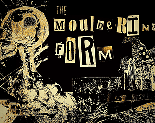
Besides being a really clever interpretation of the theme, this game presents a perspective on mental health that feels under-represented in games. I love Yume Nikki, and there are a lot of games like it that stand as visceral, impressionistic portraits of depression. There's a lot of value in these (both for people who relate and for people who otherwise might not be able to) but off the top of my head I can only think of a handful of games about getting better something The Mouldering Form doesn't help with so kudos for that.

In terms of design, I think 2-3 more repeatable sources of mental energy would really make this sing. Mechanically, this mostly just makes the waiting periods where you're otherwise just spamming the computer more interesting. And to be clear, I love the computer and the little messages! But speaking as someone for whom online friendships were life-saving, my mental health got a lot better once that was no longer my only source of support, and conversely, as my mental health got better, I found myself able to practice a wider variety of self-care. Which is to say: I think it would support the narrative as well if you're interested in expanding this after the jam.

It's rare for a jam game to hit this hard as a work of art for me. You should be proud!

The color screen after the basement is the end, don't worry, it just got added 10 minutes before the end of the jam so it doesn't loop back to the beginning properly. Glad you liked it!

Glad you enjoyed it!! Yeah, the couch thing showed up in the HTML build about 10 minutes to jam end, and I'm not sure why lmao. I'll pass along the compliments on the art and music to my teammate!

It's always hard to evaluate entries like these but it's fun to tinker with even if I'm not entirely sure how the game is meant to progress, and you put a lot of effort into the presentation, which helps a lot

The user experience could use some work (in particular, having so much friction between the player and vertical walls that the player has to stand still before jumping doesn't feel great) but this is a solid interpretation of the theme

Really dig the concept here! You can never do too much with quality of life on anything tactical or management-related, and while I really appreciated the straightforward menus, the movement felt pretty clunky without feeling like it created interesting problems to solve in itself.  Excellent game overall, ended exactly when I was starting to think about moving on to the next game lmao