Indie game storeFree gamesFun gamesHorror games
Game developmentAssetsComics
SalesBundles
Jobs
TagsGame Engines

VinnNo.

31
Posts
1
Topics
8
Followers
A member registered Jun 21, 2017 · View creator page →

Creator of

Recent community posts

Thanks for the feedback! Yes, the controls are problematic, I agree. There is a setting to change it from Asteroids-style (left/right to rotate left/right) to more modern styles where the ship rotates towards your input.  I'm open to suggestions!

The sound when the enemies are destroyed or the gameover song? If it's the latter, yes, I agree. It was leftover from when I started this project a few weeks ago.

Yeah, a lack of a tutorial of any kind of botched the ability to intuitively play this. I slapped a haphazard control layout in the settings menu and also elaborated on the controls on the actual game's page (near the top of the game description).

The minimap was a last second addition and no real thought went into it. It is simply a secondary render target with orthographic view. This is bad for many reasons, but worst of all is that with this method, it doubles up ALL draw calls and by extension the performance requirement. I figured it was better than nothing, since it does show to some degree when enemies are in-bound, outside of your primary view and most semi-modern PC's can still run it just fine. But yes, I agree with your cons entirely.

Thanks for the feedback, Ben!

I think the other comments highlight what I was going to say. I didn't find any real gameplay loop, point or challenge in this, though what IS there (shooting, running enemies, and level progression) all seem to work without a hitch. At any rate, good job!

Well, you hit it! It's funny because the floaty-pukey zombie girl was initially my least favorite to play, but once I got the hang of it, it was my favorite one!

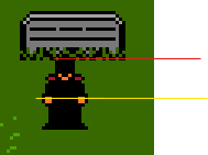
Simple, intuitive and fun! Good music, coherent graphics and it fits both jam themes perfectly! I only really have one suggestion and that would be: In top-down games, the hit boxes should only hit around the lower half. This makes it feel like everyone is laying down vs standing.

The red line is where it's at, the yellow line is about as tall as it should ever be, imho. As-in, I think I should be able to walk right up to that tombstone but that's as close as I can get.

Anyway, just a small gripe. Fantastic job!

The tutorial dialogue at the beginning was a fantastic idea. I should have taken a page from that book with my submission.  I think the basic framework has potential if the mechanics are presented in a reasonable order and the level layout is accommodating.  There are a lot of areas where this could use some improvement, so I'll try to break this down:

Movement

  • It wasn't clear to me at first the acceleration really picks up after a few seconds, allowing you to clear massive jumps WITHOUT running. This or running (via shift) was introduced as a requirement in level 3, though the awkward enemy placement made that discovery a bit tedious.
  • I think level 1 should have more runways/less pitfalls to allow for playing with these more basic mechanics. Level 1 taught me that running is generally a bad idea where as the night city level taught me blindly jumping into the abyss was good.
  • I was also a little hung up on the first platform because I didn't know I could double jump!

Collision

  • The hit boxes in this game are entirely too big. Usually one of the first things I do in 2D games is try to find a way to gauge my character's (or whatever it may be) collision bounds. I'm not 100% sure how big the enemies hitboxes are, but I suspect they exceed the sprite and the player character's far exceeds the sprite. This makes navigating even the still enemies incredibly difficult.
  • Here's me standing on a ledge, to give an example:


Visuals

  • The render cells for the player are a bit off. You can see the right hand in the picture above wraps around to the left.
  • Platforms blended a bit too much into the background on the snow level
  • The BG elements on the cave level had me impulsively trying to land on them, even after I learned otherwise.

Over all, I enjoyed this game and again I think it as potential, if you decide to build off of it.

My favorite parts are the transition from level 1 to 2 and the upwards drift on the last level.


I wasn't able to play this, due to all of the reasons Ben mentioned. I don't think this is a hardware specific issue, either. I've tried to play it on two very different setups (One: Intel + NVidia, Two: AMD + Radeon) to no avail. Don't be discouraged, though! First game jam ever and 13 years old? Yeah man, you're off to a great start!

You sir, are AMAZING at this. I did not expect there to be so much gameplay packed into this game but dag-nabbit, this is a complete game. Great job!

嘿!我实际上是在使用翻译程序,因此请原谅任何残破的讲话。
我绝对喜欢这个概念和风格。这是非常卡通和生动的。您是否还在为此工作,如果是,您是否有发布进度的地方?

I was aggravated for the first few runs at this. Not that I didn't like what I was seeing but because as it turns out, I was playing it wrong. Once I figured out that Sarah wasn't helpless and could shoot(random button mashing did the trick), the game got WAY better. At first I didn't like how the shooting mechanics were done, but it grew on me until I actually appreciated it. Anyway, this was very good and atmospheric!

This was really good. I played on both phone and pc and it worked well on both. Everything looks fantastic!

On phone, it'd be nice to lock orientation to landscape. Only problem I had was telling where the higher ground was, as the tiles blended right into the lower so well, there wasn't an apparent edge seam.

My kids loved this and were laughing their heads off! I couldn't restart the game without a reboot, so taking turns was kinda annoying.

This is a really cool game! I would love to see this expanded upon, to be something like Lovers in a Dangerous SpaceTime. Only complaint I had was death didn't reset cannon balls and I didn't know where to go vs where I've been, but it all worked out in the end. Love this!

I think your concerns are justified, Saliv. And to be frank, there have been more security issues with roblox than I can count, and that's just the ones I know about.  But let me add some defense here, too.

It is actually a game. Granted, it looks like mostly default stuff with graphic swaps, and could probably be made in just a few hours(possibly minutes), it is still probably a legit submission. My kid plays roblox and has roblox studio, so I'm familiar with the scene. While you can make a game (rather an obby) in just a few minutes and call it done, the same could be said about rpgmaker. Like rpgmaker, most creations are going to be generic. 

My kids played it and it looks mostly stock but still a legit submission, technically.

You know? I've been doing a bit of digging around on keyboard controls for a platformer, throughout production, and today, I had a look at reviews instead of just what bigger titles use as default. The bigger titles all say controller recommended and it's clear to me why this is: You can make a controler interact with the game more (eg vibration, button press sensitivity, analogue stick thresholds setting acceleration rates etc), where as keyboard buttons are simply true or false.

Anyway, a computer and keyboard are like a married couple, which is a simple fact that I overlooked. In hindsight, I probably should have put more focus keyboard remapping functionality, instead of all of the effort I put into controllers (analogue thresholds, button sensitivity, lerping vibrations etc). Based off of the reviews on steam, a lot of people have very different (and passionate <.<) ideas of what even a default control-scheme should be on a keyboard(eg some people think space should be jump, some think j, some think mouse click(what?), some think the up arrow). While this has been something of a disappointment to some of you, I apologize for the approach I took but I definitely have learned something and will apply it to the future build. 

To give you some clue as to how controller focused I am, I built most of this game WITH a controller, literally. Controller Companion from steam, a 360 controller with a chatpad keyboard, sitting on my couch and building on a 62" tv lol When I run the game to test, the keyboard mouse functionality is automatically disabled (a default feature with Controller Companion) and I'm playing with a standard 360 controller.

Thank you very much for your feedback, everyone. It was very helpful.

Thanks, man! Yeah, I put probably too much focus into the controller with this one. I'm not sure how it came out, but I tried to use the vibration as tastefully as possible, with how they approach the intensity and die off because I hate how a lot of games use it at full blast, max rpms. Probably just another example of how my time was misdirected lol

Yeah, I forgot to include the "interact" button in the pause menu, when I drew it. It's C.

No clue, then. That's just something I read on the forums once and all my sounds are ogg. The windows sound is a default in "failed to read" cases.

But yeah, I'll do a save system. I just didn't have time or want to with game maker(the default save game function was useless in my case).  But yes, I've already started importing graphics into unreal, so the remake/better build is sort of underway xD

I read about that in the bug reports on GM. It does that with ogg sound files if you don't have ogg players or at have them configured correctly or something... I don't know exactly what's happening there, but it wasn't something that came up on any of the devices I tested on :/

The saving/loading system was planned (I even drew the screen for it) but, alas, I didn't get that far.

Thank yoo-hoo-hoo!

I dunno. This on-the-fly attempt seems like it might even be more aesthetically fitting.

Golly, that is complex! You must have a knack for logical thinking because I'm not sure I could do that and I know I couldn't in such a short amount of time (and definitely not in unity, I'm super slow with that engine). Obviously, I haven't played it but it looks like a solid base. Keep up the fantastical work!

Wow, you did an outstanding job on those credits. Your code, overall, looks pretty clean and efficient. I'm sure you already have an idea on this but I usually store true inputs in its own function (eg kLeft = Input.is_action_pressed("ui_left")) so it's always false when that function isn't called. So, that might solve the pause and inputs stuff. Anyway, looks like a solid base!

That's almost an overwhelming amount of areas... Which I guess justifies the monorail lol That last image made me think of the random trainer battles in pokemon. The dude in the grass stops your movement and comes out with some cheesy reference to the oncoming battle like "Either break down or Breakout™!".

I'm just filling in the blanks here lol looks awesome.

This looks really REALLY good. I would love to be able to do something like this. The 2d in a 3d environment usually ends up looking tacky but this looks awesome. The 3d model meshes really well with the environment too. Also the swivel dynamics of the camera in the battle scene is epic. Only thing I'm not super crazy about is the walking, seems a little awkward. Not the animation, that's fine, but the actual movement/directions. Keep up the awesome stuff!

(1 edit)

Well, uhh. I've made several attempts at this project's theme, usually with some odd-ball mechanic/gimmick over the past year or so. This time, I've decided to keep it simple and familiar with the mechanics and put my focus into the artwork. Before, when I was working on hand-drawn levels on another project, I'd spend A LOT of time on each level that the player would only see for a few minutes, at most. This time I've decided to try a thing I call the "Where's Waldo" effect. The art in where's waldo isn't exactly top-notch but there's so much to look at to keep your eyes filled. So, individually, the things that make up the scenery aren't that great but hopefully it's good to see collectively.

Where I'm at!

I have the physics how I want them and it's set up to where the code is shared between both enemies and the psychopomp. So, if I decide to continue this, making new enemies is a breeze. I've kept some of the more complicated features (slopes with alternating up hill/down hill physics, moving platforms, one-way platforms, one-way walls, etc) out due to time constraints, though, I don't feel I really need anything over the top.

All the graphics I'll be using are (FINALLY) in and optimized in the best way I could. The texture pages are the biggest available (8192x8192), but I have it set up where the gpu will only need to swap between two tpages at a time. BUT the game will probably not be able to run on lower end systems. For example, it runs fine on an nvidia g10 512mb gfx card (which is a 2007 model, I think) but it runs horribly on my thinkpad x201. I started off trying to do everything in vector, since even mobile cpus are pretty beastly, however that failed so here we are.

I still need to populate areas with enemies and puzzles and pickups. I have a boss that I animated and hope to have programmed by the end. I have no dialogue system in place as of right now. The intro "video" is a mess, so that needs attention.


So, here's some of the characters

And the gameplay I have so far

Thanks for peeking!


Dialogue Update!

So, I realized that I never did a dialogue system in GMS so this was kind of new to me. I made a dialogue box tileset last month and even programmed  a shader to handle the box sizing and sprite-based text overlay in week one of the jam BUT, while I should have went to bed, I stayed up and made a weirdo  smokey particle-based speech bubble instead. It's a mess, but I think I'm going to refine it some and go with the unoptimized "outside the box" (literally) approach and continue with this epiphany based out of sleep deprivation :D

Time's running out so, I'm not sure how well this is going to turn out but here's the early result, starting with the shopkeeper.

Wow, thanks man! I agree a tutorial was needed and I tried to cover the basics on the game page. I wish the basics would show up on the submission page too, or it can and I dunno what I'm doing :P l

I completely agree with the movement speeds aswell. My daughter kept telling me to slow it down (especially the soul flare you shoot), so I cut it off where the character was just slightly faster than the walking enemies. But again, thanks for the feedback!

(1 edit)

Some Basic mechanics (Kinda took from Ness in SSB :P), level art and I did get around to making a title screen.

Probably a silly question, and I'm not even sure if I'd even try to take advantage of this but can a single sprite swap the two colors in use for another set of colors, still in the 10 color pallette limit?

This is really well done! Level design, game play and mechanics are all solid. I played this a few times and the only glitch I found was that while fighting the first boss on my second go, I died repeatedly until I ran out of lives and was taken back to the start screen.