On Sale: GamesAssetsToolsTabletopComics
Indie game storeFree gamesFun gamesHorror games
Game developmentAssetsComics
SalesBundles
Jobs
Tags

Welded Bones

75
Posts
12
Followers
2
Following
A member registered Oct 07, 2017 · View creator page →

Creator of

Recent community posts

Great feeling and a lot seems to head in the good direction, including sound design. I would recommend having better highlight or differentiation for some sprites/scenery. Like the blue slimes I found a bit dull in terms of "shininess", or the green crates being too discreet. The weapons factory level had some passages where the practicable terrain was not instantly seen for me, playing with contrast would help.

Overall I enjoyed the playthrough. It's simple but it feels good and flows pretty well.

Interesting concept. I could see myself changing the 3D orientation, and while falling I need to orientate myself by waiting for the good timing on punching enemies. Could make for a very juicy experience.

Lovely game. I have 2 little problems that I'll share.

I find the lack of inertia when stopping movement a bit abrupt. Since it's parkour I'm thinking I need to go fast and smooth, but as soon as I let off a movement key, my character stops. I wish there was a bit of end momentum so I can change directions more smoothly. Maybe it's less present on a controller.

And then, I find the jumps to have too much inertia compared to what is used while on ground. The amplitude of air control seems fine, but the early part of the air jump looks too sensible to me after what ground level anchored in muscle memory. I would not be against a slower early curve of the air control sensitivity before reaching full air control speed.

Oh and I'm thinking, playing with noise around, but I'm not sure I heard a sound when climbing ledges. Is there any visual or sound feedback? Maybe I missed it, but would be cool to have some sound and a subtle "naruto speed/deja vu drift" effect around the screen.

Thanks for sharing what was in your mind when you played. I will add difficulty options at some point so the Lantern fades at different speed.

Some little guy grabbed the big ball, and looked at me funny. I loved that interaction and how the ball was still moving with him on it. While this was happening, in the background, another dude crashed down while making an explosion of rocks. Really funny and living.

Interesting. not a lot to do but I appreciate the little combos system. Felt the buffer was a bit too wide, but it was cool playing with it.

Tried the game again. It's a lot easier when not streaming. Here's some remarks if you need them :

- I'm not sure the colors for the unlock requirements are clear. I thought yellow would be "to unlock", and green "unlocked". I also wonder if having little logos on the frames embedding a color  + the state of the unlock would be both clearer and more intelligible
- The action cards should reveal themselves just a bit quicker when you select one
- The Action freeze button instead of changing its face should always be the snowflake, but have a frozen frame/background if it's ON
- After a sprint jump, I find the air slowing a bit harsh. It's nice to to do precise jumps, but it kinda ruin the momentum for me
- Have you thought of having the power jump starting its charge when you crouch instead of holding space? Or being able to charge it while still being able to move? I would find it more fluid for a speedrun

Best deving to you

It's very early and there's already some feedback. What I can say is I did not feel that this is going nowhere. It's rough but from whatever bias I see the things connecting better and better as time goes.
I like the idea of being able to terraform and climb stuff. It could lead up to interesting ways of winning at the game. The slow combat also did not bother me too much so far, it has to be put in a wider perspective I've seen it's going to be upgrabable.

The only thing I could possibly say at this point is I did not like the auto-teleportation when going near a door. I wanted to press an action button.


Little guy peaking through walls to prepare an ambush.

Interesting concept. Pretty juicy overall, and simple (but at least I could finish). I was just a bit confused by the projectiles having the same color as the static enemies.

Firefox was blocking my inputs after start, and had a disgusting aliasing. Then the page would crash. No apparent problems on a clean Chrome. Here's some thoughts :

- I would like the Shift button after I changed the character direction
- I would like to be able to change direction while the Shift mode, to aim anywhere
- Game feels a bit slow
- I don't like how the character have some kind of free movement inside each square of the grid
- I would not mind a less pixelated image
- The color palette is nice
- The heroine looks pretty unique

Thanks for playing Vesuvius. I'll really need a way to introduce quickly to the gameplay yes. Starting to think about quick start voice over panels when you first launch the dungeon.

I'm going to try to make each run unique depending on what Opportunities get manifested, that's the plan.

If you lack Health, as soon as you pick up Food it's consumed. It's not directly intuitive. Which make me think I could animate the consumption on the UI.

I ditched the idea of different Towers at some point for ease of development, but it's something people suggest regularly. I might get back to it and maybe merge it with difficulty level.

See you around!


Controls pretty well and the interface seems clear for what is present. The theme is funny. I could see enemies you need to chase through the scenery holding bonus or life, instead of them attacking you.

I'm not sure I understand how having the ascend option on stamina is a good idea though.

- I had the impression double clicking too fast would slowdown the start of my initial attack
- The blue pieces of resources are maybe not visible enough

- I like the graphics and animations
- Dodging and dashing feels good

Very early and buggy but it feels the graphical design of the HUD will go in a nice direction.

I'm playing your game and here's some remarks :
- I wish I could develop some of the texts faster. I have to wait each roll to be done instead of left clicking to have everything displayed.
- the fighting music volume is a lot louder than the previous menu musics
- cool and unique visual identity

Hey I'm trying your game and here's a remark : I find the text too big and widely spread from left to right of the screen to be easily read on a 1080p Screen at a desk.

I wish there was more instructions on how to interact (or not) with this project.

Thank you for giving a try. My end goal is to create a fast reaction roguelike while leaving a bit of room for the player to modulate his climb by chosing a lower floor to farm (giving less xp). I take your feedback into consideration for when I come to a point of balancing the game better.


Could you share your CPU, GPU and RAM please ? I'm aware of performances problems but not yet so hard that it would impact input registering.

Fun little game. I had a problem in the first level where BOB was corrupting non visible links. Had to play a bit more to then understand the goal correctly. I support the idea of having a dezoom at some point to see the map globally.

Unfortunately, the FPS drop very quickly and the game is barely if not playable. Hard to judge the content from that point. Music was pretty alright tho.

Like last time I really like where this is going. The slide was too easy to trigger last time, but now I felt it was too hard. Have you tried to make it trigger with a 2 keys inputs in a short amount of frames? It's hard to find the perfect timing.

Cool Gnome

Hey. Thanks for the review. Glad you understood the concept and it clicked. The boss is too hard currently even when you're hero has the same level. I'll need to cook a better scaling formula for next demo. See ya.

Enemies are supposed to give less xp when you're too much leveled up; minus 1 xp per level superiority difference. Unless there's a bug it would mean you killed a whole lot. Also Lamp Oil is supposed a guaranteed spawn rate. I'll look into it, if it was just bad luck or a bad scripted formula.

Thanks for playing and giving feedback.

Thanks for your time and feedback. I agree that the current tutorial is not sufficient or even superfluous on some aspects. I'm gathering good feedback each DD and hopefully I find a good and durable direction to make it clearer (both in what I'm going to do and how to present it).

At some point I had the wish to make several Towers with specific contents. In the current version it's oriented to be 1 Tower with randomized content (each beaten boss opens to a randomisation and new Opportunities unlock, but I'm not sure anybody witnessed it yet). If I can at least involve the player in a better way to climb the Tower I'd be happy to add Opportunities with varied mechanics (combos/reflex/backtrack/stats/confusion...) and persistent contents.

I'll keep at it bringing your encouraging words.

(3 edits)

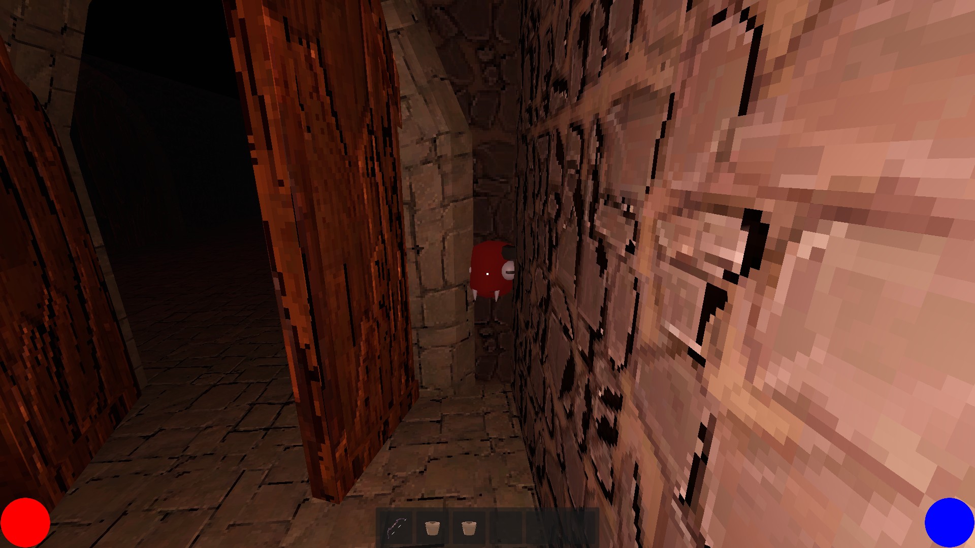
If the HUD thing becomes a real block later in development, there's always the possibility on finding a freelancer with a portfolio meeting your design choices. You provide him a screenshot or two, and ask him to tailor it (using keywords like I did to you). You're right on focusing on gameplay so far tho, card games are for brain players first and eye players come later.

If font is something you hear several times, I'd suggest going for less fat characters, and a tiny less round. And again playing with their size relative to their frame. Then try to see concordant aspects of each different fonts if you still mix many.


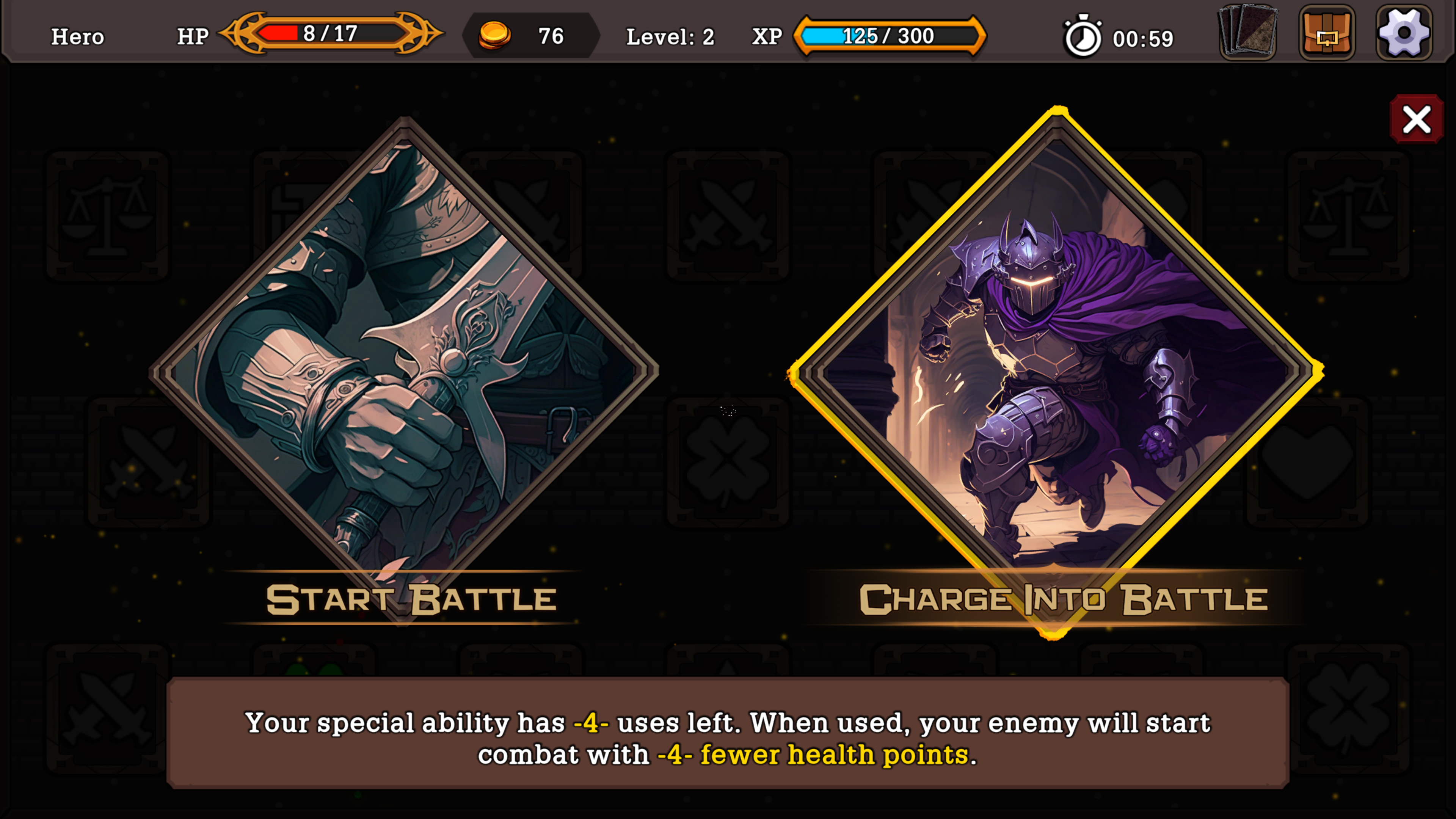
This for exemple : Bottom description is almost as big as the big Action font. The bottom font could maybe pass if lower size to begin with. But the Action font has characters not parallel (check the T and B). Makes it cartoony and fun. Your game is supposed to be entertaining, not the font. When you enter in game it's a big clash between all of them. The card description looks ok so far compared to the rest. If you can't lower the size of that, you would need to redo the card design to have more vertical space. Totally doable if you make your dungeon interface less big.

Don't know if you remember but to me your game reminds me a lot of Monster Train for some reason. I don't like (while appreciating and respecting) the artstyle. But it's a bit cleaner and partitioned to me. On top of my head I'd say take inspiration from Artifact, FORCED SHOWDOWN. Slay the Spire might not be a great candidate. (Edit : and simply modern AAA game with minimal interface, without going soulless. Get references from Japanese AAA)

Only my opinion, see what you can do as you go.

Trying the game again in better conditions. Overall I like the base very much but something is not clicking (yet). It would be about situating myself on the board and seeing the elements interacting with each others.

Also it's more personal, but nowadays I like more modern/minimalistic/sober designs for such dense games. I don't think it's incompatible with having a style and identity (thinking more of the AAA japanese approach than the typical occidental open world game for exemple).

I'll be happy to retry the game in the future.


Things I like :

  • Sound Design
  • Screen / Phases transitions
  • Fluidity of Action
  • Visual Effects (simple but effective so far)
  • The whole randomisation theme

Things I'd like to see :

  • A smaller HUD/Interface, or a slider to reduce its size. I think it could serve the game aesthetics, make it more sober and serious
  • A more sharp and serious looking main font
  • Less different fonts so the game elements are more quickly acquired visually, partitioned, and don't clash between each others
  • Better card "hitbox" when they're in your hand so the hovering put them forth more smoothly
  • Better visual separation of the card Title and Type
  • More distinct frames for different card Types
  • Not sure the mouse wheel to display a fixed frame of hovered card is nice. I'd like to just hover cards and have them being zoomed a bit so I can see them better. If I have to right click it would be to really admire the card and contemplate it for a long time, or think hard
  • Maybe having the active card and the discarded card piles facing each other and being differentiated would help me better situating myself. Would allow for less mouse traveling too when countering a spell for example

Thanks for the review. I totally agree with you on the bad points. I got caught between 2 directions and I'll redirect myself to a condensed and minimalist way (or try to).

Tutorial is a bit of a mess, used old code that I fixed quickly and there's dialogs from when I thought of going more in the dense RPG way. I learn this DD that it was a mistake to release a product like this, but at the same time it was necessary. Painful useful paradox.

I thought of doing different dungeons at some point and decided to come back to an arcade way of "either try or die". I might get back to it if there's no way I can incite players to learn by playing (I'd like to achieve what Spelunky does).

As for the "pure gameplay guy"; well yes, why am I making games instead of playing them!

Looking forward your progresses, see ya!

Thanks a lot for your detailed feedback despite not being a fan of the game (only currently let's hope heh). You have strong points that I want to work on for the next time I publish a demo. I'll answer your bullet points next. Again, thanks for your time and valuable informations.


- Good point about adding the default assigned key to the keyboard layout. I'll also try to support more than the current AZERTY

- If you're talking about the normal gameplay loop, it seems it's not clear enough that players need to level up their character by farming the appropriate floor levels. For exemple, to kill the mini-boss at Floor 5, it's best to have the hero level 5 or more, by killing enemies and getting scrolls.

- Indeed the Defense can be used to guarantee reduced damages, while the dodge is a 50/50 chance

- The fragments looted on enemies can be used every 5 Floor if you chose to use the "checkpoint" option. It opens a shop type of menu

- Interesting idea to have the health bar under the lamp one. I'll need to play with interface more and make it clearer overall

- Difficulty levels : this DD shows me it's going to be a major point I need to add, and you're confirming that. I don't want to scare off players so I'll definitely work on something 

- No way to cancel the Tutorial or see controls again this time. They are displayed on the game's Itch.io page tho. I'll try to set up a better environment for next publication

- Dodging should be an option to dodge all enemy's damages with a 50% chance. It's not (yet?) useful for a simple attack, but it becomes useful to dodge charged attacks that do a lot of damages

- Only way to improve equipment is to reach checkpoints every 5 Floor levels. While poor in use, the system is about generating a random set of stats for 1 piece of equipment. The more rare your fragments are, the better stats generated

- Agreed about the tutorial problems. I'll build a better environment next time

(1 edit)

I agree about the tutorial format; it was made when I thought of making it more of an RPG game. It does not fit the direction I'm going in now. Thanks for playing and leaving a comment.

Thanks for playing and for the detailed review. Taking your experience seriously for the future of the game. Also let me answer to your points :

- There's indeed no main menu or save possibility in this version as there's no persistent items (apart from highest floor reached). Money can be used after beating the bosses every 5 floors. It offers the possibility to open a sort of shop menu, and it stops time

- Time limit is indeed an old concept but I'm very fond of the idea of constant stress and close calls until you can rest at checkpoints. I'll be able to tamper it with difficulty levels. Maybe I can include a no time limit mode when I'll work on that

- Dodging is picking a side (left or right), and the enemy attacks randomly left or right. So it's 50/50. I think it's useful when the enemy cumulates its charges (x2/x4/x6). When it reaches charge lvl 3, it will unleash the attack no matter what. When balanced, it should give the player the ability (in some cases) to either go for the kill (by using Spirit Charge), defend to take reduced damages, or gamble on a 50/50 dodge. I could do telegraphed enemy attacks though

- I find weird you did not level once (unless there's a bug). It should be 10 enemies of your player level to gain +1 lvl. I want the player to manage his floor level to find a cruise spot to farm xp, but let him fight lower/higher enemies if he wants to.

- I started in RPG Maker because at the time it was (and still is) the engine I knew the most. I'm not making things easy but I'm not sure I could manage the transition right now

Interesting points. I like that take on diegetics. Thanks for this detailed review.

Thanks a lot for playing, and impressed you put so much time in it. I'll continue to furnish the game and try to make the climb fun and varied enough.

Thanks for playing. Your review on the tutorial is important as I will use it to project the player into normal gameplay, but with less options available. I'm still working on the main core of the game and the associated systems and I understand it's messy. As for the interface unfortunately, there's almost no chance I'll get it to work with a mouse. My focus is to find a good way to unlock content progressively, make the replaying of the dungeon fun. Once I get that I'll make sure everything can be clear enough to be played with a controller or a keyboard.

One goal is also to add a glossary/lexicon once you unlock the gameplay options, so the player has the choice to either go blind or watch what it does (inspired bu Spelunky).

I had a plan of making it into several places indeed during the summer development, with targets and objectives on certain floors, but I am going to refocus on having one Tower again as I'm still playing with the scope of the game. I'm going to keep that idea of using a run to target something specific though, I'll see if I can keep quests in, or boss seeking.


Doing my best to pursue the development and if you try another version I'll hope it suits you.

Cheers.

Thanks for the play and comment!

Thanks a lot for that playthrough, it still helps to consolidate the next steps.  Tutorials and an introduction to gameplay is a total priority for the next demo. I also thank you for the sound design compliment as it's my base skill and first domain! Hope to have your thoughts on the next demo.