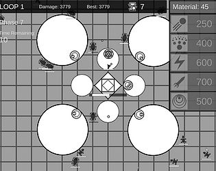
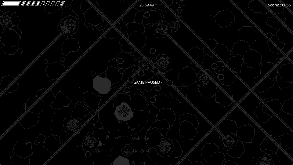
Amazing submission! Honestly an unbelievable amount of polish and visual juice in this short amount of time; I've been trying to get this granular pixel-perfect look too, if it's possible, could I get some pointers on how you got this look? Is it designed specifically for 1920x1080p? Are there any specific pixel-perfect camera setups you use, like the Cinemachine one?
This is a nitpick, but I wish the mechanics were a little bit less dodge-spammy, and a tad more deliberate. I loved the game feel, but the combination of the smoke closing in and the player's bullets decelerating made it a bit stressful for me to try and hit the enemies. I think I sort of perceived the range of the player's attack to be quite limited, and then so I felt like I had to go up to the edge to try and hit them, which meant I was much closer to their attacks and felt like I didn't have ample time to deliberately dodge the attacks.
Also I loved the nameless/random upgrades. It's honestly refreshing to see upgrades just thrown at you, and honestly for the scope of a game jam game like this I think it actually really increases the replayability of the game because you want to know what else there is, and because you're guaranteed one after every couple levels, instead of having to spend time choosing, or reading lengthy descriptions. And also saves time implementing buying systems and shops and upgrade selecting systems and whatnot, I thought it was a pretty nice move.
Awesome awesome work, among the best submissions I've played yet. Congrats on putting out this cool project!


