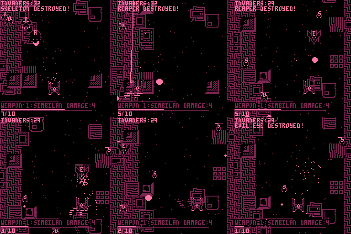
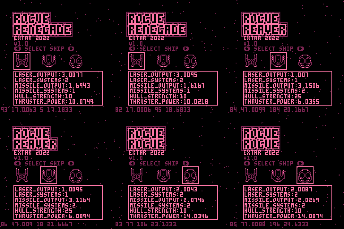
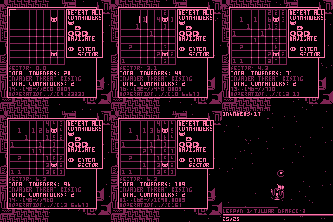
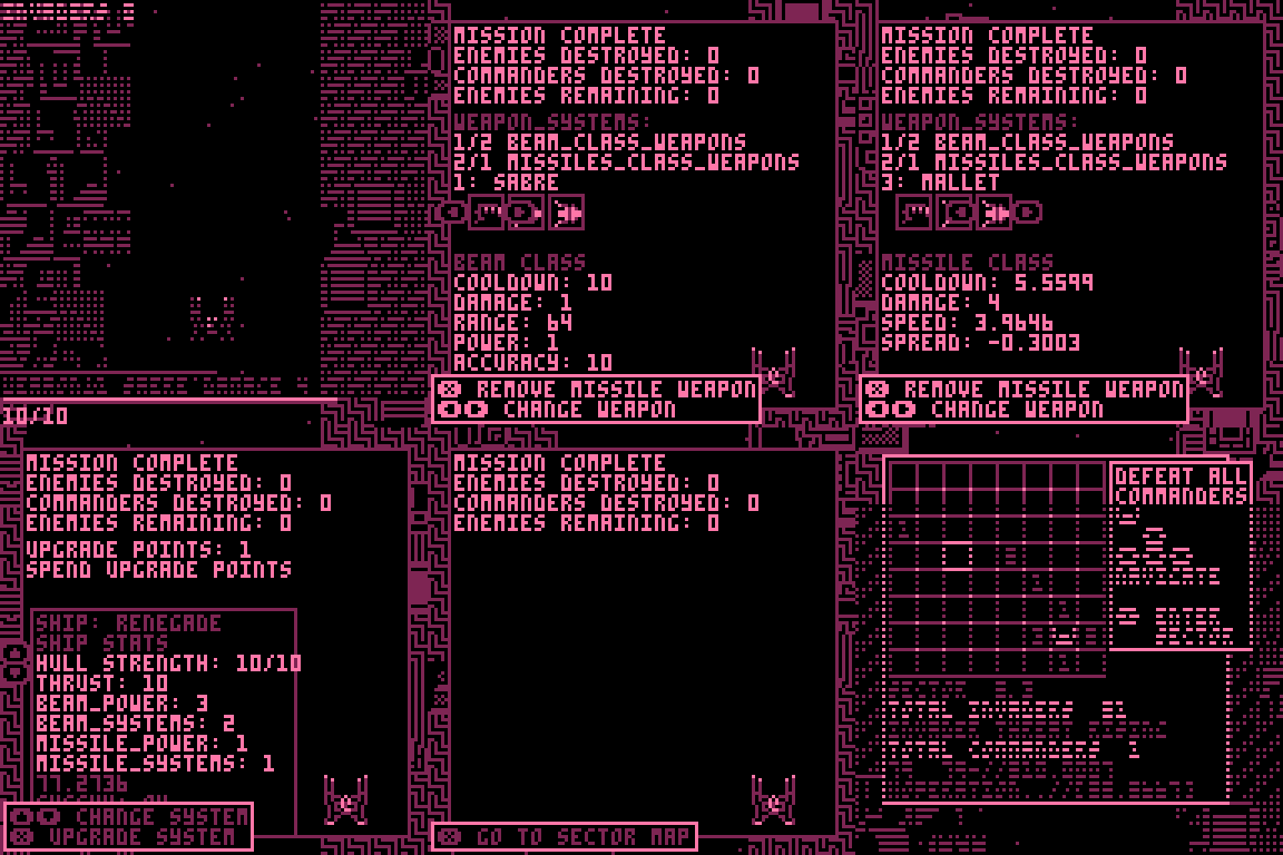
Nice game. I think I need more practice to be good at it. I was surprised that the decorations on the sides were not walls.
Play game
Rogue Renegade's itch.io pageResults
| Criteria | Rank | Score* | Raw Score |
| Overall | #38 | 3.857 | 3.857 |
| Roguelikeness | #90 | 3.286 | 3.286 |
Ranked from 14 ratings. Score is adjusted from raw score by the median number of ratings per game in the jam.
Successful or Incomplete?
Did development of the game take place during the 7DRL Challenge week?
Is your game a roguelike or a roguelite?
Comments
Thanks for playing! I definitely made it too difficult, or at least too swingy, the early-game--until you've got a decent weapon--is far too hard.
I experimented with having the walls collideable but it made the movement much more difficult and made dodging frustrating so I ditched it. Also, getting enemies to collide in an intelligent way with the walls didn't sound like a trivial addition! :)
Very sharp shmup roguelike. Though the shooting takes place on a vertical plane, the controlled scrolling nature, flowing controls, and beam weapons evoke Defender vibes. The presentation and sound are top notch, very expressive animations and transitions. Love the distinct palette, but sometimes the shooting is a bit hard to read with certain enemy types on the backdrop. I'm curious what the best strategies are here, I fully invested in the beam weapon which felt the most comfortable to me, and it wasn't long until I was razing through the fleets. Really well done.
Thanks for playing. I want to make lots of adjustments to the balance in a future revision. Beam weapons do seem good, I admit, but there are some ludicrous missile weapons you can pick up if you're lucky (see below, yes that's a boss wiped out in less than a second :S). The weapons are far too swingy at the moment. A lot of it can come down to just getting lucky with weapon drops.
Cool little game, I love the aestethic although sometimes is hard to separate the enemies from the background. Also the beam is way more powerful compared to the missiles imo. I feel like the latter should travel faster, but nonetheless a fun game.
It is brilliant for the short time span you had to make it in. The retro styling and everything is fantastic and very eye catching.
Only problem I have with it is that everything seems a little too complicated. I didn't completely get the sector map thing (maybe that's just me) and the weapon choices and everything seems a little sophisticated. But that could be just the thing some people fancy.
All-in-all, its unbelievable how you made such a beauty within a week.
Congrats!
Glad you appreciated it! The sector map can be a little opaque in terms of where enemies pop up and maybe where the player can move but it's mainly just a way to get the player to plot a path towards the boss(es). With the upgrade menu, again, it's more a failure of communication, the weapons aren't really all that complicated, it's only really damage and cooldown that matter most of the time. The upgrade menu was an important but very late addition, so it's kind of messy. I'm sort of pleased in a way that I landed on the 'too complicated' side because I was worried whether a shmup would come across as too simplistic and not Rogue-like enough :)
I was very skeptical that I was going to be playing a roguelike when I launched the game, but then I saw the world map and I saw what you were going for. Very cool mashup!
I felt a bit overwhelmed on the upgrade screen trying to figure out what it was telling me. It's clear that there's a lot going on here, but it was just too much text and blinking for me to parse. Maybe I'm just getting old.
Anyway, super fun game - it's got a lot of potential!
Thanks for giving it a try! I think there's a lot of room for experimentation in the shmup genre and I've been thinking about having a shmup with a strategy map/overworld for a while.
The upgrade screen was the last major element I added to the game and it's a bit of a mess, so you're not alone in finding it hard to understand, there's quite a few weapon stats listed that aren't all that important compared to 'damage' and 'cooldown'. I was in full 'just get it working' mode by that point :)
It looks like Itch double-posted your comment (it's been doing that to me a lot too) so I deleted the duplicate. :)
Love the sound and so impressed at what you're able to squeeze out of pico-8! The action is fast and responsive and properly overwhelming. I'm not entirely sure what's going on sometimes because there's so much happening on the screen, but it adds to the effect and I sort of feel like I've been put in control of a spaceship I'm not qualified to operate, haha.
Thanks! I wasn't sure how well the Rogue-like-ness would land, I spent the last couple of days trying to dial up the references to Rogue, like the little chat log when you defeat an enemy etc. It was my first attempt at making a game with a very limited colour palette, I think I need to make a few adjustments to which things get highlighted in pink to help them stand out.
I really like the stylistic choices here like the limited palette and the changing numbers, although sometimes I feel like they detracted from the menu readability, on the upgrade menu in particular it took me a few missions to understand what I was doing. I think because it moved me right to the next screen once I allocated my last point
Thanks, I was surprised at how straightforward it was working with the limited palette, it actually made creating sprites a lot easier. I probably did go a bit overboard on some of the fake computer readout numbers (a lot of them are basically debug numbers that I just left in and repositioned.) I had been avoiding doing the upgrade menu all week because I knew what a nightmare it was going to be, so it was completely thrown together on the last day, hence the terrible layout :)
I love shoot'em'ups, playing them since 1988 (Armalyte, Io), played a few hundred since them.
And yours felt fresh!!!
I like that moving back allows to scroll back. Controls are tight and good. I got into the flow! I like the map with the changing difficulty the more tiles I move. Very mice aesthetics! The whole package felt fresh, its not one single thing, just the package.
Nice!
Awesome aesthetic, music and sound design. I like the mechanic of the rising threat level and the separation into simple Invaders and Commanders. The differently named ships and forms provide a surprising amount of depth (instead of just facing nameless enemies). There's even upgrades! Very impressive entry for 7 days of work. Managed to clear 4 sectors in my first run, but I'm really bad at SHMUPs, so it's definitely the players fault!
Glad you appreciated it! It was fairly late on in development when I gave the enemies and weapons names, but it helped make it clearer what was going on in the background in terms of each enemy having slightly different stats and behaviour. Four sectors is pretty good! I think I made the game far too hard, when I make some revisions to the game, the first thing I'm doing it lowering the difficulty :)


Leave a comment
Log in with itch.io to leave a comment.