Indie game storeFree gamesFun gamesHorror games
Game developmentAssetsComics
SalesBundles
Jobs
TagsGame Engines
A jam submission

Sunset of 13View game page

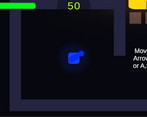
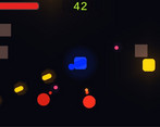
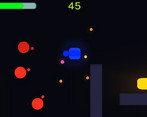
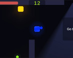
Less HP more FUN! Can you make it?
Submitted by hzetta — 1 hour, 50 minutes before the deadline
Add to collection

Play game

Sunset of 13's itch.io page

Results

CriteriaRankScore*Raw Score
THEME#424.0004.000
SOUNDS#1823.3243.324
DESIGN#2123.4123.412
OVERALL#2243.5293.529
MUSIC#2943.1473.147
INNOVATION#4012.9412.941
VISUALS#4853.0593.059

Ranked from 34 ratings. Score is adjusted from raw score by the median number of ratings per game in the jam.

Leave a comment

Log in with itch.io to leave a comment.

Comments

Viewing comments 29 to 10 of 29 · Next page · Last page
Submitted (1 edit)

Now That is what's a tutorial should be like! I loved your game. Especially how you introduced the player to the game. While everything seems great. I would say your game needs a little screen shake, bloom, and some particle effects to be just perfect. I would also advise increasing the base damage as the bullets seem to not do much damage unless we are injured. The Game Feel video from GMTK would really help! But overall, that was a great 4/5 experience!

Please consider playing and rating my game as well. I would really appreciate it! Thanks!!!

Developer

Thx! Thats a great video! The game has screen shake on damage or explosions, could increase the effect, its bigger on "turrets" deaths or your own death. The particles were cut out because of the merciless clock, but I agree its needed.
I'm going to download and play your game later after work. Thx again!

Submitted

Clever way to introduce the player to the concept of "less health means more power" by forcing them to take damage to enter into the level itself. At the same time, I wanted to see if I could beat the level with my weakest weapon but the level itself does not really let me since it becomes a bullet hell too quickly with no wiggle room. Meaning, that, although the idea is there and understood as to how the theme was interpreted, the execution forcing you always be in that state make me more like the game really just give you a two-hit before you die system more than "become more powerful when you have less health" since there's no alternative. At least in my play through :) Having said, entry is solid. Nicely done.

Developer (1 edit)

Agreed! Currently the game is balanced to roughly make to end in time on 40% hp, which is the only viable strategy. After submit was thinking how to change this, i came with 2 ideas: zones of inevitable damage (meh) or fire rate, projectile speed of enemies and time flow also modified by your own health, meaning you can play with another style and still reach the end. What do you think?

Also, could change the tutorial to 2 corridors, showing your speed is modified with damage too. The music change would keep for player discovery.
Thx for the feedback!

Submitted(+1)

Fun game, but a little to hard.

Submitted

I love the main mechanic.  That super fast fire rate when you're living dangerously on the edge of death feels great!  

Developer

Thx!

Submitted

Nice game! Good job!

Submitted

Simple and nice concept. A little too hard for me. Though good job.

Submitted (1 edit)

i like the system with health.it was easy to understand good game

Developer

Thx for playing!

Submitted

I really like the implementation of the theme, it was a bit hard but it was easy to understand and overall very good!

Submitted

I think this was a really good implementation of the theme! It was a lot of fun to play.

I had an issue with that balancing I felt like the enemies were coming in kinda hot and I usually died cause of the timer. Maybe one too many things happening at one time.

Overall though was a really great experience.

Developer

Hey thx man! I wanted to be needed the "less hp more damage" mechanic, but i pushed forward too much

Submitted

I like the concept, and the timer meant that you really did have to make use of the 'less health more damage' mechanic if you hoped to win. I do feel the timer might have been a bit too unforgiving, especially when I thought I was about to scrape by a win, killed the last guy with a couple of seconds less only to see "Get to the exit"...

Still, the concept is really good, and it does play well.

Developer(+1)

I think the problem was the lack of external playtesting, i do reach the exit with 10 to 15 seconds left, but its basically cheating because i know everything about the game, its a learning for my next time. Thx for feedback!

Submitted

I really like how this game feel, the shooting and speed when you have less health is great but sometime I still want to take some small health pick up to deal with with hoards of enemies, all very balance!

This is a really cool game! Great job! 

Developer

Thx! rlly appreciate you noted!

Submitted

This is very fun. It really makes you want to have less health sometimes, unlike other shooters with the same idea. Overall, would have made some more graphics, but the gameplay is great.

Developer

Haha im very bad at graphics! Thx for playing!

Submitted

Hey, it's way better than to import something dome by another!

Submitted

Well made top down shooter, you can definitely feel the difference in the weapon when you lose health. Good Job!

Developer

Thx!

Submitted

Interesting mechanic, I am sure there can be a lot of interesting gameplay you can do if you continue on with this. Even though the visuals are somewhat simple, they work really well for the game. One suggestion I have would be to add enemy health bars. Especially if the damage of the bullets changes throughout the game, it would be nice to know how close I am to killing the enemy. 

Developer

Totally agree, was in my todo list, cant made on time, thx for playing!

Submitted(+1)

Fun, simple and quite challenging, very well done!

Submitted

Fun, simple and quite challenging, very well done!

(+1)

Good sound design and it fit the theme well. However, I think that it would have been better if the enemies had less health. 

(+1)

A bit difficult but it is understood the theme related to the game jam, bice visuals, Great Job!

Submitted

Great Job. Fit the theme nicely and the simple graphics and environment were not distracting.  I would suggest making the bullets a little more direct and less floaty. Good game I enjoyed playing it :) 

Developer

Thx for playing! Could it be that the floaty effect is due to the lack of a reference background?

Submitted

Ooo..Maybe so. It didn't bother me that much though :). You made a solid Jam game.

Submitted

Fun game, maybe too difficult. When I'm trying to rurvive the stong enemies... TIMES OUT!!

Developer

Thx! Definitely it needed playtesting by someone else other than me

Viewing comments 29 to 10 of 29 · Next page · Last page