Indie game storeFree gamesFun gamesHorror games
Game developmentAssetsComics
SalesBundles
Jobs
TagsGame Engines

Golden Wreath Games

114
Posts
2
Topics
27
Followers
6
Following
A member registered May 19, 2020 · View creator page →

Creator of

Recent community posts

I just wanted to say I'm so impressed with this game. Mechanically its really simple, roll some dice, get some resources, spend resources to get better dice roles, with a risk reward element.

But the writing is so good, and having the resources be knowledge really adds to the worldbuilding and feeling that you really are out there exploring strange new worlds. It really feels like I'm playing someone in charge weighing risks and making all the decisions. Normally I hate overall time limits in games (or turn limits in this case) but it works out so well in this game, forcing you to take risks you otherwise wouldnt. And when these risks result in someone's death it really does feel like your decisions lead to that. It hurts both mechanically (losing a high level character will affect the gameplay) and emotionally, I feel genuinely guilty when I cause someone to die because I wanted to stay on a planet for that little bit longer, knowing they were already pretty injured.

Having a discoveries tab that lists every single discovery you find, and collating all the data on the different civilizations you find is also great. You aren't just collecting data/resources but you are collecting all this information that you can read up on and imagine these alien worlds and galaxies.

I stabilized the gate in my second run, but I'm eager to go again and find new civilizations, get more achievements and seek out that ultimate ending.
(also well done devs for submitting the game to the reproductive rights bundle)

(2 edits)

really cool concept and very well put together. The sword felt very natural to control and there was a real sense of weight when carrying the prince.

I also loved the art. Just a very pleasant game overall. It certainly had it's frustrating parts, with the prince's weight making precision difficult, but I'm sure that's part of the design.

Unfortunately the game bugged out when I beat the dragon :( the camera followed the dragon under the ground and I couldn't move the prince to the princess to see the ending. But it was fine the second time I tried, I'm glad there are many checkpoints close together in the last chapter so trying again wasn't too frustrating.

https://krazykain.itch.io/breathe-in

(1 edit)

This was fun, and looks fantastic. It took me a few goes to understand how and when to deflect, but was fun once I got it.


if you plan on updating this post jam, it would be nice to have alternate buttons for the attack/parry seeing as the mouse isn't really necessary, it would make it easier for laptop users to say use A D and J K or other keys.

Thank you very much!


I actually originally planned on doing just that with the characters. Have you start with just one ally, and then recruit the rest of the team. I was going to have separate levels rather than a bunch of waves and a boss, so I'd have more control of who was in each level. But I decided to descope all that before I even began implementing it because I already had wave management and spawning code from my main game, so I could save time and be more likely to finish in time. I'd love to go back to the game and improve the chat system and expand the story. I think there's potential here to tell a heartwarming story about the players who log in every night to play the game. But I do need to get back on the aforementioned main game I'm working on, so post jam updates will be later down the line.


Thanks again :) I appreciate the comment and feedback!

(2 edits)

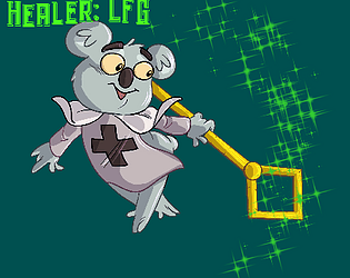
It was a deliberate decision that you wouldn't be able to control or order around the rest of the party, because you weren't meant to be anything but a healer, not a party leader or anything like that. But I appreciate that in order to make that work I should have improved the AI (at least make them move back to the center between waves for example) And the UI/UX, well I played around a lot with the placement, but after a bit of playtesting I received a lot of feedback about having to dart your eyes around too much to see the party status and abilities, so they were put next to each other.  Given more time I'll have to figure out what to do with the UI, and what other controls might work, I've had mouse targeting suggested a few times so definitely something I'll look into.

oh... but I will say.. idiot fighters rushing to their death expecting you to heal them? that's a feature not a bug.... MMO healer's know that pain :P


Thanks a lot for the feedback, much appreciated :)

That's fair, I suppose I could have explained a bit more what purpose each spell does and when to best use them rather than just what they are.

(1 edit)

fair point about the games size. It just seemed easier to lock down the size of the game then mess with anchoring UI elements... Not going to lie, it's laziness 😅


But I'm very glad your enjoyed it 😁 thanks for the kind words. If you happen to try again... Focus all your heals on the platypus when fighting the boss and he's a piece of cake because he won't change target while the platypus is healthy 

oh my god, such kind words, I'm tearing up here!


seriously though, I really appreciate the feedback. All the characters were drawn by Alen, he's an amazing artist. And the reason the great art clashes with the health bars and low res grass tiles are because I made those bits, and I'm a terrible artist, but he was too busy with the characters, end screen and menu art.

Anyway seriously, thank you so much, you've made my day

perhaps resetting the timer on damage rather than kill might have helped... it's a really solid concept for a game, and just a little balancing will make it very fun so I hope to see some udpates after the jam :)

I love the visuals and the sound is pretty good. Also the overall idea is very cool. But it's too difficult.  Getting hit comes with too big a penalty, combined with the very strict time limit to find your next kill (especially as a human), you just run out of enemies you can use to rank up. The timer is the real issue, as even just reading the text takes long enough to level down again.  I restarted every time I ranked down to skeleton as there just wasn't enough enemies to rank up. After a few restarts I was too frustrated to continue.

Really enjoyed this. Movement felt ever so slightly janky, but not enough to detract from the game.

The puzzles were fun and the possession mechanic was really cool. I did not realize you could possess stuff after they die so the last level seemed impossible until I read Kokutouchichi's comment and decided to try again, so I'm not sure if that was a failure on my part or if the game could stand to communicate that better (looking back, I see your page says E to possess pots AND ENEMIES, but I'd have liked to see that made clearer in the game itself).

I'd love to see the possession mechanic expanded upon for more interesting puzzles, but understand time constraints in a jam mean you had to stick with the few and make them good. which you've done really well.

Also kudos to the sound and graphics people, the game looks and sounds really well.

a very silly (in a good way) interpretation of the theme, I love it. As for the game, it's simple but fun. Though it is possible to stand on the corner of one of the stone platforms and just go on forever (I'm still wracking up a score while tabbed away from the game to write this comment!).

Looks like a promising Harvest Moon-a-like but I couldn't really figure out what to do. I tilled the land... and then what? I visited the town to buy seeds but had no money to buy them so wasn't sure how to get started.

No prob.. oh, and well done for finishing the game :) that's always an accomplishment.

That intro needs to be skippable, it IS very cool, but after I couldnt figure out what to do and restarted to read the instructions and tried again, it was not so cool the second time around.

The instructions didn't actually help much, I just could not for the life of me figure out what I was supposed to do, which is a shame because the visuals and audio are top notch, but it wasn't much fun to play. I couldnt help but feel that I was doing it wrong and there might be a good game in there, but if that's not communicated to the player, there's not much we can do. I'm sorry you fell ill and really wish to see what the game could have been if you had more time. Drop me a reply if you update the game further because it looks really cool.

a piece of advice I see in all "game jam advice" videos is to err on the side of too easy, so I wouldn't worry about that, as long as it's still engaging. And yeah, even though it's too easy, a moment of lost focus still can lose you the game. So I feel the difficulty works.

And yeah. Jam time limits do mean sacrifices so I get that... if you work on a post jam release and sync up inputs to the music I'd love to revisit the game.

Damn that music is jamming! unfortunately the lack of sound effects (and having only one Audio category) means I had to dock a few points there.

Overall it's a fun little top down wave shooter, though the difficulty should ramp up a bit faster, I got bored before I died, and I'm not sure how the game fits the theme at all. 

Overall I did enjoy it though.

(1 edit)

From what I understand, Zombie whose goal is to turn human again, undead to alive, i.e. rejuvenate.

It wasn't very clear what each boss was giving you as an upgrade, and I'd have liked faster movement. But otherwise the bosses were mechanically interesting and telegraphed their attacks nicely. I liked the overall structure of the game, where you could just go straight for the final boss if you didn't want the upgrades. well done

It's better to submit an unfinished game than have no submission at all, as even a low rating is better than a "not submitted". I don't want to be too harsh as I'm sure you're aware of the limitations of your game, There isn't a whole lot to do. If you do revisit this project I'd be interested to see what the game could have been.

The character animates really well and I absolutely love the little particle effect when they die. I feel like there's a lot of potential here, but the precision required is a little too high. there is absolutely NO room for error. It does result in a lot of very cool near misses where you make it only a couple of pixels away from being crushed, but it also makes the game incredibly frustrating to play.

the production value on this game is incredible. It looks and sounds great!

Not normally a fan of light puzzles, but I enjoyed this. Some of the puzzles were real head scratchers but always fun to solve. And what a name!

Love the concept. I wish you could drop a bit of your lantern power to keep some platforms active while keeping your focus elsewhere, it would have meant less having to focus on 1 NotLemming at a time as I'd have the confidence they weren't going to fall to their death and speed up the game significantly... apart from that minor tedium, however, I really enjoyed the game. And it's a great interpretation of the theme.
I played the browser version and it did crash after the third level unfortunately, but I saw enough to know I like it.

I enjoyed this very much. Took me a few tries to 'get' it. Perhaps adding something within the game itself that emphasizes the importance of hiding in the trees might help. At first, I felt like there was nothing to be done about the gears chasing you, but I eventually realized you can hide from them. Had to give the audio and graphics full marks because damn this game is beautiful.

Thanks! I struggled to find a good difficulty curve but I'm happy with how it turned out.  I appreciate the controls are confusing, they have been changed a few times as I experimented with different schemes but ultimately arrow keys for targetting made sense because the UI placement can make it easier for your brain to parse UP means this character DOWN means this one ect... and number keys for spells is basically how MMOs do it and I'm pretending you're playing an MMO as the healer.


Thanks for the feedback!

(1 edit)

To be totally fair though... some healers in MMOs get by with just spamming their skills so.... :P
 joking aside, thanks for the comment :) I would have liked to add a lot more, including different backgrounds to make it feel more like a journey but I had to focus on my strengths... Art not being one of them. I recruited an artist much later in the jam so they had to focus on replacing what I'd already put in, rather than adding to it. I'd also have loved to explore the story telling potential of the chatting and might revist the game post jam. 

Oh, and yeah, mouse targetting would have been a good idea... another thing I might add post jam. 

Thank you very much for the feedback :)

This one is very difficult to judge because I have some criticism, but the more I think about it the more I feel like that's the point. I was lost and confused, to begin with, but determined to push through. I wanted more guidance as I wandered around aimlessly in frustration... but once I started to find more of the selves I started to understand and piece together what the game is about... at least in the way I interpreted it anyway. It's a pretty cool exploration of one's own identity, perhaps even gender identity (I certainly noticed that trans pride flag computer background.... Trans rights by the way!).


I want to say this is a better game than it is a Jam game if that makes sense? if I wasn't determined to see it through, I might not have stuck to the end and appreciate it. I did want to quit to move on to the next game, to begin with, but I'm very glad I stuck with it. The game jam critic in me wants the game to offer more guidance... how many selves are in each area? what direction do I need to go through to find the next door? that sort of thing.. but as an experience... it all came together wonderfully.


apologies if this came across rambly, but that's what the game did to me :P

Feels really smooth the play, looks good and the music fits really well. But I must admit the interpretation of the theme feels a bit loose. It's a Race game with a health bar. I'd have liked more of a focus on that rejuvenation. 

I enjoyed this. The visuals are especially great. But hitting the beats doesn't seem to have anything to do with the music at all which kind of defeats the purpose of a rhythm game.

I like the interpretation of the theme, the focus on rejuvenating your fighter works really well.

Awesome thanks :) was really fun watching you play. I should probably make the controls a bit more obvious though, there's a melee attack on right click and weapon changing on 1,2,3,4.

This game's overall style and aesthetics are amazing. I love the character design and the cardboard cutout look of the world. Unfortunately the gameplay suffers from a serious lack of feedback: enemy reactions to your shots are unsatisfying and it can be difficult to even notice you took damage, let alone why and where from (this was particularly bad against the boss where it was almost impossible to figure out why I was taking near constant damage). The guns don't feel great to shoot either, they could use punchier sound effects


The art style, cute characters and good dialogue was enough to carry the game. And I did really like it overall because of this, but the gameplay does hold it back a bit.

Good simple fun. Final boss was a bit of a disappointment, but hey, at least you have a final boss.

The final level just repeats when you beat it, not sure if that's a bug? 

shotguns also feel a bit underpowered honestly.


with all that said. gun play feels good, graphics are really cool, I like the enemy designs... Overall I really like it.

I really like this game... but the levels are too long to have to restart entirely if you die... add checkpoints or mid level saves and it'll go from good to great.

Enemies absolutely need to make noise when seeing you, firing and dying. It's too easy to be taking damage from an enemy across the room you can barely see and have no idea where it is. Also the fact that enemies don't get stunned when you shoot them means there is no way to avoid taking damage. The level design makes up for this with health packs, but it really doesn't feel good. Also the enemies could use a bit more variety. Just having "bot who stands there and shoots you" but sometimes with more health, doesn't really make for interesting encounters, throw in a melee enemy, or projectile based enemy.


Anyway. I don't mean to be too harsh, the actual level's flow well with pretty good enemy, weapon and ammo placement. Actually shooting feels ok (would be better if enemies gave you more feedback!) and the guns sound nice...

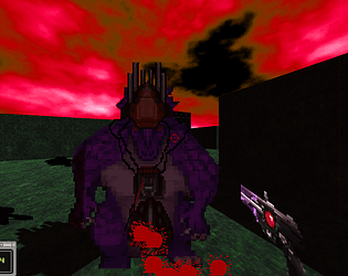
I really enjoyed working with this art pack. Turned it into a first person shooter: