Play game
Door Dash's itch.io pageResults
| Criteria | Rank | Score* | Raw Score |
| Fun | #246 | 3.089 | 3.089 |
| Audio | #259 | 3.059 | 3.059 |
| Theme | #274 | 3.208 | 3.208 |
| Overall | #310 | 2.979 | 2.979 |
| Game Design | #316 | 2.960 | 2.960 |
| Innovation | #316 | 2.733 | 2.733 |
| Graphics | #401 | 2.822 | 2.822 |
Ranked from 101 ratings. Score is adjusted from raw score by the median number of ratings per game in the jam.
How does your game fit the theme?
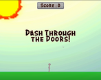
It fits by having the player dashing through doors to find themselves in different realms!
Did you write all the code and made all the assets from scratch?
Yes, everything was from scratch!
Leave a comment
Log in with itch.io to leave a comment.


Comments
Hi! Sorry for the late rate back but I loved your game! It's really fun how the environment changes so much after each door!
Thank you!
Thank you! Yes, I will play your game too!
Great game ! I loves endless runner type games and yours' is also very addictive to play. That's an amusing coincidence that we both shares the same name for our game.
Thank you! Lol ikr! That's amazing
Great game and mechanics are well polished. Would love screen shake when breaking through doors. also wish the left screen would be considered a death, makes the game kind of hard. maybe just make the left side a barrier that pushes you into death objects.
Thank you for your feedback. There actually is a camera shake when breaking through doors. After playing it again, I saw that it such a small shake lol. The left side of the screen is considered a death. Unless you are referring to the right side then yes it does!
Strong concept. Can be taken further by giving realms different gameplay elements. Good game!
Yeah definitely! I'm glad you enjoyed it!
It was actually really fun! i enjoyed it really well! i guess my only suggestion is just add some more obstacles like platforms or walls
Awesome! That's a great idea!
Fun game, it felt satisfying breaking through those doors. I couldnt tell if going through higher doors gave more points or not tho. Nice work!
Awesome! I'm glad you enjoyed it!
Nice game! very arcade-y. Dodging the obstacles was at times very difficult though, anyway, overall a great experience ^^
Awesome! I'm glad you had a great experience!
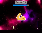
Fun game! It is simple but very entertaining :) The graphics and audio are also very nice! There were some areas (the space one I think) that was difficult for me to see the upcoming obstacles, not sure if that's intentional but I struggled with it quite a bit ^^; Apart from my skill issues, I enjoyed the game a lot, great job!
I'm glad you enjoyed the game! That's great to her!
Thrilling experience. Best Ive got was around 365, dunno if it is good 😅. Superb audio and responsive control.
That is good! Someone got over 2k! Crazy! And thank you.
Nice game! Cool visuals and audio, gameplay simple but fun, good job!
Thanks!
Solid game. I would appreciate it if you could rate my game.
Thank you! I shall!
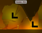
Fun and simple game. I liked the different textures for the various maps. Maybe my brightness was too low but sometimes the small lighting in the maps made it hard to see the obstacles (which may be what you were going for) but I didn't love that aspect. Would love to see other controls being implemented such as sliding, and maybe explicitly telling the player they can double jump since I did not find that out until after I failed a significant amount of time. I liked the audio and sound effects, and the door collision was a nice touch. Overall really well made, just a few touch ups I suggest. Maybe even adding some platforms that you can use could be an interesting idea .
Thank you for you feedback and input! I do agree those things will make the game better! We will look into it after the voting process
This game is really really well made, showing that your team have been working on it very well. I really loved your idea and game design. Good job!
Thank you! It is much appreciated and I'm glad you enjoyed it!
Super simple game and I think thats what makes it fun, though it could definitely do more to keep players engaged longer, maybe you could emphasise each door being a unique location by giving the player smaller permanent upgrades that are only available through certain doors/areas
Thank you! That's an amazing idea! I never thought about adding permenant upgrades :O.
I like short and simple games but I think your game is a little too simple. I like the idea you chose, choosing doors in an endless scroller is fun and engaging but I believe you could do more than this.
This game is about two things: running to the right and sometimes jumping. It's too plain. There are some buffs like invincibility and moving faster but they are generic and there could be none and nothing would change. But if you add a little twist to every pick up and/or just a small score boost they will instantly become more important and more engaging to collect.
The main gameplay loop needs some improvements too. After dashing through five or six doors player knows about everything and playing becomes quickly repetitive and boring. I suggest adding more obstacles, maybe platform which don't insta-kill the player or biome specific modifiers to make the loop better and interesting.
I would also think about changing running to more stationary and each skill or just dashing will change player position. There could be also twist with the door where better door and thus with more dangerous biomes behind them could be time-locked and proper use of dashing and collecting pick ups is necessary to reach them. Platforms would be useful too to get to them and to avoid obstacles. In my opinion I would remove the double jump ability and instead I would add this as a power up. This small change would make this ability feel stronger and will perfectly fit with yours and my idea of the game loop.
I enjoyed the game but it became quickly boring. There's still room for improvements and some suggestion I have written show that. But good job on making a team and finishing before the deadline!
Another great constructive feedback! Yes, it is simple which it was designed that way for the skills of our team! I do agree that it could be more in-depth and more features which is would have made things more fun!
One of the programmers actually mentioned about adding lives so the player won't die immediately which is great idea. We can implement those features after the voting process!
The platforming part is a new one but not a bad idea. We do have the mechanics of a platformer for the player so that would make total sense.
Thank you for your feedback! It is VERY much appreciated. We have much to think about going forward!
You have some nice background and particles, i like the way you can chose the next level.
I feel like you should diversified more the obstacles, it's always the same whenever you go, you could change the skin or even the behavior depending of the area, or had some specificity like the ice area where you slip a bit. (you could even changed the music).
Some obstacles spawn very close at the start, and some level have all their obstacles in the air, no need to do anything.
Lot of obstacles are positioned like you could slide under, but you can't slide.
I would make the dash cooldown a little bit faster, don't need much.
I've read in the comment there is a "how to play button", found it after playing, it's the question mark icon, it's not clear enough clear that it's a "how to play" button, too sneaky too (the double jump animation in it could be improve it's the same animation than "jump".), so know that i've play without looking that page.
Powerup/down:
Some bonus doesn't match the icon you show in how to play, like "Speed up times", the arrows are looking up in game, but looking right in how to play menu.
The powerdown should have red circle and red trail, they all look like bonuses. I saw that you have some red on icon sometimes like green camera and red arrow, it's not enough, plus with differents light it doesn't really looks red, so you see a blue thing with green icon = should be power up.
The Powerdown "only one jump" and "Decrease jump height" do the same thing : they kill you anyway if there an obstacle, almost every obstacles you need to jump need double jump, plus with this amount of times it's active combine with the high scroll speed with higher score, you will probably encounter a jump you can't do.
Powers can cross stages, meaning you can cross a door and directly have a powerdown on you that you can't avoid.
Would be cool to have some visual for invulnerability power up (so i could guess myself what this power do without looking how to play).
The score: The score when crossing a door is hard to read cause it's half outside of the screen and follow the door outside the screen fast.
The score is totally random, because the score was not the same everytimes, i was expecting to have differents scores depending of the door you chose, either depending of the difficulty of the area, either the height, the one on the floor + 10, the middle + 25, the top one + 50.
Ho also, at like score 1400 the music stopped :x .
Woah! This is some amazing feedback! I do agree about the slide since that would fix the issues with the powerdowns, only one jump and decrease jump height. Towards the end of the jam, I did think about adding that differetiation between the powerups, downs, and supers by colors. We can definitely implement that after the voting process!
The music part was my mistake and not hitting that loop button. I noticed even in the menu it does that so that will be a simple fix! The how to play is small looking back at it, a different icon or even scaling it up might help with that!
The powerups and such with the arrows facing up and some are sideways, the vertical ones for increasing/decreasing vertically like jumping while the horizontal arrows are for increasing/decreasing horizontal speed!
For the scoring the of the doors, originally, the idea was that you had to guess and choose the right door to go into. BUT, since the designed of the doors changed, I admit that could've been done better!
All and all, I really appreciate your very constructive feedback! It's great to see the good AND the bad side of my game so we know how to make it or other games better!
YOU GOT 2030 SCORE????? NOW I HAVE TO BEAT THAT!
Usually there always something you can improve, and i prefer tell people when i find something could be better for the reason you said, like personally only "Good game" can make me happy and sad at the same times, happy that people find it good, sad cause i would like to know what i could improve.
Well, good luck to beat my score, tell me when it's done I will beat it again.
The backgrounds were great! Died when picking up certain power ups, but it gave me a giggle so no hard feelings
LOL! Amazing! You must've gotten too greedy, happened to me a lot when testing............makes me giggle too......hehe lol
Great music and backgrounds. Good game!
Thank you very much
Nice game, though its hard to see obstacles in darker maps
Thank you for your feedback!