Play game
The Lost Oasis Hotel's itch.io pageResults
| Criteria | Rank | Score* | Raw Score |
| Overall | #184 | 3.553 | 3.553 |
| Innovation | #188 | 3.520 | 3.520 |
| Theme | #199 | 3.680 | 3.680 |
| Audio | #210 | 3.440 | 3.440 |
| Game Design | #211 | 3.600 | 3.600 |
| Graphics | #284 | 3.720 | 3.720 |
| Fun | #304 | 3.360 | 3.360 |
Ranked from 25 ratings. Score is adjusted from raw score by the median number of ratings per game in the jam.
How does you game fit the theme?
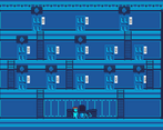
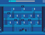
Some requests are fake and the player has to identify and avoid these. They can tell it is not real by paying attention to what real requests are supposed to look like.
Please visit the game page to receive hints on how to distinguish real requests from fake requests.
Did you write all the code and made all the assets from scratch?
Yes, all code and art was made from scratch. The sound effects and music are no copyright resources.
Leave a comment
Log in with itch.io to leave a comment.


Comments
Really fun experience, pretty tough at times but fun nonetheless, well done :)
Thank you for playing! I'm glad you enjoyed it :D
I liked the art and the music fits the game. it took me a few minutes to figure out that the doors are different too.
Thank you for playing!
Show post...
cool game, good graphics, keep it up, loved it!
would love to get your feedback on my game too ;) https://itch.io/jam/brackeys-7/rate/1418965
Thank you for playing! Yeah for sure :)
I got tricked so many times until I realized what other details I need to watch out for!
Really nice polished Game! Good Job.
Thank you for playing!
Skip for intro would be nice, other stuff nicely polished, great job!
Thanks for playing!
BEST !!!!!!!!!!!!!!!!!!!!!
Very cool game! I love the concept, theming, visual style, music. I think all my criticisms have been voiced in other comments, too much text at the start and often too subtle. But with a tutorial and some balancing, there is a very interesting game here. Good work!
Thank you for playing!
Hey!
This was sweet! I did not expect a game like that. To begin, the visuals are really great, I love the use of color because it's clear that you used a limited color palette. I think you did a really great job with the audio, really great concept and interpretation of the theme. But, I would like to give you some feedback about what I didn't quite like about the game and I hope you can take the best out of it:
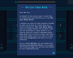
The introduction tutorial was really hard to read. I don't think it's a great idea to put the player to read few pages of text before he even starts the game. I understand that some concepts and gameplay needs to be explained but I'm sure you can do this little by little in a tutorial level, where the player gets tasks like "Go and take this" and "Now go and do that", this way the player can understand the flow of the gameplay without being overwhelmed by the amount of text he has to read. At least this is how I see it. One more thing that I didn't like was the fact that the game was not pixel perfect. If you don't know what that means it's basically the fact that not every pixel on the screen is the same size. Why is this bad? First of all, your art gets messy, but second of all those hand signs get a little bit unreadable, and I think this is a very important thing because your gameplay is based on how those hands look. If they are not pixel perfect, they will look different on every monitor. I don't know in what you made your game but you should research a little bit on how to make the game pixel perfect, in Unity is very easy.
I know this was a long review but I liked the game and I want to help you to improve it! Nonetheless, the game was really great and I enjoyed it a lot. You did very well and from what I see you did it all alone, which is amazing! Congrats!
Thank you so much for the long review! Yeah I agree about the tutorial, I ran out of time to do a proper one. I have actually used the pixel perfect component, but I wasn't aware about how it'll look different in every monitor, so thanks for the information :)
It looks like the game is pixel perfect but not the UI. Just so you know, I'm using a 2560x1440, maybe it helps. Here is an image: Hand not Pixel Perfect
Ah I see, yeah the hand's pixels aren't right. Thanks for the insight.
Beautiful graphics, congrats! Also the movement is nice. Tutorial is great but a little bit to long for sth to read before the game when you don't even know what you gonna do, probably introducing things step by step during the gameplay would be a better idea. For the gameplay, at first I was very confused cause I totally did not remembered nothing although I had read tutorial carefully. Secondly when I lost and was able to see really close how the proper sign looks like I still wasn't able to beat the game, I thought I do the right thing and I didn't know what's wrong with the sign. Now I see that you gave some hints on your game page to look at the doors too. Also, there should be a way to omit the tutorial when you want to try once again.
Anyway, the biggest pros of this game is a great art style. Honestly, it's the first game I played during this jam where everything for the graphics is executed so well. The menu, the ui, the fonts. Looks really impressive and for me it's a 5/5 for the graphics! Congrats on a great entry, keep it up ;) Cheers (Oh gosh, I haven't written such a long comment to anyone yet xd)
Thanks for playing! Yeah I know the tutorial is too long and isn't the clearest, unfortunately I ran out of time to make an in game tutorial :(. But thank you for the long comment, I appreciate it a lot :D
The art style here is really great, possibly one of my favorites so far. The concept is interesting and the gameplay is very fun!
Thank you for playing and thanks for the kind words :)
Love the art direction you went with this. The blue all swirls together, but pops at the same time - beautiful stuff. I think some extra visual clues would help spice this up, but good work overall!
Thank you for playing! I'm glad you liked the art :), and thanks for the suggestion.
Ooh! This game fits the theme of the jam perfectly! The game has a very cohesive style, and it was impressive that you were able to add an in depth tutorial to the game! If I were to make a suggestion, I would say that there appears to be a bug with the fake requests! Either that, or some of the fake symbols look far too similar to the real requests! I had a hard time distinguishing some of them, and often couldn't see a difference when I mistakenly fulfilled a fake request! Other than that though, I enjoyed the experience! Great work!
Hi, thank you for playing! Yeah some variations of the fake requests are supposed to have really subtle differences, so I guess I should have added easier variations. And when you fulfill a fake request, you will lose a heart and respawn, but if you don't lose a heart then you probably got it right! Thank you for the suggestions.
Looking at the pictures on the presentation page I thought it was going to be a simple game. Well, I was very wrong :')
Very nice game. It lacks a little feedback to show what you got wrong on a bad delivery.
Thank you for playing and thanks for the suggestion!
I had to fail a lot to learn differences on the doors! Brilliant gameplay :)
Thank you for playing! I'm glad you enjoyed it.
RATED!, can you help with mine too?, I'd really appreciate it!, Thanks in advance!
here's mine: https://itch.io/jam/brackeys-7/rate/1415313
Amazing concept! Loved the art style :)
Thank you for playing!
The game concept is great and the graphics are excellent! I confess that I found the game manual very tiring to read, I think it would be good to consider an in-game tutorial.
I see, thank you for the feedback! Yeah I ran out of time to do some sort of in game tutorial unfortunately, but thank you for playing.
Awesome game! Enjoyed it thoroughly!
Thank you for playing! I'm glad you enjoyed it.
Great work on doing it solo and the art was gorgeous!
Thank you for the kind words :), I'm glad you liked the art!
Did your build break? It says cannot read property build of undefined.
Ah I'm sorry about that, thank you for informing me. I forgot to tick windows in the uploads section of my game page. I've ticked it now, can you please try it again?
Of course. :)
Great, thank you very much! So is it working now?
It's working.