Play game
To death and beyond's itch.io pageResults
| Criteria | Rank | Score* | Raw Score |
| Overall fun and playability | #31 | 3.400 | 3.400 |
Ranked from 45 ratings. Score is adjusted from raw score by the median number of ratings per game in the jam.
Theme incorporation
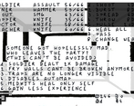
The main mechanics is based on the "Solitude" theme. You start with 7 characters, each with an important feature (typically the automap) and you'll lose all of them as the game goes. At successive plot points you'll choose a character to lose, unless they already died in combat.
An "Endless" game loop with a randomized party, randomized placement of enemies and items and increasing difficulty that you'll reach after you complete the handcrafted content was also implemented.
The settings and plot were based on the combination of the 4 themes.
Leave a comment
Log in with itch.io to leave a comment.


Comments
It was a very unique game and fun.
It was an interesting system of sacrificing party members to progress. The art style is unique and cool, but it can be difficult to play for long periods of time.
Thanks, I'm glad you like the game.
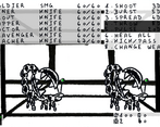
I really liked the black & white wobbly aesthetic, and I enjoyed the combat mechanics and thought they were implemented well. Would recommend toning down the wobbliness on the UI elements for readability, and the 1st person dungeon crawling is frustrating at times due to the lack of compass indicators or apparent motion when advancing down a long corridor, especially if the automap ability is lost. Overall thought this entry was very unique and visually striking.
Thanks, I'll certainly add options to tone down wobbliness on some elements (UI, walls) if I ever get back to work on the game.
This is a very creative entry with a cool mechanic, where you decide, what to loose, when the party gets into much danger. It is always super interesting to make difficult choices in a game, so Kudos for that. I did not like the wobbeling of the graphics too much, maybe tone it down a notch. But the black&white aesthetic itself was very well done. Hm, maybe the battle system is a bit too much work, selecting the characters with the F keys and then choosing from multiple options with the number keys gets a bit old after a while. Oh, the music was very nice. Very unique and fun entry :)
I did not want that the characters automatically target the first enemy because as a player it annoys me in the rare cases when I don't want to do that, but now you made me realize that it can simply be an option, so thanks for that, and for the rest of the comment, the kind words and playing the game as well.
Really love the artstyle, even tho the wobblyness made me a bit sick at first (like I was on a boat?). Sacrificing a team member and you lose an important exploration ability, is really smart and I hope I will keep that idea in my head. That's a tough choice.
Nice, I'm looking forward to whatever you'll do with it.
Love the art style. great way of using the time limit to your benefit - the wobbly lines feel quick and expressive like the doodles you do when you aren't paying attention is school. Some have said they don't like the wobble or shakiness but I think it makes it really stand out. Also huge props for the narrative focus. I know how hard it can be to tell a story and get a solid game in there in a short space of time
Thanks ! Your comment made me happy because I'm happy someone enjoyed the shakiness and I almost dropped the story bits at some point (I wrote them in the beginning of the week but put them into the game only at the end) so I'm happy you like that too.
Whew, really interesting! The art direction was unique, and I like the vibe a lot, but it was hard to look at for an extended period of time. If you have any friends that get motion sick, this would be a good way to torture them, lol.
I thought the narrative was interesting, and the combat was straightforward enough as well. Overall, good job and solid submission!
Thanks, I'm glad you like it, I could have thought a little more about players which would get sick playing the game.
Neat little jam game. I liked the handrawn aesthetic, although the wobbly part could have been toned down a little bit. I liked that each party member was unique and contributed to the game with their own abilities. It got extremely difficult once you got down to a couple of party members and choosing which "debuff" you get was daunting.
I think if the floor had a texture that changed as you walked, it might help give the player more feedback when moving.
Thanks. You're right, alterning between two different wall textures instead of single one is a good solution.
I only made it to floor 4.
Like others have said, the background was a bit much, but it did get forward the idea of madness. (Chose some good music too.)
The amount of situational awareness you need in this is staggering. I died so many times because I didn't realize I was being pursued by a stay monster.
And I didn't really understand how I got new weapons. They just kinda show up.
I really like how each floor is kind of a puzzle with it's own wrinkle. The bit on Floor 4 where you can go back upstairs, and it disorients you was cool, though I didn't see a utility in using the drop. Unless that was a trap, and it was just an alternate way down.
Unfortunately, something about this game didn't like my recording software, so I lost a lot of footage between deaths. It's basically my first go, a middle go after getting to floor 3 where I've gotten to grips with it a bit more, then a few shorter ones of me eating dirt on floor 4. I'll post it when it's up.
Oh that's cool, I'm gonna take a look at that.
Weapons and ammo are in some fixed places in the maps but yes the only indication you got something is a tiny sound and the New weapon text besides the commands which is super easy to miss as well. And you're just as right about the enemies, some sounds could probably be more noticeable.
I'm glad you liked the floors. I think you took the stairs on the right of the third map to descend, they are not accessible to you if your miner is dead, in which case the other stairs allow you to still access most of the loot of the east part of the third floor. If your miner is dead either you reach the stairs you went upwards from or worse if your scout is dead then you might miss and fall down into a hole getting you directly in the middle of plenty of enemies (but it does not save your game so you're not definitely stuck), the spinner also brings you back in the direction of the hole if you access it this side.
That explains why I was sometimes short on ammo and missing weapons when I found an economic route. I wasn't picking anything up. XD
Now I'm wondering where the heck I got that Mini-Gun.
That all makes sense with the stairs. My initial though was that I had to use it to get past the invisible walls so I wasn't sure one way or the other.
Here's the video. The audio might be a bit desynced from the editing:
To Death and Beyond by CryptRat & Mojo0jo
Hey,
cool consistent art style. But it was way to shaky for me. Still got to the wasps, but there everyone dies. :D Combat is nice too. With a less shaky style I would probably tried a few times. It was well polished and bug free. Good job and cool entry.
Thanks, two of my family members tested the game and reaching the wasps then it would get some time to do the second half of the game seemed to be their experience as well.
Nice consistency around all aspects. A bit too wobbly for me though. I liked the combat system: quick and efficient.
Thanks, yes failing to easily adjust it better I should have at least add the option for the player to disable wall animations, that was probably 2 minutes of work.
Love the wobbly hand drawn art style and the goofy sound effects. The tone is consistent throughout and this works really well.
There's a lot of depth to this which is very impressive for such a short development time! I've not seen anyone else implement such a complex party management system so far. I like that you can switch characters on the fly and each of them have different attacks/abilities.
The map is a nice addition too, but I agree with others that being able to tell which direction you're facing would make navigation much smoother.
Awesome stuff!
Thanks a lot, putting a map was already a bit kinder to the player that I like and the main reason I did is so that you have to choose if you get rid of it so a compass on top of that might be a bit too much for me ;)
I couldn't finish the handcrafted mode, it got pretty brutal on the 4th or 5th floor after the big open room full of wasps and the invisible walls. I lost all my party members one by one except for one, no one died in combat except for the last one (the mapper) shot in their back, so I suspect I was close to the end!
I love the throbbing art style with blank walls, it complements the theme of madness really well. The atmosphere is oppressive and I liked the sound effects very much. I jumped more than one time when I stepped into traps. Having to part with party members one by one is suitably stressful, too 😁 The movement is really snappy, and I love the control scheme that I found very intuitive and allows for some tactical planning.
I would have liked to have an indicator of the direction I'm facing to facilitate orientation, because exploring was already made harder by the fact that are the walls are blank and the rooms are bare, but it's not a bad thing that you are never too comfortable in this dungeon.
All in all I had a great time, and I happily retried several times, congrats for a great game!
Thanks, I'm glad you enjoyed the game.
You were definitely close to the end, if you descended to the 5th floor (not the one with the invisible walls, the one below), then there's a plasma rifle hidden behind an hidden passage not that far from the stairs (I'm not talking about a fry wall, it's really hidden, no visual indication) so you can complete the game whatever you got there with.
Thanks for the tip! I managed to beat the game 🙂 I enjoyed the story, your game is very cohesive as a whole.
Oh that's cool, thanks a lot!
Good idea! having 7 people to manage and having them slowly leave making you alone is nice! The wobbly effect on the sprite were a bit much and it gave me a bit of a headache, but good thing there is a minimap so you don't have to focus on the environement all the time.
Very cool game overall! great job
Thanks, I'm glady you like it.
I've got a fixed image settings implemented to test, I should have added it as an option to the player.
It's a fun experience and it's easy to see how you're learning and improving with each game.
My only gripe comes to the dungeon visuals -- the animation gave me motion sickness after a while.
Oops, sorry for that and thanks anyway.
Such a brutal and fun game!
It's very hard to decide on which characters you want to lose and how you want to approach each run. Did a couple of runs, always held on to my soldier and mapper for dear life, though I know the run is almost over when I'm down to 3 characters.
Loved the aesthetic, although, if I'm to critique something, I'll say the walls wobbled a little too much for my taste.
Very solid entry!
Thanks I'm glad you like it.
I agree that overall the walls are moving slighlty more than I would like, they were drawn super small with felt pens on sheets and I adjusted the results a bit but with more time they would deserve some extra adjustment.