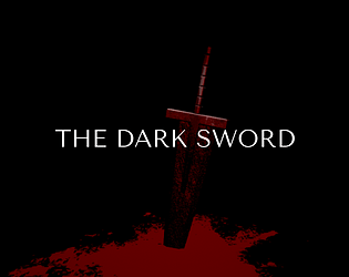
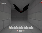
Awesome job! I really enjoyed the atmosphere and the looks and feel of the enemies and the environment. It was also a bit challenging not knowing when enemies would appear and died a few times trying to get through.
Play game
THE DARK SWORD's itch.io pageResults
| Criteria | Rank | Score* | Raw Score |
| Overall fun and playability | #34 | 3.318 | 3.318 |
Ranked from 22 ratings. Score is adjusted from raw score by the median number of ratings per game in the jam.
Theme incorporation
Ancient Ruins: The stage for exploration is the ancient ruins.
Solitude: Players will always be alone in their exploration.
Comments
Hey, just played your game! The mood and visuals are stellar, the monster animations are very smooth and satisfying. The movement could be faster and snappier I think but it's a pretty short game so it didn't feel outright tedious.
The parry mechanic is pretty well done, but it was harder to use efficiently on the monsters with slow attack animations. I think I parried the big knight thing that drops from the ceiling a total of twice successfully, while the final boss managed to only hit me two or three times while I picked away at its health, because of how snappy and easy to figure out his parry was.
That nitpick aside though, pretty good job!
The graphics seemed nice, even though the wall textures were limited and overall it lacked a bit of variety. The monsters were self-consistent in themselves but graphically being 2D black and red sprites, they weren't in keeping with the rest of the game which was nicely 3D and had some color differences. Font was OK - Did you create it yourself.
Movement and camera angles were good, although no freelook. Controls were .... infuriating. Pretty much every game on the planet uses A/D to strafe and Q/E to rotate. Why go against everyone's muscle memory? Is there a reason why you went with this, like it's default in some classic Dungeon Crawler that we haven't played?
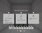
User Interface was nice and clean, and self-consistent. The 10 inventory slots that you could use with the number keys were easy to use and understand. The tooltips showing the item's stats were great. The idea that you could only use something a certain number of times with the Durability (or even the key) was a nice way to do it.
Chests looked great and opened nicely and presented you the item for your inventory. Until you could only chose 1 of 3? If we've opened a chest, we want the whole loot. It's not Trick Or Treat and we're saving something for the next visitor! It's interesting in some ways because it is a choice and a decision the player can make, and possibly on replays you might chose a different path, but it wasn't what we were expecting when we opened it.
It wasn't clear what our max health was (we think 100), you just knew what your current health was. For the enemies you had no idea how much health they had so you couldn't make an informed decision about whether they were about to die and you could get away with a sword hit, or if they needed a mega-wallop from the hammer, reducing it's durability. You could see damage being done and received and the feedback was good there but without enemy health numbers there was no context to understand what effect the numbers were having.
Enemies seemed to spawn (and re-spawn) at random, which discourages you from exploring as you may randomly be attack at all times, even after you think you've cleared an area. We forgot/missed the 'F' to parry so we don't know how good that might of been. We partly forgot we think because 'F' was also used to interact with chests. You could have made the left mouse button be the attack and the right mouse button be parry, especially since there was no freelook. There was no chance to retreat and you couldn't see them coming so it was hard to prepare for combat.
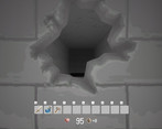
The destructible walls, using the hammer (at the expense of its durability), was a great addition. It was clear where it was breakable and it was satisfying to break it. It kind of felt like you should have to hit it twice though as the hole wasn't big enough to walk though , but you could walk through it anyway, which was slightly immersion breaking. The graphics for before and after for the break in the wall were very good and completely consistent with the surrounding textures and artwork.
We only played for about 10-15 minutes in the end because the random combat encounters were so brutal we just died before we felt we had a chance to get any further, even using up all our hammer hits. If this had been easier, or you respawned close to where you died, and not at the beginning again, we may have played for longer.
Really nice game overall. Simple but effective graphics and bug free. Not too many puzzle mechanics (maybe there were later on) but those that were there were well done. It's just a shame the combat was too difficult for us to play and didn't make us want to replay. Well done with your jam entry!
I appreciate your very detailed comments.
The background and monster graphics are my own creation, though, The fonts are free fonts called BestTen. The credit is given on the game page.
As for the controls, the main reason is that I was familiar with them. I played other people's works in this jam, and I regretted that the controls of this game were not standard. This one will be updated post jam with an option to switch between strafe and turn.
I understand that you want to get all the items from the chests. This is due to the game design, with limited items and limited durability, and we want you to be able to choose which items are best to get in such a situation.
I am also sorry about the difficulty level of the game. I apologize for the inconvenience caused by the lack of time and the inability to implement checkpoints and other features. I hope to improve on the things you mentioned, such as displaying the remaining HP of enemies, in future updates.
Thank you very much for playing!
Very enjoyable entry. The combat was quite nice with the addition of the parry mechanic that requires a bit of practice until you can get right. The mallet for breaking walls is a nice addition, as are the limited use items. I like how the mobs enter the fight, making it seem organic and the minimalist graphics worked very well with the near monochrome pallet. Excellent job!
A fun game! I really enjoyed the atmosphere created by the art and music. Also thought it was a pretty cool idea to add parrying and weapon durability systems. Good job!
Cool, if short entry! The movement and everything is all solid. I like the combat with the parry mechanic which was tough to time, but it's what saved me on the final boss. I also liked how the more powerful items had durability which made you choose wisely when using them. The enemy models were great too!
The movement was a bit slow and the dungeon very dull/gray/samey throughout.
I'd like to see more!
I was alone. I fought shadowy dudes.
I got punched in the D by batman.
Dunno why you called it a moonraker.
That reminded me of a James Bond film.
Because I'm old.
Good game.
Ha! this was fun!
I really dug the monster design in this one. The combat system was cool, and I enjoyed the parry mechanic. I was having a hard time figuring out the right timing for the bat, and I was inconsistent with the other two. But it all clicked with the final boss; he only hit me twice, I think.
Good fun, great job!
I killed the final boss with just 2 health! That gave me kind of a Bloodborne boss fight feeling. I really had a blast playing this game. It looks basic and simple but it works very well almost on all aspects. Starting from art. I dig the black/white/red color pallette and simple wall textures. Enemy design is very cool. Those shadow type emerge from the ground slowly, it's pretty spooky. It's random enemy encounters but there's a subtle transition to battle screen. It's a very nice touch.
Combat is pretty straightforward but intuitive. I think parry system makes the combat more engaging. Destructable envioronment, another very cool idea. You can open shortcuts and other stuff with that in the future builds of the game. Inventory works great. Movement is smooth and feels good but feels a littlle bit slow i think.
Final verdict: I found this game much more fun and engaging than i expected. It has a simple but very well executed formula with good polish. If it was a little longer with some more content i think it could be the best game of the jam but even in this state it's a great game to create in 9 days. Cheers for your hard work and good luck!
2 health!? That's wonderful!
I have to admit that I tried to keep it as simple as possible in order to complete it in the limited time available. Still, I had to give up some elements.
Shortcuts are a good idea. Movement speed has been improved so it will be faster with post-jam update :)
Thank you for playing and comment! I would be very happy if you enjoyed it.
That was pretty cool.
I liked a good parry system, though the attack animations being so slow ironically made it trickier to know when the parry window was.
Like others, the Silver Key didn't work for me, though it didn't take me long to figure out the alternative method. On my third go I just made a B-line for the final Boss and did OK on the parrying.
Playthrough: DarkSword Pt1 by blazeedge
I could see from the video that there was a problem with the parry timing. I will improve the parry based on the feedback received.
The silver key not working was unexpected, but I'm glad i have another way to do it as a secret. The misalignment of the UI is also a concern and will be investigated. Thank you for playing!
Was not too long and rather enjoyable. I like the combat mechanic, although it needs a little work - there's a reason why parry mechanics generally have an obvious tell just before the parry window.
Given that you're only ever fighting one enemy at a time, you can get away with not using it - but your animations need a clear 'impact' point that the player can read. In my case, most enemies did indeed have such animations - the only exception was the slime/goo creature, whose 'slowly push its hand at me' attack was very hard to visually identify when the 'impact' time was.
I think the balance of the breakable weapons needs a little bit of a tweak - if I'm giving up healing and/or a permanent armor upgrade, the temporary weapon should offer more than 2 extra points of damage. I don't feel like that would save me even a single turn in combat - and that is an important metric to keep in mind when balancing. It isn't the exact amount of damage the weapon deals that matters, but rather how many turns it will take to kill an enemy.
To be clear, though, I did enjoy the combat as-is - those are just some thoughts on how it might be polished. You can watch my full playthrough here:
Idk, I guess I just suck at parry mechanic in general. Managed it only once against sword dude... couldn't do it for the sake of me ever again against anyone else, including him. Not sure when to press that button at all :(
But everything in this entry is nice and polished. I enjoyed idea of durability items and choices from chests. I am in general just bad at timing stuff :<
Hey, that was nice. Short and sweet. The idea with the breakable walls was cool, because it is a little desicion, if you want to sacrifice a more powerful attack for it. I like, that you have parrying integrated. Something I only got on my second attemp and it saved my butt against the big dude with the red sword. But I wish, there was a little bit more telling when to use "F", as I had trouble to get it right with the biggest normal enemy. But anyways, that was fun.
I completed the game.
I guess movement could be slightly faster but overall I think every part of the game works. The game is fun, looks good and consistent enough and it controls well. The choices before the widely different items were interesting choices. Breakable walls are better than environments which are not interactive at all. One thing I really liked what that I thought the progression of the difficulty to parry the different enmies was appropriate and the difficulty to parry the different enemies and the difficulty of the last boss were right on point for my taste, I took 2 hits and my hps went to 21 until I could consistently parry the last boss.
The game is cool, thanks for sharing.
Neat little game! I think something broke on second level. I got the key but it did not end up in my inventory, so I could not open the door. Nice atmosphere and interactions.
Great little game! I never would have thought of this mix of a Breath of the Wild-like Dungeon Crawler, with weapons as consumables. The trade-off between breaking down walls and having higher damage in battle is also cool.
It seems like it’s a bad idea to wander too much, because enemies respawn but don’t drop weapons, so you only lose by fighting them, unless you are great at parry timing. I could never parry the slow golem swings, but I had no trouble blocking the boss sword, so I was able to win.
I beat the final boss, but I found a bug in that even after using my health potion I was able to spam 2 and use it again haha
I wasn't able to nail the parry mechanic on anything but the bats (I think I just didn't quite understand the timing) but the juggling of the upgrades was an engaging gameplay loop as well as the ability to us the hammers to find hidden items. Combat was fun and juicy (With the slash sound and the cool dissolving death animations). I also really liked the creepy ambient background track.
Nice work!


Leave a comment
Log in with itch.io to leave a comment.