Play game
Just a Bouncing DVD Logo's itch.io pageResults
| Criteria | Rank | Score* | Raw Score |
| HUMOR | #4 | 3.818 | 3.818 |
| INNOVATION | #4 | 3.855 | 3.855 |
| AUDIO | #17 | 3.436 | 3.436 |
| OVERALL | #22 | 3.527 | 3.527 |
| MOOD | #24 | 3.255 | 3.255 |
| ENJOYMENT | #29 | 3.182 | 3.182 |
| GRAPHICS | #76 | 2.982 | 2.982 |
| THEME | #88 | 2.655 | 2.655 |
Ranked from 55 ratings. Score is adjusted from raw score by the median number of ratings per game in the jam.
Leave a comment
Log in with itch.io to leave a comment.



Comments
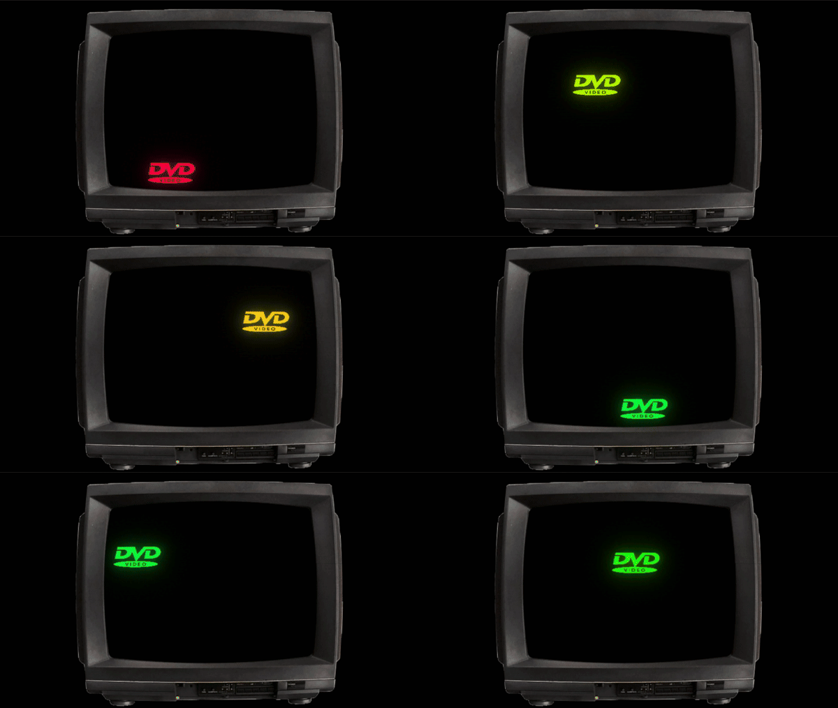
The art of designing a good camera is one that must not be overlooked. I cannot overemphasize how much this camera ruins the gameplay. Keeping the player on the edge of the screen in the direction they are going prevents you from seeing anything ahead of you. The best course of action is to constantly be zooming all the way in and out the force the camera to keep the player in the center of the screen. This paragraph goes doubly so for the maze level.
Staple the camera to the player, let me move the camera by dragging the mouse... anything but this.
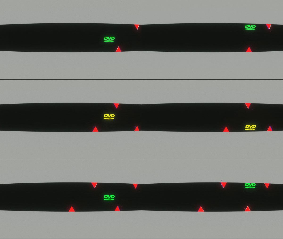
Can we also talk about the difficulty? Because it really feels like you are trying to make a "rage game". Even putting the camera aside, this game is unforgivingly difficult. Did the chase sequence really need a dead end?
At any rate, I beat the game.
Let's talk about solutions here.
Mid-Level checkpoints. The player has continuous progress. This let's you design large levels without rage-inducing consequences for death.
Updated camera movement code. Always keep the player on the opposite side of the screen relative to their movement. You always want the player to see as far ahead of them as possible. Giving the player more information is a must.
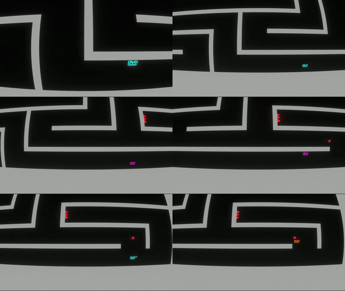
Remove all dead ends. In the maze level (which I don't think needs to exist) the dead ends only waste the player's time, which feels bad. In the chase level, ending up in the dead end is a guaruntee that you fail, which feels bad. If the camera could be freely controlled by the player, then the maze level concept is fine, but if you have to reach a dead end in order to know it's a dead end, that's just bad design.
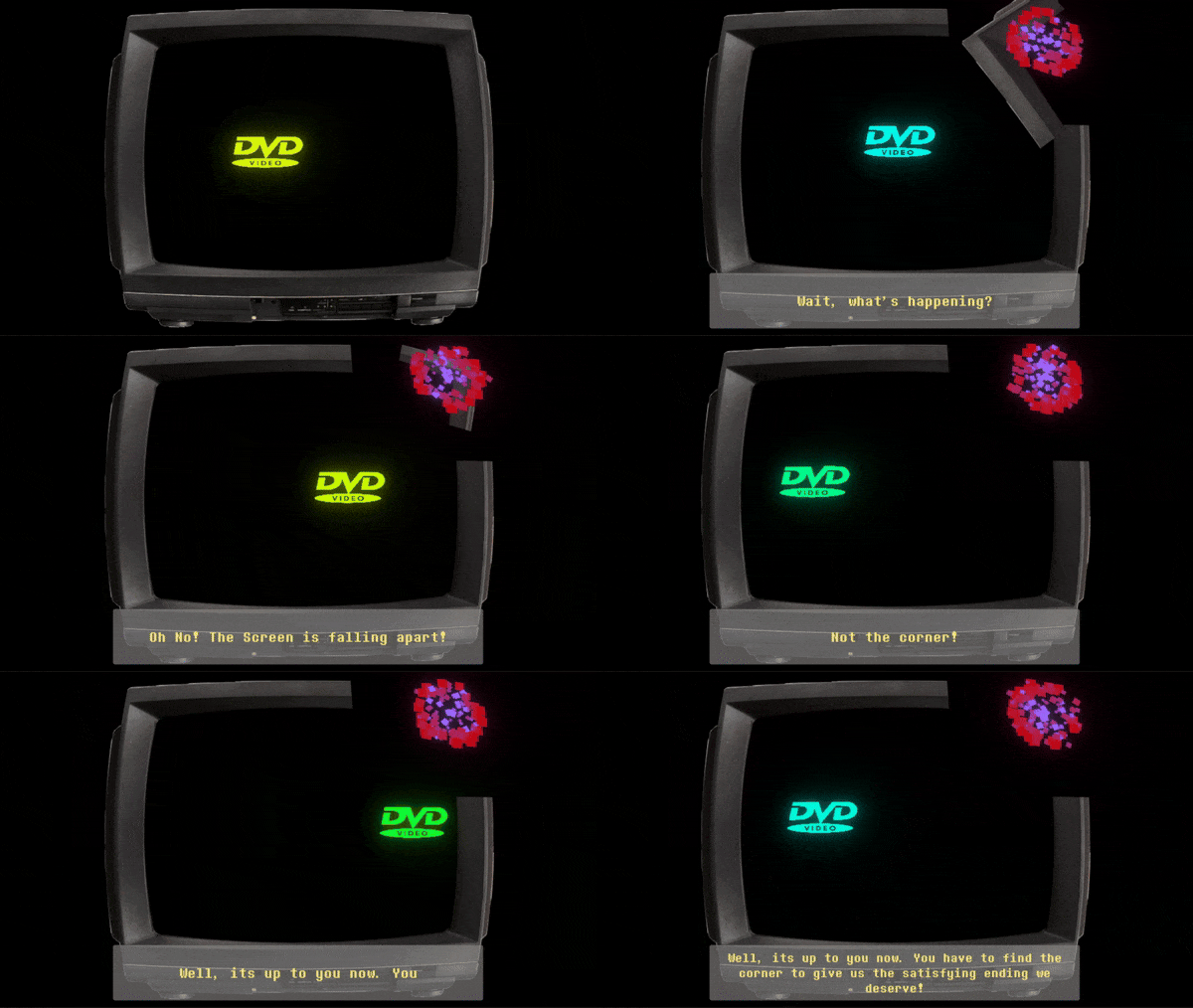
A better victory screen. The ending screen is just the intro? If I screenshot that as proof that I won, it's no visually different than the start of the game! I wanted to brag, darn it!
From reading these comments, I think I'm the only player to beat the game. This reminds me a lot of my early jam games. I made challenging games because I enjoy challenging games. I even had messages in-game saying things such as "Wow, that was difficult huh?" just like your game here, but all this difficulty really does is lead to people not finishing your game. Just look at all the comments so far mentioning them giving up due to the difficulty. You recognize the difficulty, but you also need to know that as the developer, you have way more experience and knowledge about your game than anyone else. The levels that you find difficult are near impossible for someone just picking the game up. And a little side note, people have more fun when they are winning. The difficulty just makes the victory bitter-sweet, while an easier game's victory is fun.
Just my 2 cents.
And now with all that negativity out of the way, this is a really funny concept. I chuckled during the opening, and I found the occasional fun facts about the history of the DVD player enjoyable. The survival level was by far my favorite! I like how the player's speed has no upper bound. Perhaps there should be one, but letting the player build up infinite speed is hilarious- definitely keep that. The detail of the logo changing colors with each bonk is perfect. I can tell you put a lot of work into this, and it's a shame that the difficulty is preventing people from reaching the end.
The game is tough to play but it's really funny and innovative I was not expecting that!
The controls are hard. But I really like the direction of this game and the humor is gooood, made it much more fun but a bit ragey on the side. Solid game. Great Job!
Really great humour, I do think the game was way too difficult however, espeicially with how clunky the boosting is. I had to give up after playing for about 15 mins when I realised I made a wrong turn in the maze and would have to go all the way back. Sadly just some very big level design errors, I really wanted to finish it lol.
Anyways well done on the humour, great audio, visuals and I love the text at the bottom, but yea I tried my best but just couldn’t beat the game and didn’t want to spend the 30+ minutes doing so.
Haha, I really enjoyed it. Didn't make it to the end unfortunately, found the controls really hard and the time interval between boosts too big, but still it was fun.
Having the DVD logo was a very innovative idea, had me laughing, well done!
MOM! There's a DVD in this game!
Nostalgic!! One recommendation would be to make the controls easier xD
Fun game, very difficult. Even without the reload time (or a shorter one) I would be bad at it, as it is now, it's impossible for me.
Very difficult lol. But it was great fun loved the glitchy effects.
Interesting game, extremely challenging even in the early parts of the game, it could make a pretty good rage game. I'm definitely giving you a maxed-out humor score, good job haha. I would maybe try to ease in the difficulty a bit so the player can get used to the game and the controls a bit better before jumping into bouncing challenges, other than that, fun little entry :)
Incredibly challenging even on the first area, but I like the one button controls! Lining up your rotation to chain bounces feels really nice.
great game haha , welcome to flappy bird dungeon crawler simulator . xd great work !!!
This we'll probably be the most unique game Il review. Very well made too. Very cool game
200% points in humor for sure, I wasn’t ready for this
I legit thought ok… this person really went for the joke game submission
it’s a bit ragey game for my taste when the spikes start really going, but great idea, explores the one mechanic pretty well, the narrator is very fitting for the tone