Play game
Climb the Clouds's itch.io pageResults
| Criteria | Rank | Score* | Raw Score |
| Gameplay | #21 | 3.875 | 3.875 |
| Overall | #33 | 3.833 | 3.833 |
| Audio | #35 | 3.708 | 3.708 |
| Graphics | #54 | 4.042 | 4.042 |
| Innovation | #129 | 3.250 | 3.250 |
| Theme interpretation | #163 | 3.292 | 3.292 |
Ranked from 24 ratings. Score is adjusted from raw score by the median number of ratings per game in the jam.
GitHub repository URL
https://github.com/Mineant/Climb-the-Clouds
Leave a comment
Log in with itch.io to leave a comment.


Comments
good game! great job!
Thanks!
One of best entries I've played!
Definitly has room for improvment but all in all really well done.
Thanks for playing!
I had a great time. Good design, good execution. I think my only complaint is that sometimes it seemed to be irresponsive, and I'm not sure why (I still had enough energy to attack.)
I also seemed to get warped back to the title screen after I got two the man after the training dummy. I don't know if that's intended.
I loved the variety of attacks and enemies. Great game!
After talking to the man, you won the game and will warped back to the title screen. Thanks for playing :D
Thanks for playing! Sometimes the UI will have problems when starting the game in windowed mode then changing to fullscreen during gameplay. I am happy that you liked the game :D
cool graphics and combat system!
Thanks for playing!
Incredible the amount of things done in a month. A very polished game that could be for sale on Steam with a few more days of refinement. My congratulations!!!
Thanks for playing!
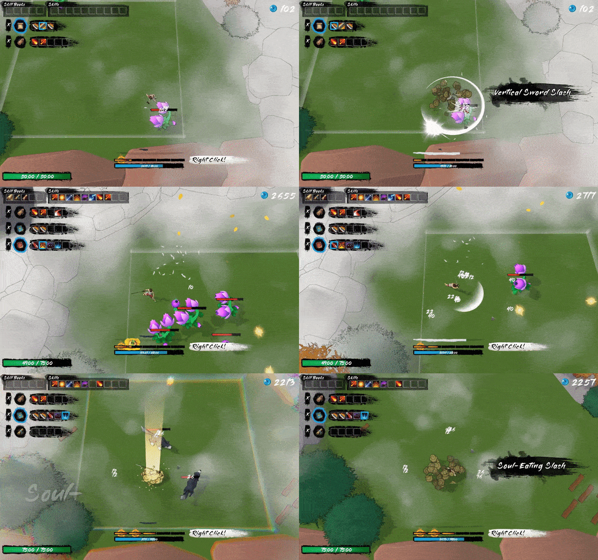
Love the graphical style. Lots of depth here. I liked the feel of the combat, the weapon effects, and the intro with jumping into the level is great. The skills system seemed a bit overly complex, I think you could probably streamline that somehow. Unfortunately, the game did freeze for me after I jumped into a level and I could not progress further, I was playing the Windows build as I couldn't get a good framerate in WebGL. Just thought I'd let you know.
Thanks for playing! There is a bug where if you don't equip any skill books and progress to a level, the game will freeze. Simplifying the skill system and making the game more playable in WebGL are definitely two problems I want to solve later. Thanks for the feedback!
I don't like the unconventional attire. It is odd for a character in a Wuxia game to be dressed in a gray vest, red shorts, and red slippers. Also, it's not the same as the character on the main menu.
Thanks for playing my game :(
Cool concept! There is a lot of to like here. I was trying out new abilities left and right.
My only critique is that I don't think I fully utilized all three spell books and felt like I needed to stop and do inventory management somewhat frequently. I imagine with practice I would be using more than 1 spell book, but as a newbie I was just swinging out there.
The voice acting was a welcome surprise.
Thanks for playing! Inventory management and switching skill books are definitely two of the main problems I want to solve. Thanks for the feedback :D
Didn't get very far but fun, I like the way you fight (even without using many abilities)
Thanks for playing :D
What an amazing game! Super beautiful, super entertaining – one of the best I've tried in the Jam. Really great job ^^
Thanks for playing!
Really awesome game. Pure art! congrats
Thanks for playing!
This game feels like a hidden gem between the games in this jam! I really hope it gets the praise it deserves. Makes me remember Hades, but with a nice and different twist to its core gameplay! Also it's well within the Gamejams theme.
Excellent game (Given the time restriction) with good potential to grow even more. Awesome job :D
Thanks for playing!
Damn, that title screen art. Love the aesthetic here, and the music is dope.
This game is super interesting and fun and I'm going to download it to play it more later. Really well done all around!
Notes:
The menu buttons could use a drop-shadow or something to help contrast it from the background image though, either that or add a desaturation layer behind UI while navigating things like pause screen and tutorial dialogue
I really like the fact that the choices for each area tell you what the rewards are so you can try to tailor a build/have some agency in what playstyle the run will have
I feel like this game was very Noita inspired, and I love that. It's a really cool idea to take a hack-and-slash and have the player construct their attack combos
One thing that might be cool (it makes sense to be out of scope for this iteration though, you already added and achieved so much), is synergies in skills (think team fight tactics unity synergies, or SNKRX) which encourages diversifying skill usage in a combo (since synergies only apply when non-duplicated attacks happen), but also gives some more build expression and direction to a run. I really wanted to combine a bunch of spear moves into a single spear spell book and have that mean something more, like maybe increase area of affect/range of the attacks or something. (It's also possible something like this was happening in the background and I just wasn't aware because there are a LOT of numbers and keywords to keep track of in the game)
Voice acting and characterization, animations, build variety... The SCALE of this submission is insane for just a month, kudos on all you were able to achieve!
With some polish I could see this being a full-fledge steam release if it's something you want to pursue.
I think the areas that could be improved for a final product are:
1) A user experience pass on the information being presented would help this game a LOT. Really highlight the elements you want the player to be using for their combo construction. If it's more important to pack rarer spells into a spell book, making the rarity colors present in the icons while in the skill bar or on the details panels would be good. If you instead want the player focusing on the types of attacks, making the distinction of sword/spear/magic or whatever, emphasize those elements more in either the art or effects. I think with a game like this giving the casual player simplified feedback on how good their build is can help a lot, and the hardcore players can dig into the numbers on their own and optimize if they choose.
2) A cleanup pass on the in-between stage animations would be good (maybe speed it up after the first one, or make it skippable? The barrel roll is cool and all the first time, but after that it slows down the pace of the game to have so much animation between stages)
Thanks for playing! The SNKRX is a very good idea. I thought about something similar furing the design phase, but didn't know exactly how to execute it. I had spear books that increases spear damage, but that isnt really what you are describing. Your comments gave me a rough idea on where to start, thank you!
Yup this game is Noita inspired XD.
A lot of time was sunk into designing the skills and skill book, it took me 3 to 4 days to fully design them on paper, and the implementation took about 6-7 days. Glad to turned out not bad :D
The game used some AI for its work, like the title artwork and voice acting. There was too many things I wanted to voice act so using AI would make sense, but for the title art I really wanted something hand drawn, the current art work will just be a temporary placehoIder. I hope this wouldn't leave such bad taste in your mouth.
Your suggestions are right onto the pain points of the game. The information presenting problem is definitely one I want to tackle first. For the scene transition, maybe I'll add a fast forward button to help quicken the process.
Thanks so much for leaving such a thoughtful comment!
this was really cool! i found the movement a bit too slow and the combat a bit too easy, but overall it was really well put together and looks and sounds great! some of the camera movement jumping between levels made me a bit nauseous, but other than that i really enjoyed it :)
Thanks for playing!
I like the item/skill system it was unique but still working. Game was easy, I just collected legendary items and had no problems. I enjoyed the fights but they can be more fluid.
At the ending when I reach sect master and talked game just ended. I was ready for another fight. Was that a bug or simply a result of time limitation of the jam?
Thanks for playing! The game ended when you talk to the sect master. But there are several different dialogues for each character and you encounter them for the second and third time.
By far my favorite yet. Fits the theme perfectly, gameplay is easy to get into, fun, pretty. Checks all the boxes. The transitions are very creative.
Thanks a lot!
Wow, this is awesome! Feels really good to play and you nailed the animations and the overall atmosphere! Nice job!
Thanks for playing :D
Amazing entry, I had a lot of fun finishing a run :) The animations are gorgeous and the spell slots mechanic is a good idea! I found it a bit too easy, we end up with thousands of gold and it is possible to trigger the special attacks with the right click nearly continuously ;) It was really cool to develop a strong build though! (thunder is great ⚡️)
Thanks for playing!
I really like the art (especially all the graphics for the skills and stuff). It was pretty enjoyable to play but it took me some time to understand how to play "correctly".
Thanks for playing!