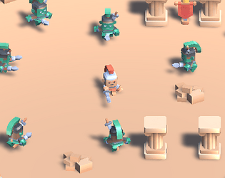
Play game
Last Roman Spinning's itch.io pageResults
| Criteria | Rank | Score* | Raw Score |
| Aesthetics | #170 | 3.875 | 3.875 |
| Theme | #211 | 3.708 | 3.708 |
| Music | #374 | 3.083 | 3.083 |
| Sound | #442 | 2.667 | 2.667 |
| Overall | #448 | 3.000 | 3.000 |
| Fun | #497 | 2.833 | 2.833 |
| Mechanics | #515 | 2.667 | 2.667 |
| Story | #553 | 2.125 | 2.125 |
Ranked from 24 ratings. Score is adjusted from raw score by the median number of ratings per game in the jam.
How many people worked on this game in total?
1
Did you use any existing assets? If so, list them below.
Graphics: https://kenney.nl/, Audio: https://pixabay.com/, Audio: https://assetstore.unity.com/packages/audio/music/8bit-music-062022-225623
Leave a comment
Log in with itch.io to leave a comment.


Comments
This is really cool! Great use of the assets, and I really liked the spin mechanic. Keep it up!
It took a few minutes to get a feel for the attack mechanic. After that, it went pretty well once I got more upgrades. I did however notice you get killed if you move into an enemy corpse. And I think hitpoints for the player would be a nice addition, like a few others have mentioned :-) But other than that it's well done for the jam :-)
yeah, that is intentional i.e. the spears are merely sticking out of the undead enemies. Probably not that good of a game design choice in hindsight.
Love the outsourced art assets! Great for the theme. Super difficult to wrap my head around the mechanics, but fun nonetheless! The upgrade system would be great with an onboarding tutorial, but dont sweat it as its just something to learn from, you did well to make a game for the jam!
It was difficult at first, but after I got the hang of the spacing it was pretty fun. I like the upgrades
Fun Game - understood the upgrades from the comments :D
Liked the art and music, making the enemies explode or more juice would be great <3
Good job and good luck
nice visually but very difficult...i managed 1 kill, the placement of the enemy spears was questionable. I think the spinning mechanic is funny but the enemy reach is way too much so you can't enjoy the spinning properly.
there are actually upgrades to improve the player's reach/speed but I didn't make that obvious in the game. Oh well.
I gave it another go and found the upgrades, i thought the cups and weapon racks were just props not upgrades. Some kind of tutorial or maybe particle effect or glow around the upgrades would have helped make them more obvious.
yeah, another person also pointed out the same issue. It wasn't apparent to me until the comments come in :/
Overall, I enjoyed the premise and became very invested in whirlwinding down that horde of enemies :D I did find it to be very challenging at times - I think the hitbox could be increased just a little bit. Great job though, thanks for creating this!
As others have said, probably a health bar would be better as it's fairly unforgiving, but fun once I got the hang of just spinning constantly and timing my move to the enemy. Well done!
Quite hard! lol! Love the music!
Love it , haha hope you guys work further
Cool idea! The hitboxes are pretty rough at first, but with the upgrades it becomes much more forgiving. Nice job!
I was starting to wonder if people are picking up the upgrades, heh
Pretty interesting concept, however the hitboxes are waaay too small, I had a pretty hard time hitting the enemies & they can just stab me in one hit!
I think with a bigger hitbox, a more chaotic turning mechanic (maybe make them spin uncontrollably like beyblades!) it could be a more interesting take on the vampire survivors-like genre ;)
it does work a bit like a beyblade if you pick up most of the upgrades :D
Oh wait I didn't realize those were upgrades XD, I thought they were just props. Maybe adding animations, a glowing outline or just a text that pops up (+Turn Speed, +Attack Range) for the upgrades would make it a lot clearer
yeah... based on the comments so far, I probably should have made them stand out more
Loved the aesthetics, however dying to one hit does feel a bit cheap. I can see this being very fun with some upgrades and more refined combat mechanics! (ღ˘⌣˘ღ)
It's actually a really neat idea and you could definitely do something with it. I think the biggest problem is that it's a bit unforgiving - one hit and you're gone, and the difference between player attack range and enemy attack range feels very tight. That difference is definitely there, just hard to find that sweet spot... and in the process of trying to get there, you often end up with a gladius in the face - nevermind where the sun don't shine =)
Yeah, I agree. I like the art, but it's basically impossible to kill enemies.
The graphics are really good. I don't like the spinning of the character as it is really hard to hit an enemy with it. It makes it unnecessary complicated and dying all the time from this makes this less fun, unfortunately.