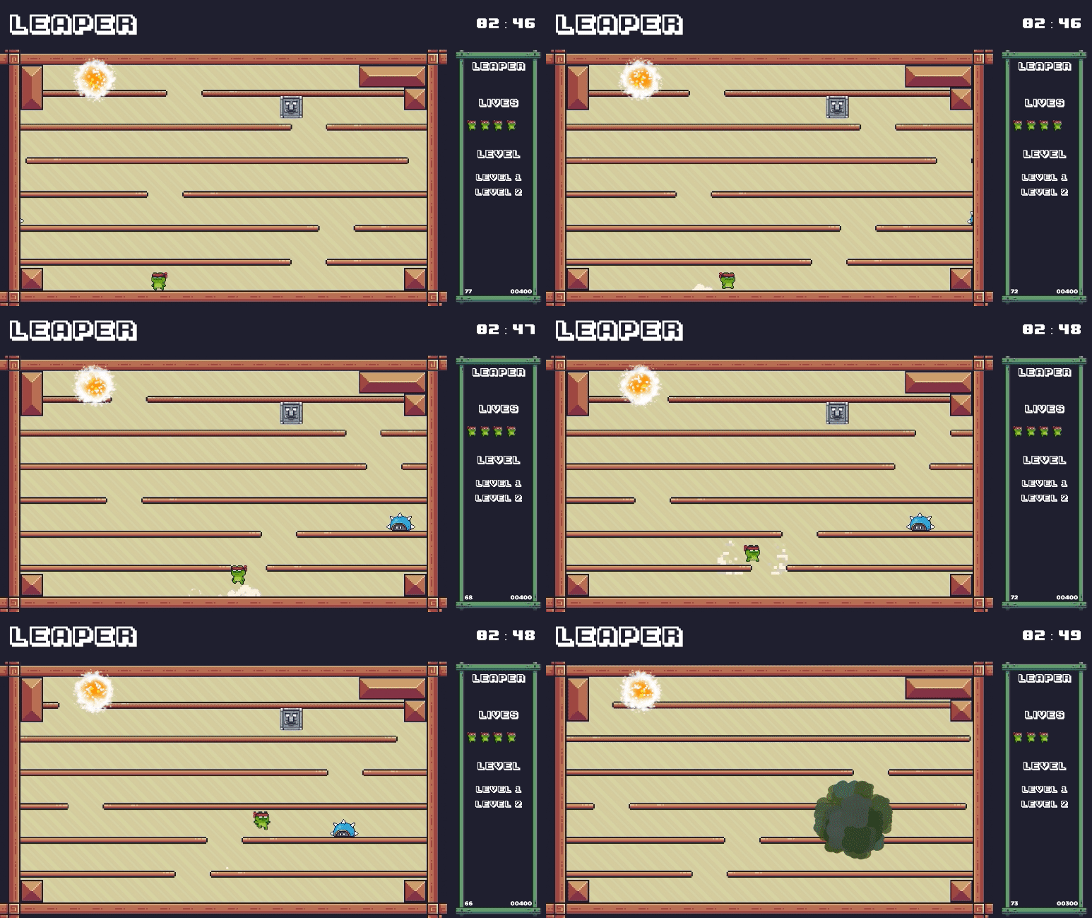
Play game
Leaper's itch.io pageResults
| Criteria | Rank | Score* | Raw Score |
| How well polished was the remake? | #2 | 4.571 | 4.571 |
| Technical Implementation | #2 | 4.500 | 4.500 |
| Sound and Music | #4 | 4.143 | 4.143 |
| Art Style | #8 | 3.929 | 3.929 |
Ranked from 14 ratings. Score is adjusted from raw score by the median number of ratings per game in the jam.
Leave a comment
Log in with itch.io to leave a comment.


Comments
cool maps, cool art, cool sound effects!!
gave me a real challenge :)
Did you finish? Good job 👏
Outdid yourself here Yanniboi
I know you watched already, but if you did need the link here were are live thoughts on stream:
https://www.twitch.tv/videos/1436793193
I adored this entry. I think you did an excellent job paying homage to the original, and while I can't pretend to know what the first devs were thinking or intended, I think you perfectly captured the feel and type of game they wanted to make if they'd had the ability back then. It was frantic and fun and fair ... and the addition of thwomp for a vertical threat was an excellent decision.
Small nitpicks:
- I wish each letter of LEAPER lit up as a beat a level so I felt the reward of progression.
- Hide the frog when it reaches the goal/portal/end
- More fanfare after beating it. This game was a challenge! Be great to have a little celebration even if it's just a song change.
But overall, such incredible and polished work. It was all the little things like the animations and sfx when your lives populate was so rewarding.
Thanks! I really lived watching you play!
I agree with all your feedback. I did have the levels at the side change colour as you progress, but I’m aware that as it doesn’t show the full list at the start it doesn’t give you an indication of overall progress because you don’t know how many are coming. If I push an update in the future I’ll address these.
Great level and enemy variations along with keeping many elements true to the original game. I didn't capture my screen, but I think my final death count was around 180, but it didn't feel like I died that many times because I was having fun.
Wow! That is commitment! Thank you so much for sticking with it 😅
Angry oinks are angry!
Great work on this! Really happy I managed to attend one of your streams while making this!
The variety of enemies make this great. Nice work!
+brutal death
Lol
Yea I went all out on the pigs. 🐖
There’s no winning against them, just need to be quick to avoid them. 🏃♀️
they are ANGERYYYY
This was a lot of fun! I really liked the variety of enemies and levels, and the animations were very nice. My favorite enemies were the ghosts :)
The original ghosts were quite hated because they would kill you the instant they appear. I added a grace period so that they don’t kill you while they are fading in and that is much kinder now 😄
Really good gameplay, super tough, I'd say the art could be scaled a bit better, some of the pixels were way bigger than others, but overall a pretty challenging and fun experience.
A couple people pointed the scaling put to me now. I hadn’t noticed but yes that would have been an easy fix if I had thought of it 😅
The bad - Platforms move a little bit slow in my opinion and artwork is not unique (but really nice though and like what you have done with it)
The good - Excellent level design, really interesting variety of enemies with unique movements, a lot of polish to the game which is the main thing of course, good level transitions and a really nice special ability that fits well with the levels
There is some variation in the platform speed across levels, but having seen some people play there is a lot of start and stop and I agree that it messes with the pace of the game having to stop and wait so much.
I have never invested any time in learning to do my own art. I always choose a pack and then work within its limitations to accomplish my goal, but yes I am aware that some asset packs get old/boring when you’ve played so many games made with them.
Thank you for the insight.
Really polished and nice job on staying true to the original game while making it a lot less frustrating and more in line with current game design sensibilities.
One little thing was counter intuitive to me: due to the levels being contained by thick walls it took me quite a while to realize that there is screen wrap.
Awesome submission!
You should have played the mvp 😂 it was super inconsistent what was wall/obstacle and what could warp. I tried to make it more consistent, but yea it’s not super obvious.