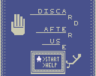
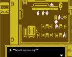
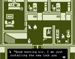
I loved the simple art style and the writing was great. It really lacked the atmosphere to keep me hooked into it. After a while i noticed i was just coasting through it trying to get it to move through the gears as fast as I could. I think that is partly down to the heat and the rating window making time feel precious. I would like to revisit it without that pressure but some sound and life would go a long way toward inturupting that chore like grind that kicks in with just reading lots of text.
Play game
Discard After Use's itch.io pageResults
| Criteria | Rank | Score* | Raw Score |
| Visuals | #22 | 3.529 | 3.529 |
| Overall | #53 | 2.882 | 2.882 |
| Gameplay | #60 | 2.471 | 2.471 |
| Fun | #77 | 2.118 | 2.118 |
| Audio | #101 | 1.235 | 1.235 |
Ranked from 17 ratings. Score is adjusted from raw score by the median number of ratings per game in the jam.
Number in team
1
Does your game include art/sound packs or pre-prepared code?
Please provide a link to the project source code.
https://drive.google.com/file/d/1MwSkp0yBzqYUW0mevMduv7ZQdOrpX93l/view?usp=sharing
Please provide a link to a 30 seconds gameplay video of your game
https://drive.google.com/file/d/160_Dup_ZxffDWbvWRFqRBbV4P2XKukf2/view?usp=sharing
Comments
I think most people have said what I would already. Nice 8-bit callback on the artwork. Good luck with future projects.
The art style was really really great. But I’ve had a very hard time focusing on a story-based game without any sound. Very creative usage of the theme as well!
The game is good, and the concept behind it works well. Writing "It makes you think" is not an excuse for not explaining the controls :)
The interpretation of "one time use" into a game about a man who uses others for his own gain was an interesting one, and I enjoyed seeing how you chose to explore it. The graphics were probably my favorite part, as the simple pixel art and coloring gave it a really nice retro feel. I also think that the lack of background music emphasized the sober feel of the game. I think maybe some sort of sound for the characters' dialogue or the dialogue boxes could have added emphasis to the text, but I don't think the game was hurting without it!
My biggest critique of the game was actually addressed in another comment, in that the theme of the game felt a bit on the nose, but I also saw that you're already aware of it. Given you only had a couple hours to put everything together, and you had to write dialogue as you thought of it, though, I think you managed very well. I also realized on my second playthrough that NPCs had different things to say when you spoke to them again, and I immediately went around talking to each and every NPC I could reach to see what they had to say. It was a very nice touch!
I enjoyed the game overall. It was a nice, bite sized little game, conveyed what it wanted to convey, and had a really pleasing aesthetic. Excellent job!
This was a really cool take on the theme and I definitely started to feel invested in the story and the implications of the protagonist's actions on his life. The art-style was great and although I am a sucker for some good audio, I think the choice not to have any was pretty smart - definitely made the whole thing feel a lot more sombre! I'd love for there to have been some choice so I could have affected the outcome and how the protagonist treated those around him, but overall thought it was a really neat narrative experience!
First of all, I adore the artwork - it may be my favourite in this jam so far.
I occasionally felt lost when finding the correct person to interact with before changing scene but this encouraged me to speak to all the NPCs and gain further insight into the story. I also appreciate the creative response to the brief. Great work!
I am a sucker for short, narrative experiences, as well as this beautiful minimal pixelart. I would love to make a game in the same style, but I always get caught up in making too many details.
I get where you were coming from with the narration, but it felt a bit too on the nose, because I couldn't even make the decision to engage in the enviroment in any other way then intended, which means I didn't even had the chance to treat anyone better. I guess it was a limitation caused by the time constraints, the liniarity helps to keep the message precise though.
All in all an amazing entry, love the artstyle and enjoyed the details when speaking to every npc the game offers.
Thank you for the constructive feedback! It's funny because 'too on the nose' were the EXACT words I said to my wife yesterday as one of my concerns. Unfortunately, due to unforeseen work commitments, I only had a few hours (8 or so) to make the game, so all the dialogue was written more or less first time, as it came into my head. I only had time for two passes for grammar checking! >.<
I also really wanted to add more agency for the player, but in Bitsy it's very time-consuming so it didn't make it in :).
Thanks again!


Leave a comment
Log in with itch.io to leave a comment.