Play Gamejam-Jam
The things we do for Love's itch.io pageResults
| Criteria | Rank | Score* | Raw Score |
| Fun | #307 | 3.724 | 3.724 |
| Overall | #386 | 3.724 | 3.724 |
| Originality | #728 | 3.690 | 3.690 |
| Presentation | #896 | 3.621 | 3.621 |
Ranked from 29 ratings. Score is adjusted from raw score by the median number of ratings per game in the jam.
How does your game fit the theme?
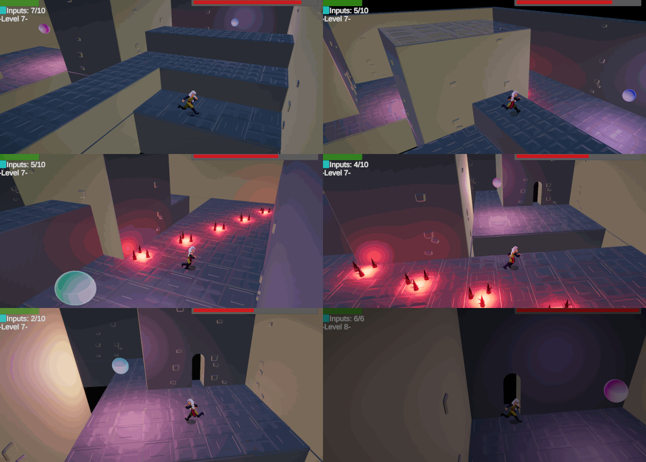
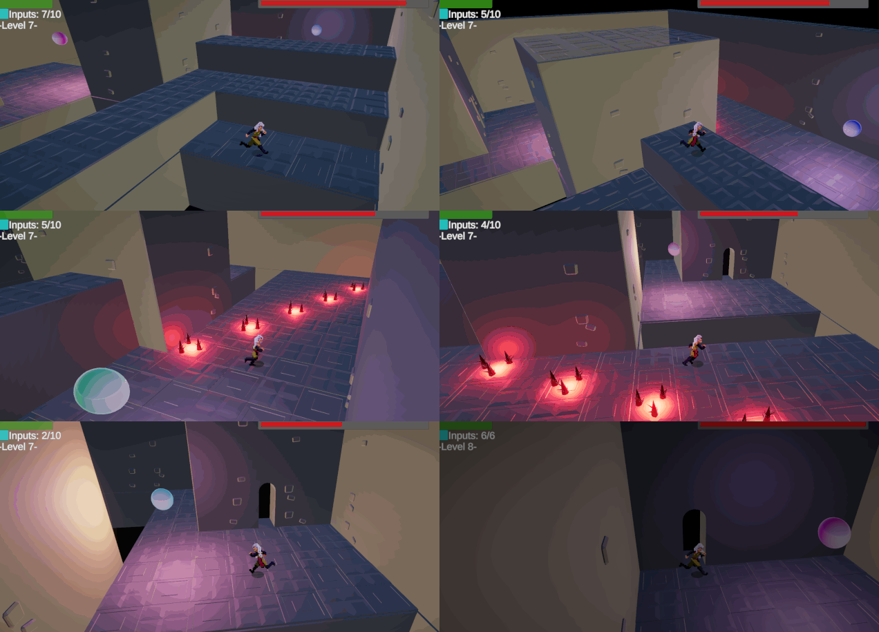
Mechanically, twofold: One, the heroine cannot stop moving once movement starts, it is only possible to change direction. Two, more literally, as a player you are soon also "Out of controlS" - each room has a limited number of button presses. And finally, thematically love's out of control. :D
Did your team create the art for this game during the 48 hour time slot?
No
We used pre-existing art
Did your team create the audio for this game during the 48 hour time slot?
No
We used pre-existing audio
Leave a comment
Log in with itch.io to leave a comment.


Comments
Really like this. Great look. Cool idea. Some feedback and end level when run out of moves would keep the pacing but real cool game. Going to keep playing and then rate.
Absolutely loved it!
Fun mechanics and a lot of levels!
And i absolutely loved the mix betwen pixealrt with 3D Aesthetics
The only bad thing i saw was the indistinguible that the key is in contrast with the arrows
Besides that, i think is awesome! Good job!
Very interesting concept, though I found the camera controls to be a bit wonky. It wasn't immediately clear that the camera direction mattered. That said, I liked the art and idea!
The mechanics are simple yet pretty fun to play. Aiming while not having a time to pause is adding more fun. Also, the fact that enemies start moving only after the character does, is a really nice touch. All in all, I have nothing to add to this (and other comments). Great job!
I like the idea, I feel like there could have been a few small changes to really improve the gameplay, like making the doors slightly bigger, or changing the colour of the key tiles. Also, I think this game should be set somewhere outside, since moving the camera is such a big part of the game. Maybe like ruins or something? But still a really cool idea!
Interesting idea, looks amazing. Feels relaxing but tense at the same time. The movement is the perfect speed. It doesn't feel too slow or too fast. The non grid based movement opens up a lot of possibilities.
I like how the ninjas take damage from spikes too.
Okay, I got assigned your game on the GMTK Reviewers Discord so let me expand on my earlier comment:
I like that the game does not operate on a grid based movement. It's way too much fun to aim your next movement to get exactly where you want. And there is a really interesting decision to make about aiming safer and scrape along the wall for a bit but loose time in the process or try to aim more acurately with the danger of overshooting in the wrong angle.
I also like the enemies that chase you. It's a lot of fun to lead them in the pits. :D
I'm not 100% sure how I feel about the damage mechanic. I think it might have been better if the spikes and the enemies would have been an insta-kill. I don't think that would have made the game more difficult because honestly, I don't remember being able to salvage a situation where I have been hit. And an insta-restart would maybe feel less like a wasted opportunity. However, that's not something really important.
What I would change however is the color of the "key" plate to open the doors. Them being the same color as the "change direction" plates means a bit of wasted time just searching for the things before trying to actually solve the level.
Apart from that the only other thing I can think of in terms of potential improvements is that the stone decals on the walls aren't completely transparent from the backside so you see some things floating in front of the camera when you look "out of" a wall.
All in all I stand by my point that this is a really fun game with a novel concept and overall nice graphics. :)
Those are some great points, thanks a lot for returning and taking the time to expand on the criticism o.o And yeah, I liked how the aiming/scraping turned out personally quite a lot, it was my favorite thing that came out of the base mechanics after I played with them
I definitely see what you mean about the colors - such should always be ideally color coded.
A lot of the things you mentioned would have been so easy to change - like the button color, that'd have taken a couple seconds. Feedback like this shows me where I need to watch for so I really can't thank you enough. Notes taken :)
Finally, the health. Yeah - I should just have gone "full" Celeste/Meatboy. It'd have prevented "gauntlets" and would have forced me to be more honest with enemy placement.
[Edit: And yeah, backfaces... I sure was cheap on how to make the walls transparent. Next time, it'll have to be done with rays from the camera to see if walls are in the way. Definitely would look better D:!]
Thank you kindly!
Love everything about this, feels really vaporwave. I'm terrible at playing it so I sadly couldn't see the whole thing.
Thank you! Vaporwary bumper blocks made for SOME decoration, at least. ^^
I think the mouse control is too clunky, and I wouldn't give away the player the full control over rotation... I think. I would just remove it, Q/E is better, more intuitive.
I think I would disable starting the level with a jump - this keeps the character in place, and those ninjas run for their death most of the time:P Yep, this way I didn't notice any difficulty spikes that the other players did
Very nice visuals/music, I dig the style;) And I like the chiptune jingle at the end;) Great work!
Edit: oh, and would make the arrows different color - it was very hard to tell what they mean, and in visualy distinguish them from the button. Though, most of the time button was in such a place that it was obvious what it is...
The jump start! I had to try it and yeah, that makes the ninmmings even more lemmingy and exploitable!
Ah, the little gaps in mechanics I don't notice.
Thanks for the feedback and getting through! :)
Now that I read it I think my comment was sounding a bit harsh - not that I want to take it back. Just wanted to mention that this game went to my top jam games list;)
Rotating the camera with Q/E is key! Very cool game!
Played up to level 6!
Great idea that deserves to be better thought out to avoid waiting for the gauge to decrease when one has failed. Nice work however ;)
You can press Escape to restart a level, you don't have to wait for time to expire. :)
ok i hadn't thought about it ^^
Happened to me with several games too, it's so easy to miss controls like that, haha... Thanks for playing it!
The game has crashed while I was playing (I was performing a jump over spikes).
Apart from that, the game itself was quite good! I liked the mechanics a lot.
Oof, really seems there's some crushing bug somewhere. I suspect it's in the way I handled collisions with Unity's ECS - and didn't catch it yet.
Sorry for the bug - but thanks for playing and liking the mechanics all the same! :)
Yeah! I don't think it's game breaking though: it's not like it'd happen all the time. Good luck!
nice game very smart
Thank you for trying it out! :)
clever puzzler. nice difficulty curve, which can be hard to judge during a jam. at first it didnt feel like there was much reason to rotate the camera but eventually that became more useful as you needed to look around corners for timings. nice job.
Thanks for giving it a go! :)
Nice game, really love the combination of pixel art and 3D, maybe adding some visual indication where the player is currently moving, anyway great work.
If I could update it I'd probably add a little spike to the shadow to indicate where the up/w key would move - and I should have thought of it before submitting!
Thanks for playing :)
Using the mouse left and right click to play the game felt a bit awkward at first, but once I got the hang of it, it made sense. It was hard at times to manage, rotating the camera in time to change direction and finally reach the exit, but it felt really satisfying when I got there.
On the level that started with two raised platforms, and then a set of spikes, I did find a bug when jumping at a wall, it somehow counted as a game over. Luckily restarting a level didn't feel like a punishment.
Good job!
Thanks for playing...and the bug note! There seems to be a rogue hitbox there... not sure why I forgot to remove it or why it's there. Sorry for that, it slipped through D:!
Very nice and fun game.. And a lot's of levels. Nice Job!
Thank you for playing it! =)
Great concept and game! Simple controls with a difficulty that makes me want to continue trying.
Thanks a lot for giving it a try!