Play game
Mapping It Out's itch.io pageResults
| Criteria | Rank | Score* | Raw Score |
| Originality | #226 | 4.053 | 4.053 |
| Overall | #256 | 3.895 | 3.895 |
| Presentation | #426 | 3.974 | 3.974 |
| Fun | #426 | 3.658 | 3.658 |
Ranked from 38 ratings. Score is adjusted from raw score by the median number of ratings per game in the jam.
How does your game fit the theme?
JOIN TOGETHER fragments of the dungeon map to build your route, take your risks, and go as deep as possible! Please read the game page for how to play, and what nasty bugs to avoid! :)
Did your team create the vast majority of the art during the 48 hours?
Yes
We created the vast majority of the art during the game jam
Did your team create the vast majority of the music during the 48 hours?
Yes
We created the vast majority of the music during the game jam
Leave a comment
Log in with itch.io to leave a comment.


Comments
This game is fantastic! Main core loop is brilliant. It does need some tweaks in combat or in some things but I'm amazed by the potential of it! Congrats on the good game
This game is super interesting and could be made into a full game with a little polishing. I think one thing you could do would be if you hover over or click on the armor you have you should be able to see the stats that way. I think they came up when you clicked on the items you picked up but I could never tell which one had which stat. Other than that, really well done!
Thanks so much <3 Yes totally agree, the item hover UI both for comparisons and for just seeing your gear will definitely be revamped for any post-jam release! Cheers for the feedback! :)
exceptionally interesting concept, and i really like it. i would love to be able to skip turns if i dont need to place more tiles or move anymore, and the death button doesnt work, but really interesting game, would love to see where it goes, well done
Thanks so much for checking it out! Agree 100% regarding the skip turn button, for sure - that's a common piece of feedback so far I think
Also re: the broken death button, it weirdly only works if you click it right at the bottom or top of the button, some weird UI collision bug.
I really liked the idea of "You are responsible for your own victory or loss" . A great memory game
Thanks!
This is a really cool idea, and you executed it really well during the 48 hours! Placing down tiles then exploring them from a completely different perspective was super satisfying! There are a few pieces of feedback I had:
- Definitely agree on the skip button!
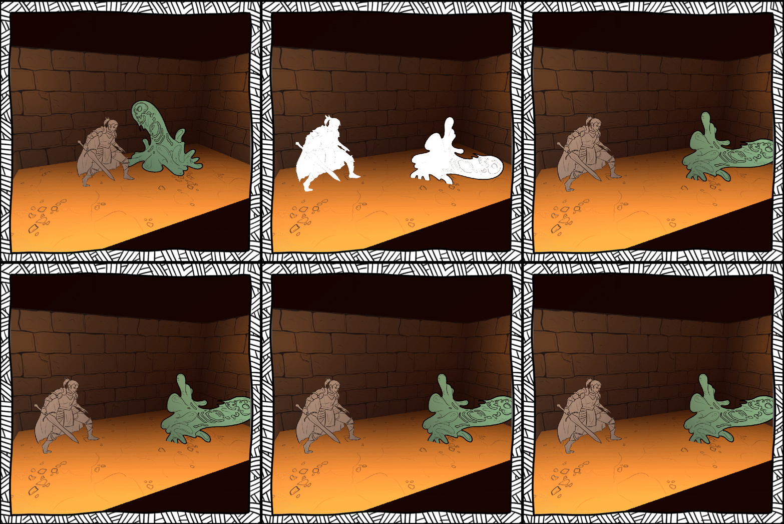
- Avoiding combat entirely is supposed to be detrimental as it means you don't level up and will get destroyed on lower floors, but this isn't communicated very well to the player at all in the jam build so I can see why this has come up a few times! The control to build around enemies is intentional, but without the knowledge that you need to at least kill some to keep up with difficulty, it seems like a smarter choice to always dodge them!
- Yeah thats the #1 bug we've noted haha, its at the top of the game page, tis a Unity button bug that is blocking button clicks on most of the button and only lets you click it right at the bottom.
- Also a seemingly quite random bug, but thanks for pointing it out!
Thank you so much for your detailed feedback, it really is super helpful for us continuing on with this post-jam :) Glad you liked it despite the issues!
This is an interesting game. It may not be the first game to do the "build your own map" thing, but this does a good job of executing on that idea. Some thoughts I had playing is that there's little incentive to go into fights, as it's a lot of risk for little reward, and you can usually place more tiles to get around any blockades. Also, since the first part of the map seems to only let you place one tile, the lack of a way of simply returning to the tile placement screen without just walking back and forth really stands out at the start of each floor. There are also the technical things, such as the buttons as mentioned on the page, and the fact that if you click on the card as if to place it, but try to drop the card without placing it, it goes offscreen where it can't be re-selected. Still, I think it was a really good entry to the jam. Good job :D
Cheers for the extensive feedback!
- RE: Combat risk, the main concept is that difficulty scales up per-floor and the only way to keep up is to level up via combat or you'll quickly be overcome. Sadly, this is only implemented very basically in the jam build and isn't visually shown well at all, so it makes total sense that people would endeavour to just dodge fights! Definitely something to solve.
- The first turn only letting you place 1 tile instead of 3 was a very late bug, and turned out to be because when we automatically place the entrance and exit tiles it counted as player tiles being placed (facepalm!). But yeah its very annoying to have to backpedal until the turn is over, could definitely use a 'skip phase' button anyway :)
Thanks again for your feedback, I'm really glad you enjoyed it <3
This really took me by surprise. The concept was fantastic, and the presentation in the dungeon was great. My only complaint is that I'd like a 'skip phase' button so I don't have to move or place more tiles if I'm already done. Other than that, this was a really ambitious entry that I think came out quite well. I'd love to see this idea fleshed out a bit more. Great work!
Cheers! Yep, totally agree that a skip phase button would be ideal, as well as trackers for how many more tiles / steps you can take. Thanks for playing! :)
I loved the graphics and the idea to build the adventure as you go is genius!
I felt like the combat mechanic was a bit odd because I didn't really have an incentive to fight, I can get loot by getting treasures and avoiding combat so I actually don't really need loot. Maybe making the monsters drop the tiles instead of loot would force me to fight them to progress while making loot interesting to be able to fight the monsters, I don't know...
I have mixed feeling about this one because it is good (regardless of the bugs) but there is a tiny thing missing to tie everything together and make it amazing.
Looking forward to see if you keep developing it because I'd love to see where it goes :-)
Cheers for checking it out! Your feedback is invaluable <3
As for the combat mechanic, annoyingly its kind of a symptom of our overly ambitious plan at the beginning, as killing monsters is supposed to level you up and increase your base stats so that you can keep up with the scaling level of the enemies as you go down floor by floor. This does exist in the game, but its not shown anywhere in the UI other than your health increasing, and its definitely not scaled well due to lack of time. So killing enemies is supposed to be a form of progression character-wise, but its definitely missing a great deal in that area as you say :)
We're definitely planning a post-jam version to patch a lot of these holes and bugs haha. Cheers again for checking it out <3
Amazing graphics! Unfortunately when I tried to compile my dungeon, I didn't place some tiles correctly and they disappeared - after a restart and more careful approach it was nice. The combat system could have used some more interaction, but overall it's really great and a nice fit to the theme as well! Good work!
Thank you! Yeah sadly thats a known bug, the placement is definitely quite janky :( Cheers for checking it out though, glad you enjoyed the rest!
Really like this concept, I love old dungeon crawling games and this is a really unique spin on them. The art is brilliant and I found the sound effects extremely charming. Great work, really ambitious game!
Cheers! Glad you liked it, and yeah old dungeon crawlers were a big influence.
Interesting concept, great design. For some reason the buttons on game over / next level screen weren't doing anything; was that a bug or did you run out of time?
In any case the art style reminded me of paper sorcerer but with its own unique twist; really well done. Combat balancing is off but you're already aware and it's something that's really, really hard to do in 48h, anyway. I'm honestly surprised it works as well as it does, good job!
Even with your limited prototype I could feel that certain itch to get more loot and puzzle the right combinations of tiles to maximize the rewards. This really has the potential for a solid puzzle-rpg-hybrid :)
Cheers for the kind words and feedback! As for the button issue, thats a bug - you can progress onwards but you have to press right at the bottom of the button (some weird UI collision issue in the final build). But the rest of the game is 'infinite' and just scales in difficulty, so you didn't miss any 'new' content so to speak :)
Big thanks for checking it out <3
I love the art style and the concept! Building your own maze is fun and the lack of mini map when going down there really forces you to pay attention to what you make. I would have liked to see some more risk-reward, since I got a lot of tiles without anything of note on them. So yeah, great game with some minor bugs. :)