Play game
SHAPE IT UP's itch.io pageResults
| Criteria | Rank | Score* | Raw Score |
| Style | #1697 | 3.560 | 3.560 |
| Enjoyment | #1794 | 3.240 | 3.240 |
| Overall | #1827 | 3.373 | 3.373 |
| Creativity | #2343 | 3.320 | 3.320 |
Ranked from 25 ratings. Score is adjusted from raw score by the median number of ratings per game in the jam.
How does your game fit the theme?
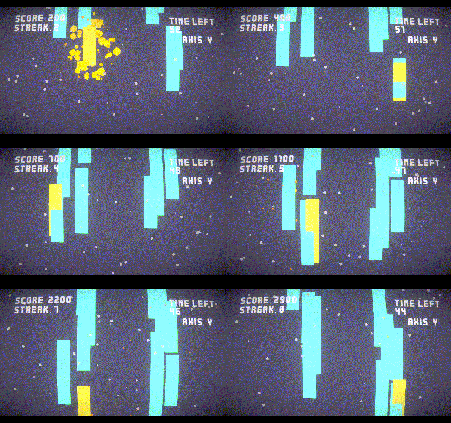
Match the scale of the pieces as they fall through the levels
Development Time
96 hours
(Optional) Please credit all assets you've used
https://kenney.nl/assets - UI, Music/SFX and Fonts
Leave a comment
Log in with itch.io to leave a comment.


Comments
Minimalistic concept and game. Works good, but a little too hard for me!
The controls and the visual presentation are awesome:D (only played the browser version, so I can't comment on sound design really)
My only gripe has pretty much been pointed out by others (a bit of lack in visual clarity)
In the end the positives definitely outweigh the negatives imo:>
hey well done. It's a good game. good idea and awesome control
Really cool game mechanic! The game is simple, but can very easily become a nice challenging game when you play the other levels. Visuals are also pretty cool :)
This one isn't made for a track pad, but it's a nice submission you have!
A good addition would be an indicator of which axis you are scaling
I like the style!
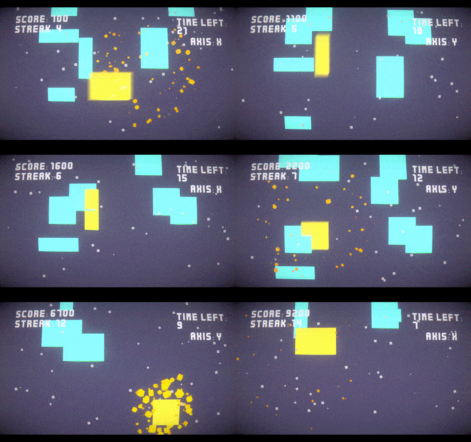
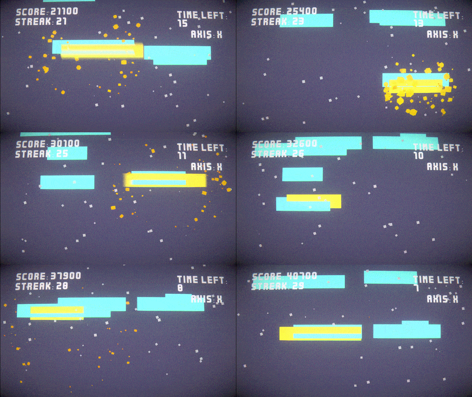
The falling shapes need some outlines to better differentiate from one shape to another. On anything other than the first stage, it is impossible to tell which is which. The lack of any sound is also not great. Overall, if the game had music and made it easier to tell what the shapes were, then this game would be a fine time killer. As it stands, stage one is fun and the other two are a bit hard to follow.
Thanks for playing! Could you try increasing the volume from the settings I'm not sure why it's so low on the browser version. And yeah I'm playing around with different outlines and colours to make it easier to know what's what
Nice and juicy visuals. interesting idea! great work!
reminded me of reverse tetris a little, worked well not my cup of tea
For some reason I couldn't hear the music, but I really enjoyed your take on the theme for this jam! I found it kind of addicting and really fun. The visuals were also really nice, and I really liked the score and streak system that made me want to try and beat my previous score.
really fun and so much polish! very impressive for the time frame great job
Very fun game with nice mechanics, and a cool retro feeling !
I was a bit lost on level 3 and did not manage to score anything, maybe changing color of your shape when you switch axis would help to know which way you scale without checking the top right corner
Great Job anyways !
I 100% agree. Looking at it the 3rd levels all have balancing issues but I might do a post-jam version that incorporates different colours and all but thanks for playing!!!
The visuals look great! lots of juice!
I thought the controls were a little difficult with the space bar to switch between which shape. I wish the mouse wheel made you expand up and down, and the left and right click would make you wider and smaller.
Is the audio bugged? I wasn't able to hear anything. I am using firefox, but I also tried out the windows version.
For the audio, it might be that it's too low? I didn't test on Firefox, unfortunately :(
Btw I agree with the controls. I initially used the scroll wheel for left and right increase but wasn't sure how to change it up for going up and down you know. But this was great feedback thank you!! I'll probably try out a few different schemes and update it post-jam maybe
Wow that’s a lot of polish! I had a great time with the art.
I noticed that in the late-game levels, shapes overlap each other quite a lot (and in the last few levels, completely), making it uncomfortable to tell what the target sizes are.
I rather liked the challenge of fitting my cursor to the shape - just not the challenge of figuring out which shape belongs to which.
The gameplay reminded me a * lot * of the “Pose Mii” minigame from “Wii Play”. So there was nostalgia in it for me as well. :)
Thank you for playing!! I'm glad you got nostalgia from playing lool
But yeah I had a hard time figuring out the balancing I could have used an extra day to figure something out but IRL stuff caught up to me :(. But I'll figure out a way to differentiate the shapes. Maybe outlines would work? Idk that's for post-jam things
Outlines might help! Although I do not know if there is much that will help with a too-large overload of shapes. Maybe giving shapes colors could also work, having the different colors blend together?
100% I think I'll do a mixture of both. I was trying to keep the palette simple and ended up making it a bit too simple