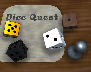
Really interesting way to present a tabletop story game! Not seen anything like this before!
Play game
Dice Quest's itch.io pageResults
| Criteria | Rank | Score* | Raw Score |
| Creativity | #792 | 3.625 | 3.625 |
| Enjoyment | #1204 | 3.208 | 3.208 |
| Overall | #1251 | 3.333 | 3.333 |
| Presentation | #1953 | 3.167 | 3.167 |
Ranked from 24 ratings. Score is adjusted from raw score by the median number of ratings per game in the jam.
How does your game fit the theme?
You are rolling a lot of dice.
Did your team create the vast majority of the art during the 48 hours?
We created the vast majority of the art during the game jam
Did your team create the vast majority of the music during the 48 hours?
We created the vast majority of the music during the game jam
Comments
Very fun to play, and the only tabletop-style game I've found in this jam so far. I like how intuitive the controls are. My only problem is that the silver die looks very similar to the white dice when it's near the bottom of the screen (under the white light), though that isn't much of a problem as you can still tell the difference if you look carefully and holding the die away from the light makes it clear which type it is.
The text adventure concept is really cool. Combined with a board game makes it even better. Nice game!
I like this board game idea. But I have a hard time trying to roll the die. I tried to drag the die around, but I rolled the die randomly. Good Job on the submission!
This was super well-made. Gives big Inscryption vibes. It was great to see a well-written text adventure in this game jam. I'd love to see this expanded upon.
Very polished and long game, was pretty fun getting through the tutorial with the gold die in hand.
More text color variation would've been nice to denote special information a tad bit more.
Very nice game!
Very cool idea! Once I got the hang of the order of operations I enjoyed it a lot!
I liked the slowly building and branching paths mechanic you implemented. Overall, great work! Nice job making it through.
This was great! A text adventure paired with a board game feels very refreshing and exciting. I've noticed a visual issue with the silver dice though, if it's in too much light it looks like it's white. It was also very frustrating when I lost my golden dice in level 2. I didn't quite understand why. What I particularly like about this game is the backtracking. If a task seemed too difficult, I went back later with more and better dices and was rewarded for that. Overall a good submission. Great job!
Thanks for playing! That is good feedback on the golden die. I intentionally made it a bit of a throwaway, but yeah I can see how it can be a bit frustrating having a whole level around it only for you to throw it into a fountain or lose it forever in some other way. I may want to reduce the story importance of it in some way. (I was possibly thinking of having the treasure of the first level being, like, a D8 or something instead.)
This really feels like a board game :)! The different conditions make up for interesting decisions – I like how owning even a "poor" dice can help you advance.
I didn't read the text most of the time, maybe it could have been a little closer to the action, perhaps on the board.
Nicely done on the game!
I agree about the UI being easy to skip. I put some important things over there, but yeah since its off the table it can seem less important. I originally had some of it on the table, but it was hard to fit everything that I wanted with a static camera angle. I may take another shot at bringing both the log and the die display in the top right more into the physical space of everything else (Like I did with the menu buttons in the top left). Thanks for playing!


Leave a comment
Log in with itch.io to leave a comment.