Play game
Oliver the Dice Master's itch.io pageResults
| Criteria | Rank | Score* | Raw Score |
| Presentation | #882 | 3.729 | 3.729 |
| Overall | #1226 | 3.344 | 3.344 |
| Creativity | #1554 | 3.301 | 3.301 |
| Enjoyment | #1642 | 3.000 | 3.000 |
Ranked from 229 ratings. Score is adjusted from raw score by the median number of ratings per game in the jam.
How does your game fit the theme?
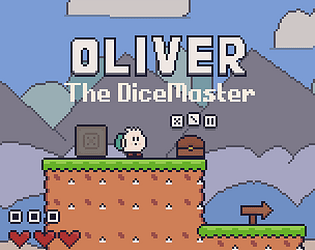
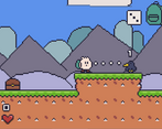
You roll dice to decide damage done to enemies.
Did your team create the vast majority of the art during the 48 hours?
Yes
We created the vast majority of the art during the game jam
Did your team create the vast majority of the music during the 48 hours?
No
We used pre-existing audio
Leave a comment
Log in with itch.io to leave a comment.


Comments
this was very very cute and well executed! I'm a big Kirby fan and I feel like you did capture the spirit of it well with your puzzles and level design, would love to see it expanded on
I do agree with what's been said prior about the menu being a bit unwieldy, it's frustrating when you get killed by something because you were faffing around with it - some sort of auto-roll/equip would help when interacting with chests and having the real time game pause when you open the menu. But otherwise, it wasn't too hard to pick up and seems pretty solid!
The only other little snag I had was the crate in the snake level snagging on the bridge a bit when I tried to push it across.
Thanks for playing! I'm planning to improve the menus a lot. I only discovered the crate/bridge glitch after the deadline, as it was somehow not detected in playtesting. I'll be sure to fix it soon, though!
Very good looking game. I really like the music, sfx, art style and the way the UI is rendered. Using the inventory is a bit difficult as others mentioned but it's a gamejam!
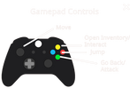
Had great fun with it, one thing I'd like to suggest is to put the jump on XBOX A instead of B. I think that's where most platformers put it, was a bit confused at first :)
Good job!
Thanks for playing!
Game is pretty, but the inventory system is quite clunky. I admire the whole menu system, but taking items and rolling within the menu can get tiring real quickly. But there's definitely a lot of potential in the game :)
Thanks so much for playing! I am planning to streamline the inventory system sometime after the voting period. You can follow me on itch to get devlog updates on the game's progress, though :)
I like the aesthetics. The gameplay was interesting, but my main criticism is that rolling the dice when you take them out of chests just seems to waste time. Maybe if the character had a single slot, and chests contained dice that were infinite in uses, but could only roll certain numbers. That way you'd have to backtrack to use other dice. That may be unfun, so perhaps two or three slots, with each dice weighing the character down, making movement not impossible but much trickier if you carry every dice for every optional path.
Knowing to keep the scope small was good. Many games, my team's included, tried to implement too many ideas and not quite finishing the initial vision. Your game was pleasant to sit through and didn't overstay its welcome. I'd like to see more when the gameplay is fleshed out more, if you're going to continue development. Nice job.
Thanks so much for playing! I am definitely planning to continue development on this game. Most of the issues you addressed will (hopefully) be resolved by the time the final version is released. I am planning to create several itch.io devlogs in the meantime, however!
Cute graphics, but the gameplay is way too complicated.
Here are some issues I noticed while playing:
I don't know what your plans are so I'm not sure it would work for your game, but I will still attempt to suggest some things that could help you solve several of your issues:
Even though your game is not perfect, making such a game in 48h on Scratch is actually quite impressive. Good job.
Hey, that's a great vertical slice you got there... Good job!
Thanks for playing!
Good idea! It's fun and the attack mechanics are interesting. It is quite short and not very difficult but it is fun. Good work!
Thanks for playing!
Pixel art and animations are great! I was genuinely surprised to see an animated GMTK logo :)
* The controls to pick, roll, and equip dice were very confusing
* I got confused on how to "Exit" a chest, and took a bit of damage a few times before I realized I needed to hit a different button
* "Equiping" dice to throw them seemed laborious... maybe it could auto select a dice and then you equip to change what was rolled?
* I like the idea of having "Unrolled" dice, but I didn't see any reason to not "Roll" them immediately
Good work, solid entry, beat all three levels :)
Thanks so much for playing and leaving feedback! I was planning on streamlining the menu by adding auto-equip and auto-close inventory (as well as a UI-based close button)
Awesome idea! The controls were quite clunky though - having to take from the box, then open inventory, then roll, then equip, and all this with the z and x keys which felt weird. Maybe integrating the mouse buttons for some of the controls (mouse wheel to scroll through dice and right click to roll or throw them maybe).
But anyway great job!
Thanks for playing! I'll definitely look into the mouse controls, though!
Cute art and music. The controls were a bit counterintuitive but otherwise excellent work!
Thanks for playing!
it looks so cute I like it. The music was good too. it looks complete. just the x and z were not good for me to use.
Thanks for playing! In the final game I'm going to add Input Remapping, so hopefully that solves some problems :D
Man, that was awesome 😁! Some said that the game reminds him of Kirby with its style and I agree with him. Your character looks cute! The tutorial is well put together. The art style combined with the music was amazing!💫
Great job man! Props to you! 💪
Thanks so much! :)
reminds me of super mario 2! very fleshed out gameplay and good game overall!
Thanks for playing!
Nicely done! The art style is very cute and the game matches the theme well! Good job making multiple enemy sprites too! I think the concept of finding dice and throwing them is a good one! The only thing that made it hard was how fast you could equip and then deal damage with said dice. I noticed you slow down the game while in the inventory to help the player out- I think that's a good idea! But I still struggled to get dice out in time and then damage the enemies. If there were more buttons, e.g., you go into equipment and roll like normal, but then you can just hit 'c' or something to throw your currently equipped dice, I think that could help a lot and not change your game play up too much!
Overall, good job and nice game!
Thanks for playing! That's actually a really great idea! I do agree I definitely need to streamline the roll/equip/throw system, though.
Good work. The art look great, the game play is enjoyable and the theme is well incorporated into the design.
Thanks so much!
congrats! excellent entry!😀
I'm curious, Did you make your game on scratch?
Thanks for playing! And yes, the game is made in Scratch and exported using Turbowarp Packager. The Scratch project actually has over 4000 blocks! :)
wow, that's awesome!! Thats a LOT of blocks, I would prob get lost
first time I've ever seen a scratch game in itchio! 😀
Haha this is a very late reply but I feel like there aren't even that few Scratch games on itch, most of them are just so good that you don't really notice. Scratch is a very capable engine when used by the right people.
Game is fun and has a solid foundation for a full game if worked on more. The pixel art is great and love how it's made in scratch.
Cute game!! The art is on point!
Thanks for playing!
Interesting idea. I don't think I fully undesrtood it, and i struggled with the controls. Maybe it could be streamlined more. Anyways, excellent art and very impressively made for scratch.
Thanks for playing!
This game looks really good! I would suggest pausing the game when you open a chest or your inventory, because it's annoying when an enemy hurts you and you can't move. Also, maybe you should only be able to roll each dice once, because otherwise you reroll the dice for ages hoping to get a good roll. Otherwise, very good game
Thanks for the feedback!