Play game
Flick the Dice's itch.io pageResults
| Criteria | Rank | Score* | Raw Score |
| Enjoyment | #505 | 3.575 | 3.575 |
| Creativity | #792 | 3.625 | 3.625 |
| Overall | #974 | 3.450 | 3.450 |
| Presentation | #1995 | 3.150 | 3.150 |
Ranked from 40 ratings. Score is adjusted from raw score by the median number of ratings per game in the jam.
How does your game fit the theme?
You shake the dice for as long as possible for good luck in a dice roll!
Did your team create the vast majority of the art during the 48 hours?
Yes
We created the vast majority of the art during the game jam
Did your team create the vast majority of the music during the 48 hours?
No
We used pre-existing audio
Leave a comment
Log in with itch.io to leave a comment.


Comments
Great game! It was a little frustrating when the dice seemed to fall in a spot with no dots - I did recognize that I could try and punt it over to more populated areas to increase my chances, but it never felt like I had enough control over it's direction to be able to do that consistently. I lot of people scored much higher than me though, so that's probably just a skill issue on my behalf : p
I'm curious about the decision to have the starting dot above the dice - is this to communicate that you can point the arrow down and it will still flick the dice upwards?
Hi, thank you so much for the constructive comment :)! You're right that the dots might sometimes feel unfair. Here's a few things I have tried to mitigate it:
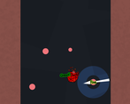
1. the dots spawn in a way that they spread out as much as possible – when there are four of them and the dice is coming from above, there should always be a dot that you can use
2. when the dice is low and there aren't enough dots on the screen, I usually think of it as a player mistake when I'm playing – hitting a powerful flick launches the dice really high and prevents this (which I know is a little brutal to say, but at least there's a high skill ceiling)
3. in sticky situations, you can still flick from a larger distance and it may be enough to save you
If you want, you can check this video of my 150°C run to see it all in action.
You're definitely not the only one bringing this up though and it's probably something I could have figured out if I had done more playtesting with new players. On a side note, the top scores on the leaderboard are very impressive ;). Yours is still in the top third of all highscores!
About the starting dot, you're on point! That's exactly why I did it, to force players through an otherwise a bit unintuitive mechanic :).
Thanks again for the feedback!
Great game! I couldn't manage to go over 50 deg :( sometimes there is no spawn point where to shot from, not sure if I missed something about it. but very cool experience :)
Thanks! I've tried to make the flick points spread out as much as possible and fill in the gaps, though you're right that there are moments when none are around. I've found that with enough practice, it's almost always possible to avoid or get out of these sticky situations though. The game is quite difficult and requires some powerful flicks to keep the dice in the air ;). The skill ceiling is very high and the records just keep surprising me! Fifty degrees seems to be pretty good, around the top third of the leaderboard!
I have cried blood, sweat and tears until I finally managed to appear on the leaderboard. I'm in 15th position, so I'll probably only be there for a short time, but I'm satisfied. The game is a lot of fun and manages to sting you fast. The physics feel great, and the aesthetics are simple but enough for what the game asks for, very good!
Thanks a lot :D! The leaderboard turned out very competitive, congrats on getting up there! I wish I had made it scrollable, haha.
Great Game! Your physics were outstanding! Beautifully Done!
very addictive, i like the scoreboard!
very cool game, i had fun playing it
my only concern is that i don't see how it fits the theme
good job!
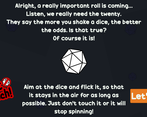
Hi, glad you liked it :)! About the theme interpretation, each run is literally a roll of a dice, in which you're trying to shake the d20 as hard as possible for good luck! This is explained in the lore before playing as well as when your run ends (you should hear the dice rolling and it tells you at the top what you rolled!). Hope that clarifies it, but feel free to ask further if it's still unclear.
This was hard to learn, but fun to play, and there was some dots that I wasn't able to touch for some reason. I usually assume these errors are on my end tho. Great concept and use of the theme!!!
Thanks :)! I don't know of any bug with the dots, but sorry about that – perhaps they're just hard to hit sometimes. Glad you had fun, cheers!
I liked the simplicity of this one, though I would have liked a little more intro on learning how to play. But once I got it, I just kept flickin'
Super addictive. The little text that pops up was a really nice touch that can help you get better at the game by letting you know what is and what isn't working. The leaderboard kept me playing for way longer than I thought I would.
This game was insane to play, the leaderboard makes the game so addictive :o
Great game, thanks for submitting it. GGs!
You deserved 15/15 :)
Thank you so much, I really appreciate it! <3
The texts add so much personality! Love it, although I had hard time knowing where should the die be to score highest. I got 11th place at a time (77C) so that counts :D
Nice idea. Wound me up a LOT !
Like the high score tables. That kept me plugging away for a bit... Until I realised I was rubbish and had to stop.
Great job!
This game was actually really fun despite the simplicity! I like how you focused on overall gameplay rather than a huge game with tons of features... Great game!
Such a simple idea but yet really fun and effective. Good job with the juicing! It felt really satisfying!!
Surprisingly strategic! I also like the text which tells you how well you did on the flick, it adds a lot of good juice/feedback.
Lore behind the design of the game is always fun! Simple gameplay loop but I found it pretty hard to manage for longer than a few seconds, as the controls required so much of me in a short time if my shots weren't aimed perfectly. Leaderboard is really neat! Well done!
Glad you liked the lore, thanks :)! Sorry to hear it was too difficult for you.
Nice job integrating a leader board. It played well, and with some more polish could be a really good time waster!
Thank you! What kind of polish do you have in my mind, what should I focus on next time :)?
My metric is usually is usually if I can recognize the defaults of the engine, like text boxes and stuff like that. The look of a game can be so good but I can be taken out of it by standard UI elements sticking out from the rest of the style for instance. I like the individual looks of the d20 and the background, but they feel like they are from two different games. You have the simple shapes for the background elements, that look great, and then thin lines of the D20 and arrow which look out of place. Its mainly just small nit picky things like that, but overall I still really liked it, and the gameplay loop is quite solid.
Thanks a lot!
Cool idea! But at times it didn't count my clicks and I lost it(
Thanks! Sorry about that, I probably should have made the hitboxes bigger.
simple but addicting!
Strangely addictive, had to force myself to click away!