Play game
Memory Map's itch.io pageResults
| Criteria | Rank | Score* | Raw Score |
| Theme | #5 | 3.870 | 3.870 |
| Fun | #7 | 3.652 | 3.652 |
| Overall | #7 | 3.652 | 3.652 |
| Graphics | #8 | 3.826 | 3.826 |
| Accessibility | #9 | 3.130 | 3.130 |
| Audio | #10 | 3.609 | 3.609 |
| Originality | #12 | 3.957 | 3.957 |
| Controls | #14 | 3.522 | 3.522 |
Ranked from 23 ratings. Score is adjusted from raw score by the median number of ratings per game in the jam.
Godot Version
4.0
Wildcards Used
Navigator, Under Pressure
Game Description
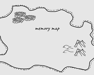
Minimalistic memory game
How does your game tie into the theme?
It is a memory game, the forgotten knowledge if what you forget!
Source(s)
N/A
Discord Username(s)
hexadecimalwtf
Participation Level (GWJ Only)
3
My game has an export for Linux, Windows, & Mac and/or is playable through HTML5
Leave a comment
Log in with itch.io to leave a comment.


Comments
I like the minimal, hand drawn style. Memory games are always a struggle for me, but I think I got pretty far. I had a note that I wished after you placed a tile that it would persist to place the same tile again, and then I saw you already have that as an option to enable :). Minor thing, I did notice sometimes the tiles would appear on the edge of the map, overhanging a bit. Great work, perfect fit for the theme too!
Yeah the tiles appearing on the edge was a limitation of how I coded the area in which locations are picked. I could have brought it in from the edge more but then the total area would have been smaller. Similar issue with icons appearing right on top of each other. I made the decision to not worry about that and focus on other aspects like the UI sounds effects which end up driving up scores in a game jam.
This was fun! I liked the difficulty ramping up, although the timer for drawing got incredibly short - it might have been nice to have a little more time to place things, even when the memorization timer was really short.
The first few rounds where new place types were introduced didn’t actually end up using those types, so it took until one of the very difficult levels for me to actually end up seeing e.g. a farm on the map. It might even the difficulty a little to ensure those ones get introduced earlier.
I really like the simple graphical style and the music + ticking clock provides a nice atmosphere that seems fitting for this style of game. Some extra visual feedback when the timer was running down might have added to that pressure feeling even more.
Nice entry, congrats!
Thanks for the feedback. Yeah the things to place are just chosen randomly so its possible you might not get the new ones the first time they are introduced. Making sure there is at least one is a good idea and something I might consider as I update the game.
Sadly I couldn't actually play. I read the description a couple of times and tried 1/2/3/4/5/6 and Q/W/E/R/T/Y but no icons appeared during the round, it always just times out. Played on Chromium/Linux.
From what I did see the polish on the menus and game seemed quite good though!
Dang I am sorry to hear that. I don't have a Chromium or Linux machine but I will try to find better ways to test to make sure its playable on multiple platforms in the future. Thanks for trying it anyways.
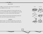
Got to level 5. Good use of the theme. The music was nice and fit the game well. Should have used the icons themselves instead of text for the reminder of what number is for each icon.
Yeah you are right that is a great idea and so simple. I completely didn't think about it. Thanks for playing and the feedback!
A nice little memory game with a great presentation :) Love the art style. Not much to critique here but I did find the font size just a hair small in the browser. Not unreadable or anything like that, just think a point or two higher would have been preferable for me. May be because I'm on a 1440 monitor.
Thanks for the feedback. I didn't even consider the font size on different screens. Next time I will consider a settings option to control the font size so it can adapted to different screen sizes.
What a cool twist on the memory game.
Well done!
Really fun and surprising stressful in a good way! also love how clean the art direction is
Thanks drawing isn't my strong suite so I wanted to do something simple. I was aiming to make it look hand drawn so I think the roughness of it kind of works.
That was a really cool game. Was a lot fun to play and brain training. Something to improve (or maybe it was intentional) is having the icons with numbers instead text. I had sometimes problems to understand the images what exactly they are showing. But before the challenge started you got them, so everything fine. Good Job!
Glad you enjoyed it. And yeah that is a good idea. I struggled with coming up with a good user experience. Keyboard and mouse is not always very intuitive. Thank you food the feedback.
Good work on this! I like the little details like the sound that plays when you hover over options in the menu. Pretty challenging too.
Thanks! Yeah it is challenging and I was worried it might be too difficult which is why I added a few different difficulty settings. I struggled with the difficulty myself as I was working on the game
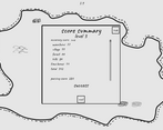
This was great fun! Managed to get Level 12 on my 2nd try. Simple, beautiful, and well-executed.
Level 12!? I was never able to get that far as I play tested the game lol. Glad to know I am bad at the game I made.
Very neat, reminds me of brain teaser games on the DS! Would probably work very well on the app store as something you play while waiting at the doctor or something. Simple and elegant.
Thank you!
Really cute game. The art was really nice, and it was satisfying to try and get each location as close as possible. Its a wonderful fit for the them. Great job!
Thank you! I had a lot of fun making it and glad you enjoyed playing it.