Play game
Grendel is Vanquished's itch.io pageResults
| Criteria | Rank | Score* | Raw Score |
| Graphics | #94 | 3.182 | 4.500 |
| Audio | #119 | 2.711 | 3.833 |
| Theme | #120 | 2.946 | 4.167 |
| Originality | #131 | 2.593 | 3.667 |
| Overall | #140 | 2.424 | 3.429 |
| Controls | #148 | 2.121 | 3.000 |
| Accessibility | #156 | 2.003 | 2.833 |
| Fun | #183 | 1.414 | 2.000 |
Ranked from 6 ratings. Score is adjusted from raw score by the median number of ratings per game in the jam.
Godot Version
4.2.1
Wildcards Used
None
Game Description
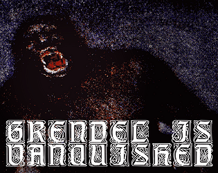
An adaptation of an excerpt of Old English poem Beowulf, taking the perspective of a defeated Grendel, the poem's antagonist
How does your game tie into the theme?
Beowulf is a traditional folktale from Scandinvia and Great Britain, and was passed down orally for hundreds of years before being written. This is an adaptation of that folktale.
Source(s)
It isn't
Discord Username(s)
.joas
Participation Level (GWJ Only)
This is my first time!
Leave a comment
Log in with itch.io to leave a comment.


Comments
That's impressive that you have that much narration in the project in such a short time.
I thought it was still on some really long intro cutscene or cinematic sequence, and I was going to possibly note that the cutscene might have been way too long especially when showing just the exact same background the whole time.
It's a great looking background scene, and the narration is excellent but it may only be able to work like that for so long especially with the same exact visual.
After checking the comments, I realize the game was supposed to start during the narration, you were already able to move.
You were supposed to, from what I can gather, not do much except run around during the narration, but nothing else really.
However I may want to go with my impression before checking the comments, as maybe it's more accurate:
What I think is it's not very clear that it wasn't actually an intro cutscene, something about the way it's shown.
I think to improve the game, there should be something changed where it's very clear if it's a cutscene, or the game at the same time with narration.
In my personal opinion, suppose this were the full game and it had more after this. The problem may not be that you have nothing more than running. The real problem may actually be if you add anything else after adding more than running, but still leave this part (and maybe parts throughout the game) potentially confusing in this same way - even after adding everything else, including additional elements like this one.
I think you shouldn't leave it like this or have too many elements like this because they may be confusing what they are (unless they are tweaked to be clearer somehow, with very clear indications of it's a cutscene, if it's the game, or both).
I don't know exactly what this improvement looks like for your game to make it less confusing in this aspect.
It may be as simple as keeping a static text with no narration that just says the controls to move.
Once you start moving, or maybe a few seconds afterwards then the narration starts right away as you are moving.
(however, the moving may have to be more obvious than it is now, of which the way it is now may also be contributing to it still potentially being confusing. It looks like someone is dying in the background rather than the player being able to assume they are actually able to move, much less run, while dying. And I am not sure putting up literal movement controls on screen, then narrating after they move really works for this idea, that's a really oversimplified example, I think you should try something better than that instead. Since it may still be confusing that there's narration while you move, too, which may still continue to introduce the possibility to confuse it for a cutscene)
I think it's tricky to get right. You seem to be trying to go for a really original feel here, so the exact way to get it right may be different than some over-simplified suggestion like the above.
Other than this detail above, I actually really liked this game.
It really got me thinking about a lot of things, and your narration is excellent, the story is really great, it was a thought provoking experience, so very nice job on this!
Thanks for the incredibly detailed feedback! I really appreciate the time to write things down! For the narration, luckily I'm taking from an actual poem, and so there's recordings of people reading it online that are copyright free (check out LibreVox!) and so I simply edited this rather than trying to get my own recording. Though I think if I were to improve on the game, I'd want to record my own narration somehow.
As for the intro, I did actually think about this! Before the scene is shown, there's the title card, and then just the word "FLEE" on screen before the gameplay and main narration start. This was meant to be an indication of what to, with the implication that it could start right away. Obviously difficult to tell if this is something that is a recurring problem since there's not that many people playing and leaving feedback. But I agree that it's tricky to find a balance in keeping things abstract vs communicating what's happening to the player. I think the smallest change I could make that would maybe help is changing that text to "FLEE NOW" to indicate an urgency and the fact that they can actually move right away.
Anyways, I'm so glad you enjoyed it and that you found it thought provoking! It's always super satisfying to hear that my work has somehow affected someone, so I appreciate it.
This was a really cool experience, the narration was very well done as well the overall design was and lends itself very well to the story. The scratchy textures in the sky and in the ground, and dark tones are just excellent. The Music is a little powerful as it kinda takes over the narration a bit, causing a bit of a peak as it swells up, especially when listening with headphones. But Overall I think it was well made!
Wow, a very cool and spooky tone. I really like the sound design, though I would agree with @Ollie1700 that the levels are a bit off.
The silhouetted character with the visceral particle effect looks so cool, and I love the frantic feeling from the camera angle and run animation.
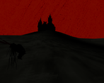
I really like the shaders you used on the ground/sky that gave it that animated paper aesthetic. Super cool looking.
Is there more to the gameplay than just running towards the horizon and looking around at the scenery while listening to the narration? If not that's fine, does a great job of capturing the story of Grendel's flight regardless, just wanted to make sure I'm not missing anything.
Also, I was wondering if you modelled Grendel + the castle yourself or if they were assets you found somewhere? I really liked them both so nice job if they were yours!
To answer both questions:
Nope! There's nothing more to the game than just running. If it was a longer project, I might've included something, but I mostly just wanted to capture the feeling of fear and simply fleeing. That said, now that I'm thinking about it, I feel like with more time I might've added more features that ultimately would've diluted the experience? So maybe it's good I didn't have more time ahaha.
Anyways, I did both models myself! Really not modeling characters, rigging, and I think this was my first time doing "proper" 3D animations, so I'm glad you liked them! Personally wasn't super fond of the final model for Grendel, and was considering it as something to do over after the jam at some point if I wanted to polish things up.
Anyways, thanks for the feedback! Glad you liked it!
Awesome narrative experience! A minor piece of feedback would be to make the voice a little louder and the background noise a bit quieter. But that's if I'm really nit-picking. The aesthetic and graphics were awesome.
An evocotive little narrative experience.
The animation and lighting really sell the pain and rage of Grendel.
Loved it!