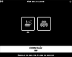
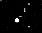
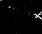
Great game, love the art. I think this time is a bit more difficult than the previous stage? It was quite hard for me this time around, but overall nice job, the game has a simple enough concept where you could easily expand and make it a bigger game!
Play game
Commander Puppy McPaws's itch.io pageResults
| Criteria | Rank | Score* | Raw Score |
| Art / Aesthetic | #6 | 4.286 | 4.286 |
| Overall | #7 | 3.829 | 3.829 |
| Likelihood to make money | #7 | 3.500 | 3.500 |
| Gameplay / Fun Factor | #8 | 3.714 | 3.714 |
| Potential for Post-Production | #10 | 3.929 | 3.929 |
| Music & Sound | #10 | 3.714 | 3.714 |
Ranked from 14 ratings. Score is adjusted from raw score by the median number of ratings per game in the jam.
Did you submit to all previous sprint jams?
Was this made by a team or a solo jammer?
Comments
It is more difficult indeed, once I started mixing waves of enemies it became harder. I could have spent more time balancing it, but the sound design and the boss consumed most of the time. Glad you liked it despite that! I have plans to balance the game and add more content: at least 10 new items, 4 more enemies and 5 more bosses. Thanks for your feedback!
Lovely retro aesthetic! As a feedback, the legibility of the text could be improved in some moments. The game was a bit hard for me, so I didn't went really far, but really nice work on setting the Atari game fell!
Very fun! We really enjoyed the Aesthetic and presentation style! Great Work!
Very well done. More difficult than I expected. Really left me wanting to play more!
I'm not too good at bullet hells, so it took me some tries before I think I got a handle on how to handle the enemies and dodge. Once I built up enough items, I felt almost unstoppable just spraying bullets and lasers.
The starting move and shoot speed feel a lot better than before. It'd be nice to have a way to view stats, since it was hard to gauge how big or small 0.1 or 0.5 is.
Amazing game and I liked the flavor text you put in with the items!
Thank you! I would have liked to balance the items better, but it also feels great to "break the game" and feel unstoppable, glad you liked that. I want to add some stat panel in reward screens, so you can better understand what each item change. And also add lots of content that got cut during production time. Thanks for playing and pay attention to the little details!
Wow you upped the difficulty on this build. It was definitely more fun once I got into the groove, but the difficulty ramp / learning curve was pretty steep. I know last time I mentioned combining enemy clusters, but it'd be nice to meet enemies in isolation the first time you encounter them just so you know how they work. The exploding rocks with the direction changing debris and the enemies that shoot a spread of bullets non-stop got me a few times before I was able to figure out exactly what was going on I also never encountered (or was unable to find the interface for) a shop, so I never chose coins, which made it feel like the only choice was whatever the other item after each stage was.
Overall I think the game shows potential, roguelikes are always popular and choosing your path / rewards is exciting, but it needs balance tweaks to really make it stand out. Keep it up and you can have a really exciting game on your hands. Great job!
I need to work in a better first-time experience, maybe simpler/easier waves in the first level/run. During production build it was easy to overlook shops and item screens, so I fixed that making the character speak to the player in those places. But if you couldn't find one, maybe it didn't work as expected. Lots of content was cut during production and that made the game unbalanced, I want to add all that in a future version, so I'll be working a lot on balancing the game. Thank you so much for playing and leaving your valuable feedback!
Oh man. This is great! This feel so much like an old Atari game, it even has the monochrome to match! I like the descriptions on the upgrades and the fact that you can't see them until after you decide. However, some of the descriptions make it hard for me to decipher the impact if I don't know the current numeric values of the stats. I know some roguelikes will simply use a '+' or '++' to indicate the level of the stat increase. Regardless, I love all the sound effects and music. And I especially love the visual effect after destroying another ship.
Thank you for playing and leaving your comment! The stats are mostly hidden, except for hull and shield, but I might change that for an upcoming update. I like the ++ thing, need to play a bit with that. Glad you enjoyed destroying your enemies and liked the game! It means a lot and encourages me to keep up working on it.
The game is definitely much harder than it was before, thanks to tweeks like the mines having tracking shots or the possibility of facing combinations of difficult enemies. I found myself wanting more firing options more than ever, but I wasn't to make it through too many screens. I think the game fits the target design, and I think there's an audience for it.
Thank you! I found the mines too easy and simple during the prototype, but couldn't think any other "upgrade" than make their shots more dangerous. At least now they are a threat. But I'm afraid I could have made the game too difficult now, thus hiding most of the content I did during polish. I hope someone notices sooner or later, haha. Thanks for playing and your feedback!
Good work again! The rewards screen seemed to have more information to help in choosing. On the map screen, would have liked some indication of the relative difficulty of each room. This might help plan the exploration. Just my opinion, some might prefer it this way. Music is good; possibly the volume is a bit low compared to the effects.
All the best to take this forward!
Maybe I worked too hard towards replay value, but I wanted the player to experiment and explore. Collecting an item for the first time without knowing what it will give is a bit risky, but then on later games the description will be there for you. Difficulty grows up in a certain way in every constellation, but that knowledge will come playing multiple runs. Like knowing where the boss is.
Glad you liked it! Thank you for playing and for giving your valuable feedback!
I came back here to check on your game, and it plays much nicely than the last submission, congratulations on such a polished entry!
One of my favourites so far, thank you :)


Leave a comment
Log in with itch.io to leave a comment.