Play game
HEX-CONNECT's itch.io pageResults
| Criteria | Rank | Score* | Raw Score |
| Theme | #78 | 3.756 | 3.756 |
| Art Direction | #89 | 3.667 | 3.667 |
| Overall | #153 | 3.258 | 3.258 |
| Game Design | #181 | 3.111 | 3.111 |
| Fun | #222 | 2.911 | 2.911 |
| Innovation | #254 | 2.844 | 2.844 |
Ranked from 45 ratings. Score is adjusted from raw score by the median number of ratings per game in the jam.
Leave a comment
Log in with itch.io to leave a comment.


Comments
This game could very well be a new rythm game like OSU if developed further! I like the minimalistic art direction, good music, nice idea and the message at the end XD. One small thing I had problems with was the camera, sometimes I didn't have enough time to see what's coming to react accordingly.. I think making the camera zoomed out or follow the player faster would make it a bit easier... But again, other than that, it feels very satisfying to play, great work!
HAHA! Thanks for the message at the end! Great mechanic and art direction. Well done!
I'm delighted that you enjoyed it - thank you for the opportunity to participate!
Nice idea and good use of the theme
Cool idea and it looks awesome! Well done
Solid idea, simple but effective and presentation is on par. Could really benefit from tuning the input to make it perfect.
I liked the style of the game,Great job!
This is an interesting time-based game! The sound effects were satisfying, as well as the particles created when successfully hitting at the right moment. I did find it slightly more fiddley than I think it should be, especially in the parts of the drawing that overlap it becomes chaotic and I just spam the space bar haha, maybe that is the point though.
Very solid entry.
What I liked :
What can be improved :
Hope it helps.
Congratulation. Game is easy to go in, fun and well performed.
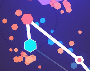
Nicely done! Simple geometric visual elements but they match each other perfectly. Great color palette. The sound and audio goes together as well. Zipping around is pretty fun too. See the image at the end was a fun reward.
I think maybe you could have added some way of knowing when the next node is coming up. The close camera made it so that there was not much time to react, especially when there where multiple nodes close to each other
Thanks for the thoughtful feedback!
We have already received similar criticism, so I believe that you are definitely right in the fact that it can be hard to see and react to what's coming next.
Cheers :)
A cool idea. I liked the clean aesthetic. The sound was good for the most part, but there was a quite harsh click noise when you went past the nodes.
My main critique would be the "level design". Some of the nodes seemed impossible to accurately tap, they were simple too close together to react to, this was most evident on the sword. Something more rhythmic or that followed consistent patterns would go a long way, as the nodes essentially felt random in their placement. Despite mapping out images.
It was a cool idea though, and you executed well on that idea. Nice one!
The harsh click sound is a WEBGL error I have no idea how to fix haha :)
And yes we will definitely be adjusting some of the levels, most importantly the sword level as you have pointed out.
Thank you sir :)
Nice! I like the simplicity of the game and the visuals. Diversifying the same shape in terms of a color and size is a nice touch, and so is the ending <3
Looked great the menus and ui looked very professional and well done. loved the use of sounds and was a great submission would love to see this expanded to a full game and how it would go
Timing, timing, timing... Very clean and nice game! congrats!
smooth and relax game, the art is match with the game play, nice work ☕