Play game
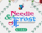
Needle & Frost's itch.io pageResults
| Criteria | Rank | Score* | Raw Score |
| Graphics | #2 | 4.739 | 4.739 |
| Overall | #48 | 4.076 | 4.076 |
| Gameplay | #54 | 3.739 | 3.739 |
| Audio | #95 | 3.652 | 3.652 |
| Authenticity (use of resolution) | #199 | 4.174 | 4.174 |
Ranked from 23 ratings. Score is adjusted from raw score by the median number of ratings per game in the jam.
Did you work in a team?
Just one person. Super fun experience!
Was the resolution a challenge?
3D stuff gets funky, that's for sure.
What did you learn?
A TON about pixel art, state machines, and color.
Leave a comment
Log in with itch.io to leave a comment.



Comments
5 stars for the graphics, no question about it. the gameplay is simplistic but quite fun once you get the hang of it.
wow, such a good idea, and a beautyful itch page too, i love this entry
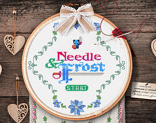
Wow, what a unique way to present the game! I never would think of making a 64x64 game in this way. A rotated view on its own is interesting, but the whole cross-stitch aesthetic is just mind-blowing. I didn't even know you could make itch pages look like that! It almost feels like there needs to be a new category about creativity to properly rate the game.
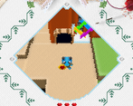
Presentation aside, the game is a fairly conventional Zelda-esque adventure game, but executed well. There's a decent amount of world to explore and solid - if simple - combat. The graphics are also well thought out. I've played some low rez 3D games that just slap a pixel filter on detailed graphics, but this voxel-y art style works well with the resolution.
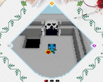
I had one bug where the music stopped playing in the grey cave area on the left.
So pretty and unique! It's like discovering a brand new artstyle. Amazing work with the engine too!
It would be a crime against games if you didn't make this a full thing. 5/5 I'd be so proud to have made this myself :)
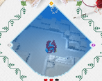
I encountered 1 very minor bug, When going into the water temple and you walk slower, I turned around and came back outside, I remained going at a slower speed until I stopped and started moving again. Nothing serious just want to help :)
I've mentioned this while watching on stream before but this is amazing work. Love the Zelda influences. It's one of the most unique and creative games I've seen so far, and the way the page overlays the game with a screen effect is a nice touch.
As for criticisms, I wish the music was more befitting of the rest of the game with more charm and personality. Also the sound effects are a bit on the loud side, especially compared with the music itself.
Really enjoy this type of game and hope to see it continued/finished
The moment I saw the page layout I thought: wow I never would've thought of that! The visuals are obviously very impressive, especially the fact that you managed to make 45-degree rotation work well. You've given me a lot of ideas to think about!
The only nitpick I have about the game is that the enemies are too repetitive. Otherwise the level design was pretty good. I liked the fact that you can just commit suicide in the water dungeon to get back to the door faster lol. Also I guess the holes are for the same purpose right? So after you get a key you don't have to manually walk back, ha!
Such a unique experience, I never expected to see anything like this in the jam. The cross-stitch effect and 45 degree view angle is impressive and I loved how you incorporated the art-style into the game page as well. For a one person job this is amazing!
Great game page and interesting take on the resolution limitation, qutie unique even thou I’d say it generates a few readability issues at some angles due to the lack of clean vertical lines. Nice character design and general aesthetics, even though the diamond shape kind of “blurries” a bit the crispness of the sprites themselves, but I guess that’s the whole point with the diamond shape approach ;) pixels bleed into neighbours as they form a cluster. Even though the restriction “applies” to 64 diamond shaped clusters the actual rendering forces this project too far out the limitations for me, so sadly low poings on authenticity, but hey, very nice game!
So cool! Played through the whole game, really well done. It's a bit opaque where you can go at first, but once you realize that some edges can be climbed over the world becomes more readable. Also I think the soundtrack isn't looping, since it just stopped playing for me at some point. I really like the attention to detail put into the jam page and the game as a whole!
A really great game. It has a lot of great solutions in the design category. I would like to highlight: an amazing system for saving progress, the screen rotated by 45 degrees, stylized embroidery. The author has done a great job with the concept of the game for a gamejam. It is clear that the creator was inspired by the first games in the Legend of Zelda series. The game has potential and already has an excellent realization.
Wow! Your page design is just amazing. There is so much detail in that alone. I also thought the rotated aspect of the pixels was super cool and really gave the feel of 64x64 effectively, just rotated.
Tilting the viewport was such a clever idea and the needlepoint theming was adorable. The gameplay was fun and left me wanting more. My biggest complaint was that I found the sword sound a bit grating (I think it was the high pitched component, maybe some filter would help).
I like the old school Legend of Zelda vibes I got from this. Impressive making a 3D game work so well within the limitations of the Jam.
Thanks! Turns out 3D is really hard at 63x63, but it adds a little somethin'. I learned a lot!
Music was good, but not great. Sword sound was super repetitive.
Expected to be able to attack diagonally but that doesn't work. seems like it should, but I digress. The water level was clever but was there a way to get your breath back? i just had to die cuz it took me a sec to figure out what was happening. The rectangular charge attack guys sometimes phase through walls.. I LOVE the artwork on the page, and the title screen, and I hope to see more from you. I actually followed you after playing some of the other stuff you've made. Good work. Also I'm glad i told you to go with your idea of tilting the pixels that turned out great. it really does look cross-stitched.
This game is so uniquely different from anything i've ever seen before, I love it!