Play game
Neon Critters's itch.io pageResults
| Criteria | Rank | Score* | Raw Score |
| Fun | #4 | 4.222 | 4.222 |
| Graphics | #13 | 4.111 | 4.111 |
| Polish | #14 | 3.778 | 3.778 |
| Overall | #19 | 3.667 | 3.667 |
| Audio | #20 | 3.556 | 3.556 |
| Progress | #21 | 3.444 | 3.444 |
| Innovation | #34 | 2.889 | 2.889 |
Ranked from 9 ratings. Score is adjusted from raw score by the median number of ratings per game in the jam.
Leave a comment
Log in with itch.io to leave a comment.


Comments
I really enjoyed this one. I found it a little on the easy side so far, but I would prefer that for a game with only one difficulty. The laser gun seemed underpowered compared to the other two. The only major critique would be that there is no controller support yet, this would be great as a twin-stick shooter. That's about it, though. A solid game with a fun visual concept.
Thank you for playing! I haven't closely measured the dps of weapons, but they should all be pretty close to each in terms of dps. Laser gun shots go through walls. We'll see how hard it is to add controller support and possibly add it in the future.
Its a very fun game the graphics look very clean.
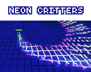
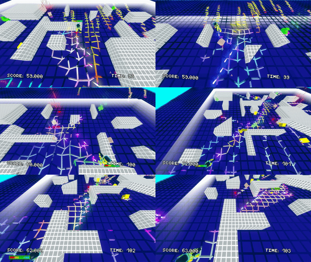
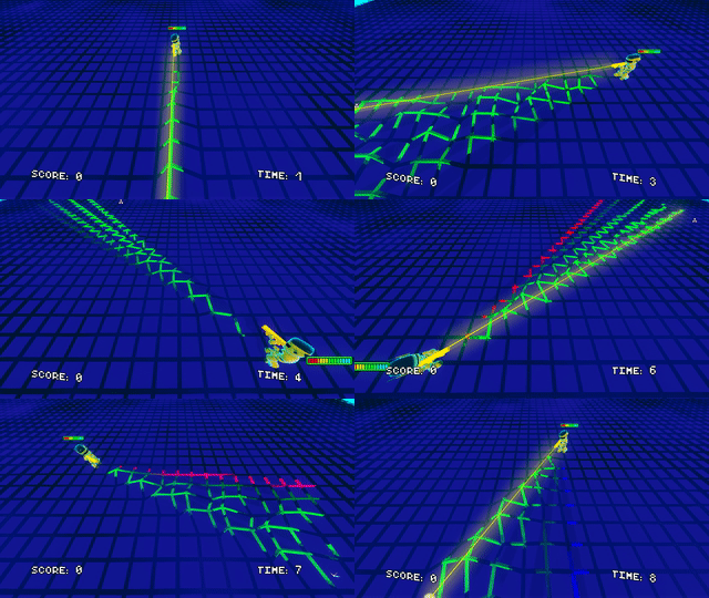
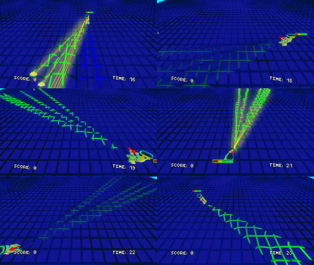
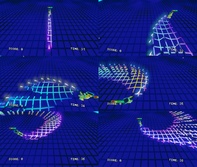
I especially liked the shader thats twisting twisting the ground, altough it's sometimes a bit to strong when the player is walking in my opinion.
The only real gripe I have is that the controls aren't mapped to the Arrow-Keys, which is kinda inconvinient for some left handers like me.
Overall it's looks great for now keep at it :).
Thanks for the feedback. The twisting of the ground certainly adds to the fun factor :) We'll add arrow keys for movement in the next release.
:) Had a lot of fun ! I love the neon graphics and arcade feeling of it and some mobs are interesting (the teleporting ones and the grey runners). I kind of think that the low-fi "rough" geometric shapes can be more endorsed as the main aesthetic (why not simplify the player too and may help to get more time on concentrate on pure aracade idk) but this opinion may concern only me. Beeing on azerty I regret a little not having a switch to azerty mode specially for the level 2 which is quite challenging (still fun imo) X). Definitly will replay it and want to see more content and levels etc. Btw work flawless on my arch linux I suggest you to add a readme file with ```to run the game on linux `$chmod +x neon-critters-linux.x86_64` then `$./neon-critters-linux.x86_64` ```
Thanks a bunch for playing! Yea we're figuring out what we can redesign the player model as. We likely will go with a more simple model that's closer to a primitive shape. The other dev and myself are programmers and have limited knowledge of how to draw, use blender, and animate. So, we're certainly going to tame our imaginations for what we want to do. I'll add the install instructions for linux too, thanks.
Hey there!
This was an entertaining game. I loved the visual. It gives this sci-fi vibe, which goes well with the game concept. The music was chill. I think including a tutorial is a great idea.
This is an easily expandable game, so there are lot of directions you can go if you ever plan on working on this in the future. You can add more weapons and enemies. I saw other comments, and adding a multiplayer mode sounds like a great idea.
Overall, this was a fun game. Great job, and good luck for future dev work!
Thanks for playing! It's always best to really hook people on your game with visuals then provide fun core mechanics and gameplay loop ideally ;)
If the game does become a medium or long term project, we really need to step up the models and animations and aim for a consistent art style here. Initially, we were super ambitious with weapons (5 types, 3+ per type), but I think it's better to refocus on the design and incentive to use each weapon.
Multiplayer would be fun.
This was really fun, and the audio and visuals were really well done too - I especially liked the distortion/lighting effects on the floor. I'm not sure what your long term plans are, but I did think it could make a really fun multiplayer game :D
Thanks for playing. You can thank @jaerei for all the implementation of the floor models and crazy shader code. It's had at least 3 major revisions. We don't entirely have a well defined roadmap; we're just taking smaller steps. We've hit some limitations of Godot Engine with physics and rendering which has been a bit discouraging for us on this project in particular. We still love the engine, editor, and gdscript, and look forward to Godot 4.0. Multiplayer is always a fun challenge to do correctly.
I had a lot of fun with this one! Really enjoyed exploring all the different weapons and wall sliding away from enemies. I would love to see more situational challenges which make the player switch up their strategy. I found my favorite gun (shotgun) and mostly stuck with that. I was in neon heaven with the audio/visual polish and floor warping effect. Everything came together to make a nice cohesive experience.
Great job on this! - It looks like quite a long list of edits in this 0.2.0 version for the jam
Thanks for playing, and I'm glad you enjoyed the visual! Yea, the design is pretty loose on our 2 levels right now. We're giving the player more than enough health, and he can easily beat the levels with any one gun. We're looking to better teach the player walldashing, and to add enemies that require you to use a certain gun to efficiently kill them.