Play game
The Wayward Tower's itch.io pageResults
| Criteria | Rank | Score* | Raw Score |
| Story | #3 | 4.274 | 4.274 |
| Presentation | #3 | 4.712 | 4.712 |
| Implementation of Theme | #7 | 3.973 | 3.973 |
| Creativity | #8 | 4.151 | 4.151 |
Ranked from 73 ratings. Score is adjusted from raw score by the median number of ratings per game in the jam.
Team Members
Baldoh, Cardigan, Erebus, Metrio Baryx, Origin of Majesty
Name of Wolf/Wolves
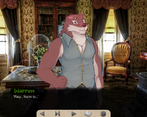
Warren
Leave a comment
Log in with itch.io to leave a comment.


Comments
I AM RATING THESE ALL THESE JAM SUBMISSIONS RELATIVE TO ONE ANOTHER. THERE ARE HIGH HIGHS AND LOW LOWS BUT PLEASE DON’T TAKE THIS TOO PERSONALLY, AFTERALL, WE ALL ONLY HAD A MONTH.
Implementation of Theme (4):
The never ending expanding tower was an great use of the theme but the only thing that kept it from being a 5 was that it never came up that often.
I also have in my notes that it was about “expanding curses” but the curse never expanded. It just transferred from one person to the other.
Story (4):
Considering the title being The Wayward Tower and how the tower magically changes as needed, I was a little disappointed that we didn’t see the Tower do all that much in the VN.
Besides the climax with the curse exchanging, there wasn’t really a lot big moments in the story. No side characters to bounce off of, just you and the MY WOLF. I kept feeling like something was missing.
Was not a fan of this whole “hopeful” ending. I want boykissing! Not will-they-won’t-they.
Presentation (5):
The opening sequence was breathtaking. I don’t think that opener could have been any more hype if it was trying to be.
Erebus’s UI might have been a little wonky at first but I got the hang of it quickly.
I wasn’t expecting Metrio to do the sprites since I never saw her make sprites before but it was a delightful twist. I just think his ears are a little too small.
Origin’s music was fantastical and breath taking.
Creativity (3):
I remember seeing Baldoh’s pitch for this in the COMMUNITY Tab and thinking that it was going like Howl’s Moving Castle but I was wrong.
This entire VN kind of gave me Beauty & The Beast vibes and was expecting something wacky to happen. Like the furniture to start talking. Or for there to be some interesting use of the magic that Warren has but nothing.
Total (16):
A really solid entry and great way to take Cardigan’s VN Developer Virginity.
It’s a petite bite of a dessert that leaves me wanting more. Like an episodic creature of the week kind of deal. A new magic every week!
I still don’t understand why Caridgan wasn’t the person who published this. I understand if you didn’t want to use your previous clout and following for the Jam, but when is this account going to be used again? I mean, I did say the same thing about Team Lycoris and I was very very wrong.
Who knows, there could be sequel for MAY WOLF 2025 for all I know.
35th VN
An efficient and heartwarming tale.
Obvious stuff first: the presentation is jaw-dropping. It looks beautiful. It sounds beautiful. It reads beautifully. I can't think of an element that struck me as bad. Maybe one could say that explanations like the key run a little long, but the story was never ground to a halt for the world-building.
The competing art styles felt like real "Instagram v Reality" moments, but they gave me a light-hearted laugh more than anything.
Just an well-rounded product. Top marks for sure.
I think my favorite part of this submission is the world-building; we're shown this little snippet of a huge world that leaves us craving for more. As for theming, it feels a bit on-the-nose, but the vn overall fits well enough.
I do hope this is expanded, as this feels a lot like it's in the middle of a much longer story. Exposition could be removed in favor of expanding the vn to a larger scale.
The writing in this entry is phenomenal, the art and presentation is great, and the story is short but sweet. It's clear to see why this one is as popular as it is, and (although this might feel weird coming from me) I think this novel absolutely has the potential to be the winner.
Time constraints are apparent, I wish we could've seen WHY the main characters fall for each other in the first place, or maybe a couple of more scenes with them together. Not that it feels undeserving -through the writing alone, you can tell these characters care a lot about each other-but it would've been nice to see some real moments of intimacy between them.
Overall though, an incredible piece of art by the whole team. Congrats to everyone on board, and I'd absolutely love to see more projects like this from you guys ♡
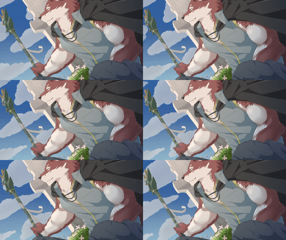
An absolute masterpiece in my eyes. The entire experience is handily in professional realms, from the UI to the artwork to the soundtrack. I was afraid the change in styles between the CGs and the actual sprites would throw me off but both styles and renditions of Warren have so much charm and personality! I found myself so enraptured with his actual sprites and how expressive he is! oh goodness my heart
My only critique is that I can see where this would be more interactive, had you not had to make the whole thing in a month. The bit with the Gizmos is absolutely a jumping-off point for the player to engage with the world in a really fun way, Warren's tower itself would be a whole slew of fascinating exploration opportunities, and the solution to the climax would be such a satisfying contribution the player could make! As it stands, however, the kinetic novel approach is appropriate and still a good experience!
I am very hopeful this team stays together because y'all obviously work GREAT together, I'll be eagerly watching what you can put out in the future!
Clearly a blockbuster entry in terms of production values. Besides having a lot of nice art and a great central character design that communicates a lot visually, the dynamic animations of The Wayward Tower elevate its information-heavy opening in particular. The original music rules, and though stock photos are used extensively, they're picked with enough care to look cohesive together. The UI feels fully thought out, too – the skeuomorphic icons scream "fantasy", and the font suits the fairly grounded drama of the story while also recalling the journal central to the plot. The text box maybe feels slightly underdetailed in comparison, though.
Smaller nitpicks: some of the transitions feel PowerPoint-adjacent in a way that clashes with the mood a little, and the buttons in the title screen have some sort of weird border around them. These are non-issues in the big picture; it's a gorgeously made VN.
The writing is solid, carefully maintaining a good balance between otherworldliness and the relatable mundanity of the emotional conflict. If feeling harsh, you could accuse it of veering too far towards overexplaining at times ("Warren, this wise master of magic, can be as excitable as a puppy" – needless to state when already shown), but in general, the game doesn't get bogged down in lore, maintaining a mercifully tight focus on the character drama. Bits of backstory feel thoughtfully incorporated, too; there's a sense of the history between these two without the need for explicit flashbacks. Just a really smooth read, honestly.
While the jam theme does not feel like the most important piece of the puzzle (I maybe wish there had been more about the journals), I like the images and ideas the story plays with. Not to get too Literary Analysis 101, but the protagonist's cyclical life of being unable to settle down feels like a fitting representation of the self-sabotage inherent in his reluctance to confess his emotions, even if the magical mechanics of the back half muddle this interpretation a little. In any case, I think the climax works on an emotional level, being precisely open enough.
Just a very good entry all around; not necessarily groundbreaking or rapturous, but a pleasant reading experience that feels solid on a technical level.
I think this is an example of the whole being less than the sum of its parts.
First of all, in terms of visuals, it's hard not to think this went through some kind of troubled development. The artstyle changes abruptly after the first couple of minutes. I'm usually not one to complain for contrasting artstyles in FVN, I think that is part of the charm.
In this case specifically, however, I thought the art change was to the work's detriment, for two reasons:
- First, the way the art is used changes dramatically. In the first couple of minutes you get spoiled with a million CGs per second (with fanciful transitions too). Then, for most of the story, the VN becomes a classic case of "sprites + edited pictures for backgrounds".
- Secondly, while I enjoy both renditions of Warren's character, my mind cannot process them as the same character. It's not just that the artstyle is wildly different (I would be ok with that), it's that what the art is trying to communicate does not align at all: Warren shifts from being hot steaming buff wolfman, to being adorably cute puppy dogman. Both the artists did a fine job, but a coherent art direction was missing.
Also, I can't help but feel the story is trying to setup the tower as this beautifully whimsical place with that establishing shot, but then it doesn't really lives up to it in the rest of the story. With the exception of all the teleporting around, the tower after the establishing shot feels just like an old fashioned well furnished castle.
As far as the writing goes, the writing is competent but it did leave me unsatisfied in a couple of aspects. First of all, this VN suffers from a classic case of writing with some nice illustrations on top: IMHO I never takes the step of using the VN medium to its advantage. You could mostly remove all the visual elements, and this would read the same, the visuals feel superfluous.
Secondly, I think the writing could afford to be more daring. It seems like at every turn the safest choice was picked. For example, how do we establish the premise? Opening exposition dump. That, and a lot of description of furniture. With how simple the story in the end is, I think it could have been presented in a more interesting fashion.
Like I said, I think all team members did a fine job on their own, but possibly because of time constraints and trouble development the different parts didn't really enhance each other.
Bro, you made me cry. I hope you're happy
But really, this is a beautiful short story I so desperately want more of these characters, this world, I want a happily ever after. I'm not lying when I said I cried, when I got to the end of the game It just hit me like a truck this story is truly beautiful.
I loved how fluidly the sprite work and cgs worked together. If I understand correctly, different people were responsible for them. The user interface design also looked very refined, and the music fit quite nicely. There were several screen transitions I've personally not seen used elsewhere that pair well with the concept of the key. The sound effect that plays reminds me a bit of old 8 bit point and click games, though seemed a smidge too loud to the music by comparison. I enjoyed the pacing of the story, and would like to see a continuation of this universe.
I can appreciate staying on point with everything having to be contained in such a short story, but I was hoping to see some misadventures when trying out the key. For example, not figuring it out right away, or accidentally using it and going to the wrong place could give a bit of humor, and a slight deviation from the "I'm finally gonna say it" tone throughout.
When the wolf mentioned the gizmo and the mirror, my mind immediately went to the idea that the key would let him traverse into the mirror somehow, and he would find the answer he was looking for within it, expanding his world. I felt slightly disappointed that there wasn't a bit more buildup of tension again, as the MC just quickly figured out the answer in order to progress the story.
Please take that with a grain of salt, because I really enjoyed this one, and see how much work and care went into it. Those were simply two places I felt like I was expecting something more to happen based on the cues in the narrative.
The only other thing that caught my attention was during the scene where the mc wakes up. The quick transition from the dark background to the bright white letter hurt my eyes, and it took me a second to focus to be able to read the words. I would suggest either slowly transitioning the background to one less dark as the scene progresses, or doing a slower fade as the letter appears on the screen. Another option may be to do a sprite of the piece of paper in hand with the words on it, and updating with a few different versions where the words appear line by line, dissolving into each other.
Again, these are all very minor points. This was a well polished collaborative work, especially within the time frame!
Spoilers follow, etc etc.
Theme: The tower being very big and hard to navigate?
Story: Mutual unrequited love + curse.
I didn't love starting with the expositional world building. Some of it was pointing to things that sounded like they would be more interesting than revisiting this tower barring the handsome woof trapped in side.
Frankly, I'm not the biggest fan of the voice of more classical works, which I think you do like and carry forward with you. It felt out of place with the tale, as that felt like a more modern harlequin novel standby, as opposed to the buffoonery of something like Far From the Madding Crowd, or other works that were contemporary with it (what else could I call it other than such when one uses divination to send the most eligible bachelor in town a letter saying "marry me"?), and in that, it made the voice feel discordant with the narrative, for me.
Just because it's "fantasy" it doesn't have to be archaic/medieval in all conventions. You mentioned physics and in the same breath had people saying "Damnation".
I liked the attempt to take the curse onto the self, although I don't know if I feel very convinced that it should have fully abated with the mirror's shattering, given the difficulty in removing it from the (insert-name-here protagonist). It would have made more sense to me if the affliction was shared between the two, given it was an echo of the original, and in that, I think you could have progressed to a more satisfactory ending other than "I failed to do what I wanted due to external forces and not being brave enough and then selling away my desire to say so to abate my suffering".
It's also a bit nebulous why the curse kicks in there, given he's like "I can seldom revisit places, especially ones that exist away from usual space time"--why does it partially work there? Just revisiting itself already seems like a lot, and two day windows at a time doesn't seem like a great amount of bonding in prior visits, especially if one day is just dedicated to being examined or passing out from the fatigued life of the road.
I suppose we're suppose to engage with the idea of a sort of "distance makes the heart fonder" in that both of them are constantly thinking about the other, but the protagonist again pines about some of the wild travels he goes through nonetheless.
It felt like it was afraid to commit to the implications of the shared curse and how that would inform the ending, by discovering a new rule of the curse out of nowhere (that seemingly the mighty magician couldn't possibly fathom before in any capacity?), and I think having that shared tether would have made the fear of not seeing one another again more poignant-- "I can't stay here lest I hurt you too. Of course you wouldn't want to see me again. i stole away another place where you could rest" etc etc. The reaching for "you want me to leave because I hurt myself" doesn't quite work as a logical conclusion, for me.
---
Story asides: Cursed mark? Alright naruto fan.
Gizmo feels out of place, especially in light of the more archaic tongue of the piece (the first known use seems to be in the 1940's per my googling of the etymology). I think there are other similar terms you could have used that wouldn't feel so "artificial".
---
Presentation: The first bit pops off very hard in a pseudo-comic format, and then it transitions into still lovely sprite work. It's a bit curious to do that instead of like, spreading the cgs more throughout.
The custom music felt very appropriate, and I appreciated all the transitions, and the woof was cute in any form he took (cg or sprite).
I didn't quite get why he took off his coat given he was in the tower already, but it wasn't like I was upset to see his arms :p
Creativity: I feel like this felt afraid to commit to explore further, especially in having a boy fail protagonist (at least, he felt like that to me). I think maybe some explicit application of the theme might have found a way to carve out more space.
Overall thoughts: A cute story with a lot of effort put into it (i was really impressed with the cgs, transitions, cutes sprite, etc), but the narrative has both some clunky wording (for me) and focus. It didn't feel like it sufficiently resolve the tension in what I think is a matter that goes towards where the work was aiming, but delays it with a half smile and avoidance of the "promise" of suffering at the start.
I really loved it HANDSOME WOLF ((i drew him AHHH i cant stop simping, I swear this reminds me when i played adastra it was my first vn but this VN I CRAVE MORE ;-;)) loved it 🥰
Very handsome wolfo ^^