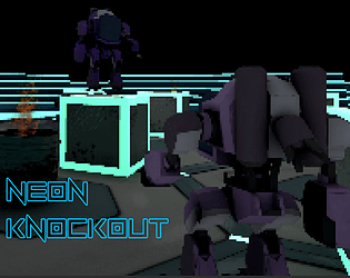
Play game
Neon Knockout's itch.io pageResults
| Criteria | Rank | Score* | Raw Score |
| Visuals | #61 | 3.019 | 3.375 |
| Audio | #69 | 2.460 | 2.750 |
| Fun Factor | #71 | 2.571 | 2.875 |
| Overall | #73 | 2.795 | 3.125 |
| Originality | #81 | 2.795 | 3.125 |
Ranked from 8 ratings. Score is adjusted from raw score by the median number of ratings per game in the jam.
Is your game a video game or a physical game?
Video Game
Was your game made solo or in a team?
SleepyJack - Producer and programmer. Astral Wonder - Level designer and environment artist. MarshMallow1902 - 2D character and background artist. Vortexbil - 3D character artist. Rocking Cockatiel - Game designer and UI programmer. Salty Tomm - Narrative designer and writer.
Did you use any third party assets, if yes what assets did you use?
With music by Chris "Torone" CB: https://torone-music.com/ https://soundcloud.com/torone/tracks https://torone.itch.io/ And sound effects from: https://assetstore.unity.com/packages/audio/sound-fx/weapons/gun-explosion-sound... https://freesound.org/people/peridactyloptrix/sounds/213384/
Did you choose from one (or more) of the optional secondary themes?
Arena
Does your game contain 18+ content (Nudity, Gore, Language)?
N/A
Leave a comment
Log in with itch.io to leave a comment.


Comments
Very cool but also very difficult. I would tone down the amount of enemies in earlier levels. I love the visual style of the game.
Nice game, though definitely a bit difficult. The aiming doesn't help but still pretty fun. I liked the art as well, very good job with it! Just needs a bit of polishing and it would be really fun!
And also, for me at least the controller controls are sort of broken. Unless I'm playing wrong, I couldn't really aim properly using it, it was like the movement and aiming were fighting each other over the control of the mech.
Fun game, you can tell a lot of work has gone into it! It would be nice to have some pickups for health and ammo to make it a bit more fair as I couldn't get past the second wave. Good job to everyone involved!
Thank you for the kind words, I'm glad you hade fun with it.
We're going to take another look at the difficulty post jam, as we definitely didn't give it enough play testing.
We were originally going to have ammo and health pickups, but it got cut for time, maybe we'll look into it again.
Interesting concept, the style is neat, but i feel like the movement speed is a bit fast, especialy for a mech moving. (Maybe it’s just the missing animation, that it feels like im slithering around on ice). That also makes the enemies get to you very quickly, so it feels a bit like you are just randomly moving around shooting, becaues it’s way to fast paced to think about it strategically. The first time i also fell of the map on the borders and get stuck there and needed to restart.
A major annoyance was the reload sound. It’s mostly 2 sounds, who sound very similar, and whenever i hear the first one i thought i had already finished reloading, but in fact i did just start. I think the reload finished sound needs to be alot more prominent and distinct from the starting sound, because it is my “go” signal to shoot. In contrast to that, the little suicied bots where very well done, they where good to hear so you could react to them.
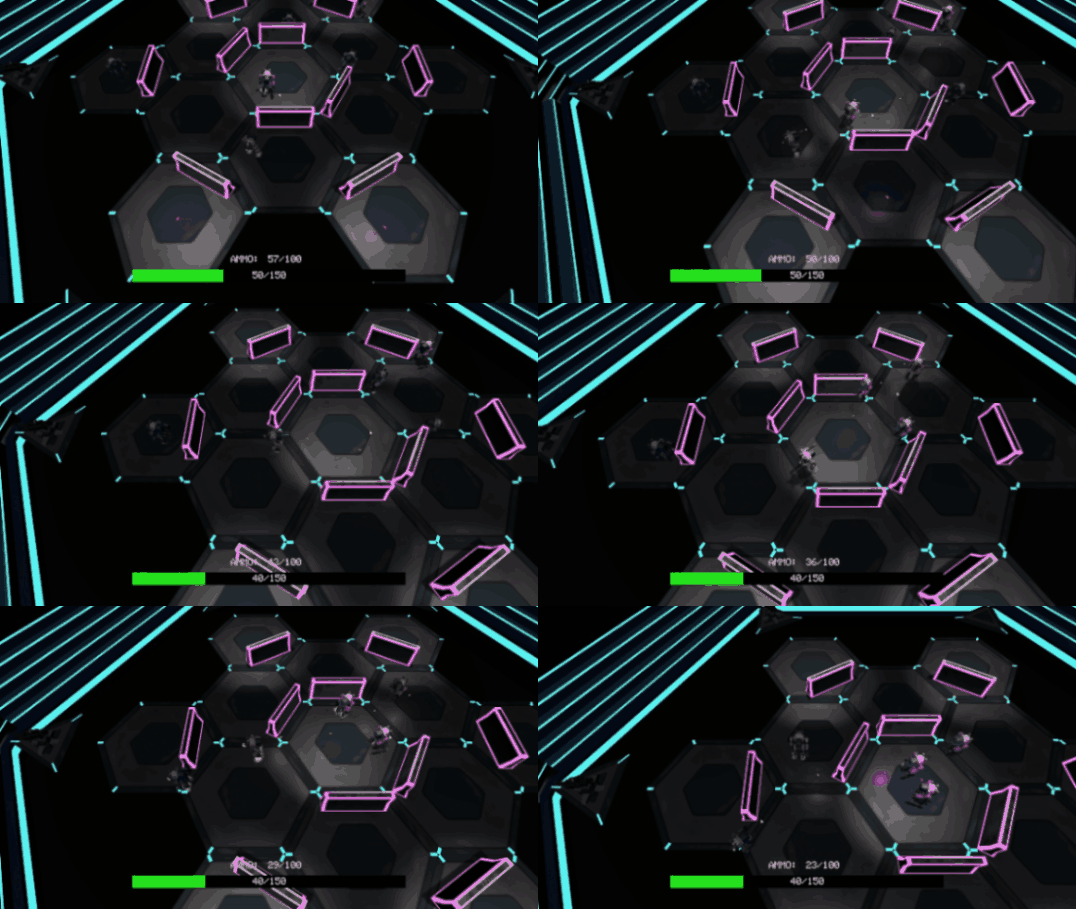
Another issue was the turrets on the side, their hitboxs where very akward. As i finished the waves in Stage 2 i was confused why it didn’t, because i tried to shot at them but nothing happend. As i later figured out i just have to stand at a certain position that they get hit. But the hit indicator for them shoud be way stronger, especially because they are very dark and hard to see, so i need some feedback from where i can actually hit them.
Also the text background was not there for some reason, so i had black text on black background, so couldn’t read anything.
Thank you for the feedback.
We had no one on the team with any animation experience, and our 3d character modeller fell sick halfway through the project. So the method we came up with was just to have it sliding around and use an effect to imply it was "skating" like mechs in Armoured Core. It's also the reason that we kept it fast, as we felt it would look weird if the mechs were all just slowly sliding around the map.
Thanks for letting us know there's still issues with the map borders, I had thought we'd ironed that all out, but there must still be some gaps in the invisible wall we haven't found yet, so we'll go over that again.
For the reload, we had planned to have a visual indicator for reloading, as I agree that just using the sounds isn't quite as clear as it should be. Sadly, this feature got cut due to time constraints, but we'll try to add it in post jam.
I'll increase the turret's hitbox as right now it only covers the centre gun part of the turret and not the base. From a top-down view, I can get how this would look wrong and like your shots are missing, as the turret would look larger than it really is. It is programmed to flash red, but with the point light on the bullets being yellow it kind of becomes hard to see it flash, so I think we might try adding a spotlight above the turrets.
As for the text box not appearing, could you tell us what scene this happened in, as we've been unable to replicate this bug?
Again, thanks for all of your feedback, it's super helpful when it comes to improving on our game and game development skills.
The text box background not appearing happens every single time. Might be due to the fact that i’m on a wide screen, so the text is partially out of view anyways. The first line of the text is visible thou, so dunno quite why just the background would be gone.
I didn’t find a solid way to reproduce the issue with the borders thou, it only happened one more time. Might be an fps drops issue? (Dependns on how large those border hitboxes are).
I think the issue with reload is also, that it just takes a very long time. It’s like 3-4s? And this everything is moving so fast this feels like an eternity. And i mean viusally you have the bullet count at the bottom, but that’s not so great to look at within combat. Also, i realized another thing. The visual bullet count refreshes before the reload is finished. So there is an additional delay, so even when i look at it is a tiny bit out of sync, which makes it feel even worse. Because i’m always trying to shoot but it’s not quite ready yet. Synchronizing those 2 and making it a bit shorter will probably already be a big improvement on how it feels.
Love the visuals! Fun characters and game play as well. The difficulty ramps up pretty quickly for me and I couldn't get super far, but this has lots of potential!
Thank you for the feedback, and I'm glad to hear you liked it.
I think post jam, we're definitely gonna experiment with the difficulty a bit as I've seen a few players struggle to get any further than the second stage. We definitely needed more playtesting from people not used to the games systems before releasing, but we'll learn for next time.
well made top down shooter
Thank you 😁
Exciting Arena Combat Game. Was able to beat the game and enjoyed doing so. I think the weapon should rotate to the mouse cursor because the aim is off to the left a bit (Mech left facing that is) or that instead of the CenterPoint of the Mech facing the mouse, the gun faces the mouse. I missed reading that I could swap weapons and beat the first stage with just the Pistol and couldn't beat Stage 2. Might be nice to have an image of all the weapons above the Health Bar and Highlight the selected weapon to be an easier way to show Players they have more options in game without descriptions. I'd love to see this game extended by adding more waves and enemies. I would like to see some type of Skip Cutscenes added for people who play through more than once. Maybe have a button on the Start Screen that's Labeled Arena and it loads straight into the Scene and that skips the Dialogue.
Thank you so much for the awesome feedback, and glad to hear you enjoyed it.
The offset with the weapon and the aim was caused by an unfortunate miscommunication between myself programming it and our 3d character artist modelling the mech. Didn't explain to him that the weapon would need to be centred, so that's on me. I might see if I can adjust the way it rotates to see if we can get it always hitting where the mouse cursor is pointed.
Having the weapons above the health bar is actually a great idea, and we might use that. Originally we were going to have upgrades between rounds where the player could buy a new weapon, but we ended up cutting that system fore time.
Adding a skip button into the menu should be an easy fix too, so I'll implement that once the Jams over.
And again thank you so much for the feedback, it really helps :)