Nice entry! i don't like the b key to atack, it makes complicted reach from wasd but don't see other thing than that, pretty art, sounds, mechanics and animations, feels like a complete game, it made me remember to prince of persia, well done!
Play game
Kafir (Demo)'s itch.io pageResults
| Criteria | Rank | Score* | Raw Score |
| Overall | #1 | 3.982 | 3.982 |
| Metroidvania | #1 | 4.214 | 4.214 |
| Design | #2 | 4.000 | 4.000 |
| Enjoyment | #5 | 3.571 | 3.571 |
| Presentation | #6 | 4.143 | 4.143 |
Ranked from 14 ratings. Score is adjusted from raw score by the median number of ratings per game in the jam.
Engine
Godot
Team/Developer
Meanlight (philow, Azagaya, Leandro Cuello, dPoten, LagartoJesus)
External assets
none
Reference info
azagaya#5894
Comments
Great game, great entry, really nice. awesome music, really fit it well, animations and sprite really like it, love the parallax effect trough cave and temple. two complains, some spikes that could collide when you touch it at the side, for example when entring cave at the most right side, before that is a jump with dash, you stand by the side and it collide with spikes. other complain, could be related with checkpoint, but I know that you need to use the potions, if you want more chances to advance for hard parts. overall, great entry.
The music was amazing to listen to and the player movement was great. overall this was a good game.
Hello,
The overall presentation and polish is outstanding, the player movement felt smooth. I had a lot of trouble with the bats - they had really janky movement and struggled with those parts. The music slaps, especially the theme in the area. It felt very much like a metroidvania. :)
Smashing job!
ART Fantastic pixel art really nice! some of the contrast between layers confused me a little. The enemies especially looked great!
SOUNDS
Game soundsed good, the music gave me flashbacks to when I was a kid - so good job on that!
GAMEPLAY
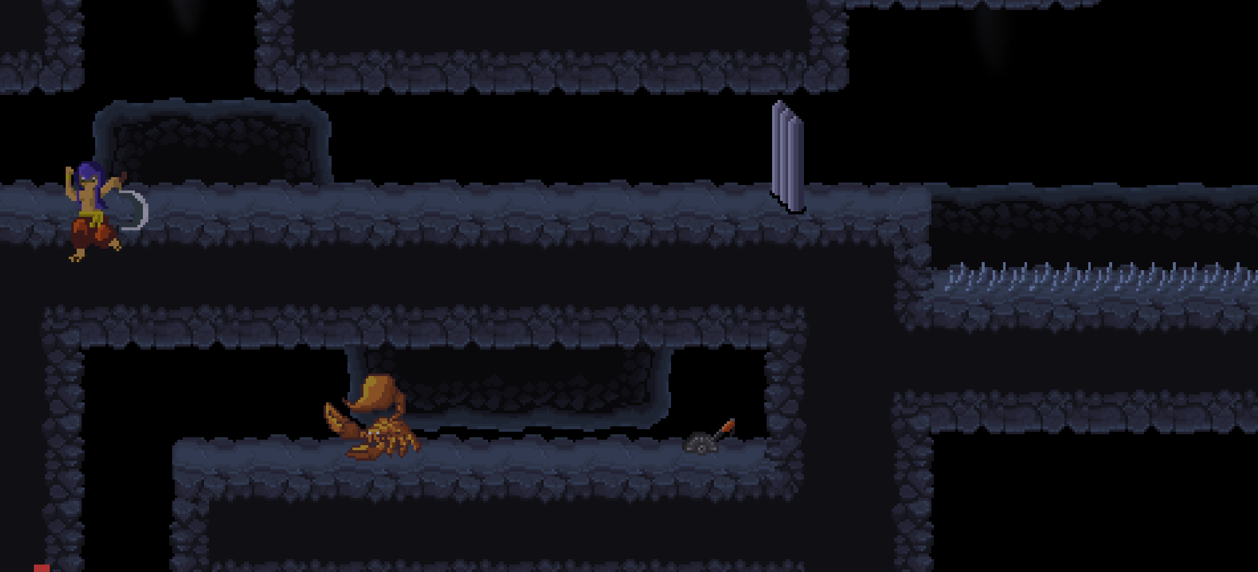
Gameplay was good, had a few issues with the room transitions, falling to my death and I managed to get stuck in a tile when I stopped at the edge of a scene border by mistake:
Only other thing that I didn't really like were the controls (B to attack I did not like) - but that's personal and minor
OVERALL
Great entry! would love to see this expanded on - well done on submitting :)
Impressive especially for a jam entry :o
The pixel art is really high grade, the music also fits the game to a tee, perfectly captures that feeling compos from the Castlevania series have with a bit of it's own jazzyness added to it.
Gameplay overall feels quite polished but still has some small issues though. Some jumps are really stretching far to the limit of the max jump height and length the character can reach making some quite hard, this is a bit eliviated when you get the double jump but still, the map helps but some aspects of the level design still feel a bit confusing (with some areas i suppose requiring an upgrade i didn't find yet to get to ? but wasn't sure about)
Now with that said this doesn't take away from the positives and sheer quality on display here, the variety of environements and music, and well general amount of content considering the deadline even for a team effort deserves to be noted.
Overall had a real good time with this one even if i didn't get too far
So congrats, and good job to y'all :)
Thanks! I'm glad you liked it!
Yeah, some jumps are too much in the limit. As usual, as a developer i didnt notice while playtesting myself, but noticed that when seeing other friends playing later.
And yes, there are areas you can only access with dash, and others only with wall jump. Double jump is just the first of the habilities.
Thanks for the feedback!
The game feels awesome to play, the soundtrack is a blast and fits each area, and the SFX is very well crafted and placed too, adding a lot of game juice to the experience, and making it really satisfying to play!
I want to talk about some minor problems that could be fixed, but the game is great by itself!
- The minimap only shows where you are. I guess this was a design choice, but I feel that showing your current position in the room could improve the navigation.
- There are some parts where the background and the ground blends and makes it difficult to see what's a wall and what isn't. The best example of this is the Desert area, where the darker bricks are almost the same color as the ground in the background, making it hard to see if you are focused on the enemies and platforms.
Other than that, it was a very pleasant experience, and a nice surprise to find! Good job 😋.
Thanks a lot for playing! Im glad you liked the game!
Yeah, the minimap could use that improvement. I also prefer when it works like you say. I think i could easily do it.
And yes again, sometimes backgrounds blend to much, specially in some monitors. I noticed it but didnt have time to change it. Will surely fix it if we continue the development post jam.
I would love to know how far did you get!
I loved this! The game felt great to play, loved the music, the sound effects were superb, the level design and graphics were awesome - just really good all around. I hit a bug in firefox where the player disappeared when respawning, but apart from that it felt very polished.
My only criticism really would be that the map didn't work for me at all (was excited to see that as it was something I wanted to add to my game) and a couple of the rooms felt a bit rough as you moved into them to immediately drop off a ledge (usually into spikes)! But apart from that it was excellent really. It felt quite megadrive-y, and I mean that as a compliment!
Very neat, I see a lot of game juice already, pretty cool.
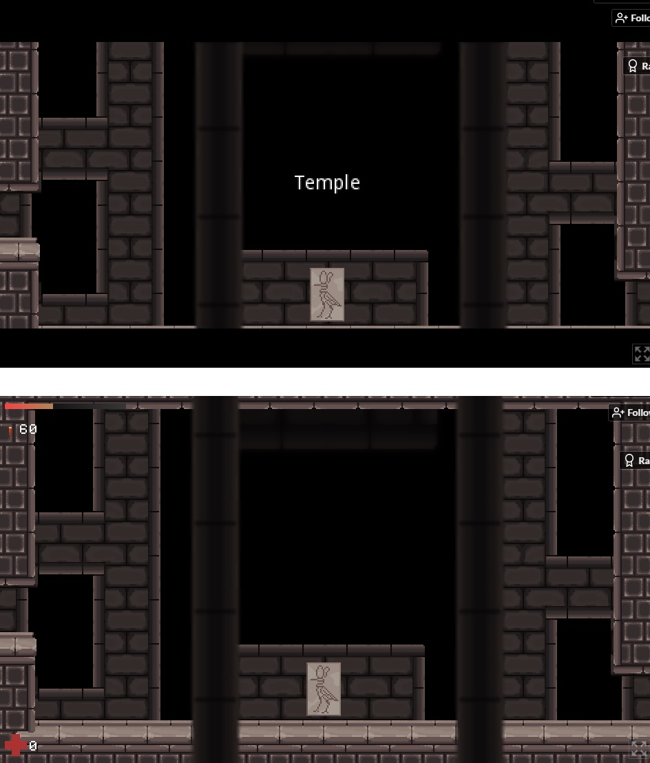
I would sugest a better combat system, I don't like to stop when I have to attack. Also after I etered the temple, the game just stoped, I couldn't walk, or go back.
With a little polishing this can be really cool!
Could you send me a screenshot of what happens when you enter the temple? cause i cannot reproduce the issue. What browser are you using? could you try another one? Im aksing this because if you got stuck there, you probably wont even be able to judge how much "metroidvania" the game is, as until that part is pretty linear.
Strange, i cannot reproduce it on chrome. I dont have edge, ill check if someone can try for me. In the meantime, if you really want to experience it as a metroidvania, you can use a binary version. Its a pitty that you just played the intro. Obviously is up to you, i know there are a lot of games to play.
Managed to complete this, it was very hard towards the end, I was stuck in browser version which my controller was a little iffy with but regardless of that the controls worked great.
The art/sound and game design were top notch, it was well explained with little text, and I loved how when you got a new power you was quickly needing to use it to solve the next floor.
Most importantly I actually enjoyed myself in a genre I'm not that big on, so amazing work!
What I liked
- Fantastic music and visuals. Definitely ranks among my favorites from what I've played so far.
- Animations were very fluid
- I love controller support. It felt *almost* perfect.
- This the first game that I've played that has kept the scene active while showing the map, and looks good doing it. The "out-of-focus" blur is perfect.
- So much polish. Its amazing what a team can do during a jam.
Improvement suggestions
- You should add the d-pad keys for their respective movement directions. It feels more natural to me to play with the d-pad in 2D games.
- You should definitely add an in-game options/quit/resume game menu. I was pretty shocked that despite all the polish, the game was missing this
Bugs
- There was a random time where I died and when i returned to the last save spot, I was invisible, and couldn't interact with the game other than attacking and opening the map.
Overall, you guys did a great job!
Hey! thanks a lot for playing! Yeah, i prefered to add more polish instead of pause menu. I can easily add that post-jam. But i tend to think polish is a greater improver of the experience.
The DPAD was going to be used for selecting different potions, but we couldnt implement them. We could use it for movement, surely to add post jam.
Ill try to reproduce the bug. Thanks for reporting.
Really cool Game. Enjoyed going through all the Maps back and forth, the Combat is easy and quick.
On some Areas the Tiles are Black, seems like a Tile Rule or something is not correct.
Nice Graphics and well designed Map Layout with lots of PowerUps
I just would like to have different Controls or Controller support.
besides that you guys made an awesome game! Ah and a Map would be cool since there are so many Intersections!
Thanks! The tile rule is ok, i just placed some of them wrong.
There is a map! You enable it with TAB or L2, forgot to add to the control list (please try it, i think it turned out cool!)
There is also controller support that we forgot to add to the page too.
The game is not finished though, we need to fix some things that i expect we would be able to fix in this 72hs.



Leave a comment
Log in with itch.io to leave a comment.