Play game
Candidus Caves's itch.io pageResults
| Criteria | Rank | Score* | Raw Score |
| Enjoyment | #6 | 3.929 | 3.929 |
| Design | #6 | 4.000 | 4.000 |
| Presentation | #18 | 3.857 | 3.857 |
| Overall | #22 | 3.571 | 3.571 |
| Metroidvania | #52 | 2.500 | 2.500 |
Ranked from 14 ratings. Score is adjusted from raw score by the median number of ratings per game in the jam.
Engine
Unity
Team/Developer
Omniclause
External assets
I used a variety of art assets, tools and music for the jam. All are properly detailed with links in my page description and the credits scene of the game.
Leave a comment
Log in with itch.io to leave a comment.


Comments
good game, really liked it.
I think I managed to get outside the map, getting stuck there endlessly falling.
okay, I used some unintended rocket manovering which for the most part saved me some parcouring.
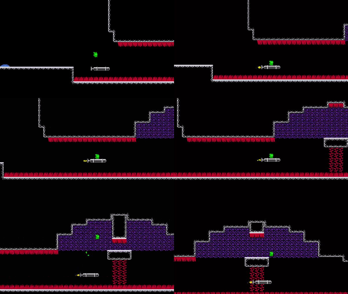
sadly in the last case, flying alongthe top of the upper rock brought me apparently past the world map and i jumped off the rocket out of boredom, so i fell forever. some respawn button would be nice :-)
Thanks for playing and for the feedback! Glad you enjoyed the game and sorry about the bug. Thanks for letting me know but I'm probably not gonna do any work on this game as it's out of the jam period now and I don't think anybody would play it, but if I ever decide to come back to it that will definitely be the first thing I address.
Well that bug requires you to basically avctively try to cheese stuff, like instread of flying straight through the caves as obviously intended holding up nonstop from the second you get on the rocket.
so doing it is already non trivial anyways :-)
I gotta say that I really liked playing this. I know you used a lot of assets, but it is very polished because of it. I really like the art style. The gameplay is very polished as well. I have to say that when I see 2D platformers as part of a jam, I am hesitant to play them as I know most aren't any good. This is very well done, has nice progression of mechanics and challenge.
Thanks so much and glad you enjoyed it! And yea getting platformers to feel good is really hard. I make primarily platformers and had to get a lot of people commenting that the player controller felt terrible and improve a lot to get to where my player controllers felt good. Still have a long way to go but really happy with how this one came out.
This is such a well put together game! The bold use of simple color translated very well and I like the cute sprites. I really enjoyed my playthrough all the way to the credits, you set up the new abilities well and ramped up the difficulty very well. The movement feels great, my team can definitely take some notes on that from you! I had many deaths but they all felt fair and that it was my mistake to learn from. My only critique is the linearity, I don't think I found any branching paths and didn't require any backtracking. All good though, excellent entry.
Amazing! :D I love it so much
The player controller is immaculate, and your platforming is super generous, especially the fall time on crumbling platforms. Makes those long gaps between checkpoints really feel like individual levels I love it! :)
The art/animation and sound are a great vibe, and the humour too. Congrats on getting all this working together so well, I enjoyed it a lot.
I can't think of anything to say other than it was a bit linear, but it really didn't bother me, it just sticks out as particularly linear in contrast to the other metroidvania games on here.
well made! :)
I really like the simplicity and clean-looking artstyle. I genuinely think that it's just a different style to our submission and aren't comparable in that regard. The way that you used different colour to represent different types of object makes it really clear which ones are dangerous and which are safe. (I'm NOT my team's artist, just to be clear)
Gameplay-wise, the controls feels responsive, double jumps and dashes feels impactful, and the level design made great use of all the available abilities, requiring me to mix and match them in different ways. The difficulty curve is very well done and all of my deaths felt fair. I especially liked the part where the player gets launched into the spikes for not getting off early.
One criticism I can give is that the checkpoints can sometimes be a little far apart. Occasionally, it feels like I'm not able to jump right into action after respawning, due to the wait on the rocket platform, and to be honest, I couldn't think of any way of preventing that. I would personally also prefer the camera to lean more towards the direction of the rocket so that I have more time to prepare. These are just nitpicks though, since I'm able to clear the game without any issues and enjoyed the experience throughout. Great job on the game!
Thanks for playing and your kind words and detailed critique. And yea I totally agree with you on the camera placement and actually tried to address it during development but wasn't able to figure out how to get the look ahead working right. Player is mostly center of screen because in some sections you go to the left. I use cinemachine and I know it's possible to have the camera look ahead of you more regardless of which way you are facing but haven't figured that out yet. Learning my way around cinemachine and using multiple virtual cameras and zooms, camera shake etc. is something I wanna focus on before my next jam. By the way the camera system in your game stood out as really stellar and was the best I've seen in the jam so far. Thanks again for playing!
Thanks for noticing our camerawork. I personally think that it was one of the most troublesome thing to tweak in the whole game. We noticed the issue around 1 or 2 weeks into the jam and tested out a few solutions before settling on the current one.
We used the ProCamera2D package to handle it, but are seriously considering using cinemachine since it is better integrated with Unity’s pixel perfect extension. Either way, I think it’s worth the time experimenting with it. All the best on your future projects!
Really chill songs used, I vibe :D
Great platforming and level design, very cool game :)
The game is obviously very linear, but the journey is well paced, and for a gimmick mechanic, the rockets worked well and don’t overstay their welcome.
The character controller was well made, I never felt that a death wasn’t my fault.
I have to say, I was half expecting some sort of villianous twist at the end with the Dad, but I’m glad there wasn’t one.
I think you have stumbled backwards into a very entertaining platformer here. :D
The design and presentation are solid and I really, really enjoyed this one in terms of the 'feel' of the controls, the jump in particular gave me a feeling of something I could and should master and that I was in control of. The only place this game takes a hit from me is genre, since it's definitely fairly linear overall despite a branching path or two. But I could easily see you taking this concept and building a larger exploratory/precision platformer of Nifflas proportions with this as a precursor mission. One of my favorites so far. - kkairos
Thank you so much for your kind words! Look forward to checking your game out as well! I kind of figured with this jam there would be a lot of games that were gonna have players lost and that maybe a lot of them wouldn't roll credits on, and decided to go with a fairly linear level design with really obvious clues to encourage players to stick with it through the whole game, but I think this ultimately ended up being the wrong call. I've gotten some positive reactions to it though so I might end up adding some more content in the form of a second trip to the caves that features a few new upgrades with more backtracking and non-linearity.
Very smooth and cool! The monochrome + strong colors style is really neat! Also, I loved the little shadow under the player character even when jumping!! How did you achieve that? I wanna add it to my game haha. Awesome job and keep it up~
thanks for the kind words gonna check out your game after work! The shadow on the player is actually an asset I purchased from itch on a whim and have ended up adding to all my projects since. https://uppon-hill.itch.io/pixel-platformer-shadow
That’s the asset. It is paid but only costs 1 dollar and is well worth it imo. Incredibly easy to set up and took less than 10 minutes.
Amazing experience! Great controls and fun abilities! My one issue is that this is quite linear. It really does not feel much like a metroidvania, despite the unlockable abilities. I also found a bug where after some point (can't remember exactly) you are not able to progress dialogue with any controller button (I think it was right after I got the dash). Only the escape button worked in that scenario
I still finished the game and it was awesome. Great job!
Thanks for playing! And yea I do agree it ended up being a little linear for a Metroidvania. I’m gonna check your game out after work!