Play game
CRUSH 'em all!'s itch.io pageResults
| Criteria | Rank | Score* | Raw Score |
| Use of the Limitation | #31 | 3.706 | 3.706 |
| Enjoyment | #67 | 3.412 | 3.412 |
| Overall | #91 | 3.324 | 3.324 |
| Concept | #91 | 3.412 | 3.412 |
| Presentation | #151 | 2.765 | 2.765 |
Ranked from 17 ratings. Score is adjusted from raw score by the median number of ratings per game in the jam.
Team members
fanti
Software used
unity
Use of the limitation
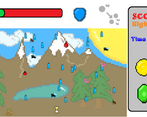
using a written timer, a slider and some boost that give you more time
Cookies eaten
9
Leave a comment
Log in with itch.io to leave a comment.


Comments
Very cool concept. I liked how I could use my coins and emeralds to purchase upgrades to help me when I try again, and not just upgrade for my current game. Adds a "progression" system feel to it. Also good use of the time.
thanks a lot. also, if u have time to explain me, wdym with progression system?
Im saying your game feels like theres a progression system. Because each time I play, I can have upgrades that I couldn't before.
This is so far the most unique and simplest way so far that I've been playing on the game. At first, I was confused on how to close the prompts because it does not have a close button, and the rules are too long.
Nevertheless, great job!
sorry if the rules are too long but sometimes ppl are... sometimes ppl don't understand that much lol anyways to close the shop and the rules you just gotta click again on the shop/rules button, as easy as that. thanks for the awesome feedback, by far the best i received i really appreciate that :)
when I said the rules are too long, i meant the rules are too overwhelming because the rules are placed in a single prompt. It's a good way to divide them (like on a list form or placing them to separate prompts that you can next/prev with) so that players can easily digest them.
sorry for the misunderstanding, and thank you for responding =)
thank u for clarifying. I'll make sure to use your suggestion in future projects :)
It's better to add sound effects. Overall it's a nice game, well done! :)
thanks! anyways, if you increase your volume, you can hear 7 different sound effects i don't know why u didn't hear them sorry...
Very fun little game, feels well balanced to ensure runs are fast but fair and tempt me to try another to see if I can beat my score.
Would be cool to be able to see my highscore from the main menu, so I know what my target on my next run :)
you are absolutely right. I'll write it down to ensure I'll fix this in my next update thank :)
Simple concept but I think it's pretty good! I agree with some of the other comments, a larger hitbox would certainly be nice, and I think it would be better if the items can't stack on top of each other. I clicked an hourglass and as soon as I did a water bottle spawned on top of it and I ended up losing! The inclusion of the shop is good and adds replay value which is nice! With some improved graphics as well (since they're not particularly interesting to look at and since the primary thing you're doing is staring at the screen waiting for things to spawn nicer backgrounds and art would really enhance the game.) I think this game is a great start to something awesome!
thank you I appreciate that as you guys did an awesome game (by far better than mine so it's always awesome to hear people better than you congratulating with you). anyways, if you read the comments there are many ppl asking for a bigger hitbox... i think i found the right balance now, k just need to update the version. sorry for the thing that go one on top of another, it's my first time building in weblg (in the unity version this shouldn't happen cuz i used a list with the rigid bodies). thanks again and goodbye, have a good one!
Some of the most fun I've had over this jam. Well presented, clean UI, a helpful how to play section (minus some typos, that would bring the level of polish even higher).
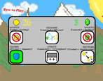
My only real comment is about the shop. I don't really understand why there are two different currencies and why you need 10 emeralds to unlock the multiplier that costs 75 gold, it's a bit confusing and maybe could be reworked a bit. Maybe the emeralds could simply be sold for coins and the whole shop worked on coins? Or maybe the emeralds can be used in a secondary shop page for more powerful buffs.
Other than that great stuff, loved it!
thanks a lot for the great comment! anyways sorry for the typos, I'll look at them asap. also, you don't need 10 emeralds to unlock the multiplier (why are you saying that, what happened in your case)? anyways, I'll make sure to adjust the shop when i can thanks again i really need feedbacks like so that helps me improving :)
oh! I misunderstood then, my apologies, in that case I have no idea what the 10 emerald buff does. I thought it meant you needed this upgrade to unlock the multiplier.
nope sorry if the game isn't that clear. the 10 emeralds buff increases by 1 your highest score
This was quite a fun game. One note of improvement is that I wasn't sure what the athlete item in the shop does, is it +1 to the number of things that can appear on the screen? It might be helpful if the items could have text underneath them with a short item description.
you are absolutely right I'll add that thanks. anyways the athlete thing increase your highest score by one (there is a small above the button if you can read that says that). thanks for the feedback man :) bie
Thanks for the quick response. It says +1 to highest, so I was thinking highest what?
to highest score. if your highest score is 68, you can bring it to 70 with 20 emeralds (example)
It’s simple but fun. I like details like the screen scrolling on start, the timer… I would demand more satisfaction when you smash something. Also it could be nice to change the mouse pointer with something else, like a crosshair
you are absolutely right. I'll do that in the next version that comes out man. thanks a lot
I really liked the idea of the game, sometimes the hit boxes were bigger than I thought so I lost a few times even though it felt like I shouldn't have but overall well done!
thanks for the feedback. btw if u read the comments, many ppl told me to increase the hitboxes size, and so i did. apparently now they're too big lol but i'll fix that asap. rìthanks again, stay safe :)
Hard to hit that sweet spot I guess 😅
yeah lol
It's a cool idea and very fun to play. A little buggy with the hitboxs and the buttons on the menu, and the visuals could improve to be less saturated. But it is really fun to play!
thanks for you words but, as I'm constantly improving my games, I'd like to know which are the 2 bugs you discovered so i can fix em. thanks :)
Sure, in the menu sometimes I couldn't close the shop, I needed to reload the game. And also sometimes the bottles had bigger hitboxes and I lose if I click on next to them.
thanks i'll fix them both!
The game is enjoyable, concept is clear and not confusing, presentation is not too bad and the use of time is great, I think you did a pretty good job on this one nice!.
thanks a lot for the good feedback! i appreciate that
I think that with a few tweaks this can become a very fun game. Improving the visuals and bug hitboxes (making it a little bigger) will make this a very pleasant experience. I couldn't get more than 50 points though, I'm that bad at this.
hello dude thanks for good feedback. i'm costantly trying to fix bugs so it would be great if you could tell me what u found wrong, so i can improve my game. don't worry if your score is low, i (who developed the game and played it for several hours) didn't even manage to make 100 lol (even if i bought boosts!). anyways already many ppl told me to scale the hitboxes up, but i think that would make the game too easy (i made them small on purpose); although if still many gamers want me to make them bigger, i will do it. thanks again for the feedback and i'll make sure to play ur game too. also, if u use the web version, consider maximising your screen please. bye for now!
The thing with small hitboxes is that it can make the experience a bit frustrating when you see the cursor above the bug, click it and nothing happens. I think that if you wan't the hitboxes to be small, you could scale the bugs down to match them. If you think that big bugs might make it too easy, I think you could do something like bigger bugs require more clicks to kill.
Just an idea though, you will probably get comments from people that enjoy smaller hit boxes, it's just a personal preference!
thanks now that you say that i agree with you. give me 10 minutes and i will change. please check it as soon as you can and tell me if it's a bit funnier to play. thanks again
aight i fixed it along with another bug in the shop. tell me if it's now better as soon as you want. thx
Interesting game.
I really like how the menu and the transition to the game are made.
It seems that after the defeat, the objects do not appear on the screen on the next attempt, you have to reload the page.
The time slider can be moved with the mouse, while adding or subtracting time. Funny bug.
thanks for the good feedback and for reporting the bugs. i'll fix both them. and i'll also play ur game asap and rate it. thanks again man!
You don't have to, but thanks!
okay i fixed both bugs. could you please playtest it and tell me if it's allright? thanks dude
Great, everything is fine now👍
awesome!
good concept, good game. though i think the item sizes are pretty lame. maybe you should scale them to be bigger? i know this is your first game but i hoped you would figure. dont be discouraged by my comment and review, cause lets be honest here, you made a game and thats true.
Hi again man. I'm sorry if u misunderstood, but that's definitly not my first game lol, i just haven't uploaded them on itch (i used playstore mainly and steam once). It's just that i did it in 5hrs and 32 mins (i recorded) cuz i had school. Anyways thanks for the comment. Hope u rated it well hihi :) bie
oh alright
Good start! Though I encountered an issue where only two bugs appeared on my first playthrough then none appeared after that.
Thanks for the compliment! I know about the bug and i just fixed it; i will upload a new version right now. Please play the game and enjoy. Thanks again for the feedback, i'll play your game :)
Hi quick update: i uploaded the new version as well as a web version. Please play it and feel free to rate it! Hope u enjoy, bye for now
i recommend you put a way to play the game without downloading it, that way people wont get scared thinking your games a virus. not rating this one
Heya man. Thanks for the suggestion. I just uploaded a "play on browser" version of the game. Hope you like it and please rate if you have time (that makes me understand how to improve)! Bye