Play game
Another day Reaping away's itch.io pageResults
| Criteria | Rank | Score* | Raw Score |
| Use of the Limitation | #3 | 3.947 | 3.947 |
| Enjoyment | #21 | 3.421 | 3.421 |
| Overall | #28 | 3.447 | 3.447 |
| Concept | #29 | 3.526 | 3.526 |
| Presentation | #62 | 2.895 | 2.895 |
Ranked from 19 ratings. Score is adjusted from raw score by the median number of ratings per game in the jam.
Team members
2
Software used
Unity
Use of the limitation
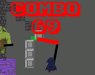
Attack using your health bar scythe! The lower your health, the more range you get.
Cookies eaten
0
Leave a comment
Log in with itch.io to leave a comment.


Comments
A good use of the limitation, that, cool. Was thinking of lazer swords while playing...
24 seconds before the deadline - how.
The balancing of health and scythe length was a very original creation. The Dash effect was cool, reminded me of Hyper Light Drifter. The scythe boomerang move was also very fun to use. Also liked how the character faced the direction of the cursor.
Amazing game!
Thanks, Hyper light drifter and Hades are some of my favourite games, and I am definitely happy about my contribution to the genre :)
A very original and well realized idea
loved the boomerang, i used it a lot. the sound fx work really well. fun game, good work.
Clever use of limitation. Fun gameplay.
Wow, that was fun. I think the idea for the limitation was clever. I also really like how you setup and displayed the tutorial. Great work.
Thank you!
Fun game and took the limitation quite literally :D Had fun with it good job!
Thanks!
I love it! The art style is astonishing, the music is great and I kind of resembled it to another music I liked to listen when I was a kid. I liked the idea that your healthbar is your actual weapon! In conclusion - would play again!
Thanks, I made the music and a few sound effects myself using LSDJ, which simulates gameboy audio
Oh wow, I have never heard of LSDJ, I just use BFXR and BOSCA CEOIL. I'll make sure to check that out.
Got 4200 gold. It was really fun. I like when the goblins send these purple things haha. It was quite challenging. Great job!
Thanks, I am glad you liked it!
Got 4500 gold :) Was a lot of fun, I love how the difficulty increases overtime. Also nice graphic and controls well. Chasing high scores is addicting. Thank you for this fun and challenging game!
Thanks!
4100 gold and a 35 combo (no biggie)
This was a lot of fun. This game feels really good. Aside from a little learning curve and some potential fine-tuning, this game has it all. It has some simple options to play, but once I started experimenting I found myself switching constantly between moving, attacking, throwing my scythe, and healing from my combos! I didn't utilize the roll as much. I think because I would have preferred to roll in the direction I was walking.
Not only could you explore this game further and come up with some amazing levels, but I would also imagine a beautiful futuristic society where this game is in 3D.
solid 4.5/5 entry here.
Thanks! I am glad you enjoyed it
Dang this game is going on my game that if it just had more juice it would be perfect. Honestly I had a blast playing this one, the enemies dont have contact damage (yay) they all have different moves, movement felt just right, the combo system was clever and encouraged risky gameplay. A really really fun entry.
I feel like the entry is being held back by lack of juice and feedback. A small list of things that would have added a ton imo:
Screen shake when you got hit, enemy flashing when hit, animations, particles on hit, A smear frame that showed how long the attack hit box was out maybe, Screen freeze. The list is infinite but the more you add the better tbh. The person below linked a perfect video but here is a second one.
You made a seriously great game, I enjoyed it quite a bit!
(Plus Im happy to see someone take the litteral "Your HP bar is a weapon" approach)
Thanks for the feedback! I am working on adding some juice right now. The hitbox is visible by a slight color change on the red part of the scythe, I have been playing around with it for a bit, and I think it definitely needs something more.
I have updated the game with a bunch of your suggestions, and damn it really do make a difference. Thanks for the great feedback!
Super fitting with the limitation, I was going to make something like that as well. I think one thing this game can benefit from is the juiceness, just like our fellow dev below is saying. Good entry!
Very True
Good advice, I added some more juice and hitting enemies feels much more satisfying
I definitely appreciate the 69 combo in the header.
anyway, using your health bar as a blade for your scythe is a really good idea. However, I feel like it's missing feedback for when you hit enemies, something like screenshake, or them flashing, a sound. Dashing should send you in the opposite direction IMO, since you're always facing enemies to throw the boomerang. Also, even when my health is at max the bar shows a bit of red, I know how to fix this in unity, let me know if you haven't fixed it already. And I would make the blocks that stop you a different color, they blend in with the background, especially when there's too many enemies on screen.
overall really fun!
You can only hit people with the red part of the bar, so there is a little extra to stop your weapon from being useless lol. Flashing enemies is a good idea, and I should definitely make it clear that the last part isn't actually missing health. Thanks!
I added a small black outline to the red part that stays constantly, and much more effects when you hit the enemy. Also the blocks are much easier to see at a glance now. Thanks for the great feedback!
Its pretty unique, your health bar is literally your weapon, pretty smart right there, the art style is good, I like the light sabers that the skeletons hold, but I think you should’ve added a start screen where it explains the controls and stuff and so it wouldn’t just start right away, nonetheless, pretty fun!
This inspired me to add a tutorial, check it out!
The tutorial is simple and effective, Good Job!