Play game
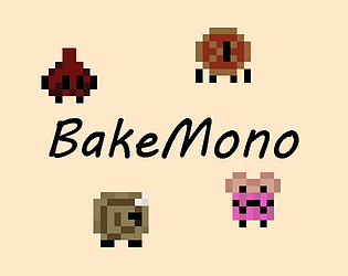
Bakemono's itch.io pageResults
| Criteria | Rank | Score* | Raw Score |
| Concept | #13 | 3.733 | 3.733 |
| Overall | #41 | 3.200 | 3.200 |
| Enjoyment | #44 | 2.933 | 2.933 |
| Use of the Limitation | #46 | 3.267 | 3.267 |
| Presentation | #49 | 2.867 | 2.867 |
Ranked from 15 ratings. Score is adjusted from raw score by the median number of ratings per game in the jam.
Team members
2
Software used
Godot
Use of the limitation
We only used two buttons?
Cookies eaten
surprisingly, 0. but lots of pie and cake
Leave a comment
Log in with itch.io to leave a comment.


Comments
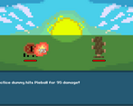
The cooking part was busy and fun. The fact that the result is a monster is also outlandish and interesting. However, my monster was beaten down by a practice dummy while I was confused about how to control it. If there were less elemental, tutorial levels, I think I would have understood and enjoyed it more. Good job!
Wow, the idea of crafting with food it’s awesome! I like the style of the characters, it would be great to keep the same style in all the game. Also I just missed some music in the background but very interesting idea!
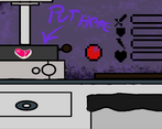
I think this is a cool proof of concept. It's cool that you have different actions you can do with different kinds of food, but it feels really difficult to actually multitask, especially since the right click seems to not work reliably when an ingredient is still in the pan. I also think the pot could be clearer, I was never quite sure what I was doing there. If you decide to keep working o this, you should try and find a way to put some strategic depth in what you put in the mixer and definitely make multiple tools compatible with multiple ingredients.
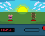
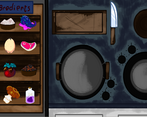
I also agree with the other commenters saying it'd be better to stick to one art style. I think the one in the kitchen with the ingredients is clearly the stronger one out of the three. I could see an argument for making the battle look different, but the two areas in the first phase should definitely look more similar. I also agree that those two areas could and should be a single screen.
Despite the many small negatives I brought up, I think this was a very good submission. You guys can definitely be pleased with what you accomplished.
Thanks for playing! I think clarity is actually the biggest issue with our game right now, and the first thing I would address if I continue to work on it! The specifics of the gameplay can feel outright unintuitive without proper explanation. Originally every ingredient was usable with every tool, but I just didn't have time to code unique effects based on preparation style so I limited them. And yeah, where the art styles clash in the first phase was definitely something done for lack of time!
Thank you so much for all the thoughtful feedback and the kind words! I'm definitely proud of the work my partner and I produced given the time allotted!
Really cool game concept, I think I would of liked the kitchen more if it was all one screen going back and forth didn't feel very fluid.
All in all really cool.
Thanks for trying it out! I'm workshopping some ideas to make the first phase feel more unified, because the transition can be jarring I agree!
Basically, I was going to write my thoughts in detail, but ReallyOkeyFruit summed up really well what I thought about your game. Good job!
Thank you for playing!
Great Game. Really liked how each ingredient needed to be prepared not only in a different place, but with a different mechanic. Although my bakemono was completely and utterly wrecked in the end XD.
3 Things I think you guys can improve. I really liked the art, but the mix of different styles threw me off a bit, I don’t know if it was intentional. Music and sound effects would do wonders, I know that 3 days is very little, but next time try to squeeze some simple stuff in for flavor. And the controls were a little but too sensitive, I ended up stopping a task midway, because I moved the mouse a bit.
Apart from that, great work and keep em coming!
Thanks a ton for playing! The mix of art styles was a decision made because of time constraints lol. I like the mixing styles a little but would have preferred to have them be completely distinct at the least. I actually just updated the game with sound! Although some of the audio compressed a little weird in browser, the game is still much better for it! I also noticed a bit of sensitivity issues with the tools, but that was under audio in our priority list so it still needs tweaking :) thanks for all the helpful feedback!
Wow, super awesome. I’ll have to replay it to listen to the changes.
Regarding the art, making them completely distinct would probably very cool as it would make it into a style of itself, at least I think, I’m no expert
But Good Luck! I’ll come back with feedback after I replay it ;)
Pretty good game! The art is pretty nice and its got a lot of stuff to do and optimize. The four different mechanics for making things is nice, especially the fact you can do them all at the same time.
Here are some things I noticed
Thanks for playing and thanks for the great feedback! The art is actually a blend of styles, I did all the pixel art :) . I know it messes with the vibe but we were a little short on time lol! We also wanted to include a better explanation of the mechanics but yeah again, time caught up with us! We're planning to update the game with a little more polish after the jam period!
I found your use of several mechanics to be interesting, especially the mortar/pestle. I thought the ingredient artwork was unique and otherworldly too. Would've liked to have some sound or music though. Keep it up!
Thanks for playing! Sound is coming, but I usually implement it last and just didn't make it in time for the submission deadline!