Play game
Margonem Adventures's itch.io pageResults
| Criteria | Rank | Score* | Raw Score |
| Overall Pitch Quality | #6 | 3.875 | 3.875 |
| Engagement | #7 | 3.625 | 3.625 |
| Clarity | #8 | 3.563 | 3.563 |
| Unique Selling Point | #13 | 3.375 | 3.375 |
Ranked from 16 ratings. Score is adjusted from raw score by the median number of ratings per game in the jam.
Judge feedback
Judge feedback is anonymous and shown in a random order.
- Great visuals and nice-looking trailer. You've done a great job with the Press Kit! Suggestions: -- Include gameplay in your trailer. -- Set up a Call to Action link : This could be a Google Play page where people can Wishlist the game or a mailing list so they can get notified when it comes out. (Follow on Itch is probably not going to be very effective for a mobile game) -- Could include a Minecraft meets XYZ game type description -- lot of people like this type of breakdown.
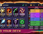
- Visuals are great Would like to see more examples of the cards being used in combat Video in tweet is effective but it would be great if the journey through the tunnel stopped at the door and the door opened to reveal the title Would like to know more about retro gaming re-imagined
- Very clear USP. The presskit a bit hard to read due to background images, but good info.
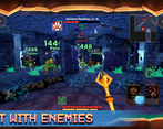
- A render of gameplay would help in understanding how these dungeons tie into a deckbuilder style game.
- Feedback submitted as Indie Legion.
- I am intrigued by the setup, slow cinematography and the music also complements the foreboding nature. I think it just lacks that punch to sweeten the deal. I was hoping for more by the end of the stinger clip.
PitchYaPitch Tweet
https://twitter.com/Margonem_2/status/1452594500405186562?s=20
Press Kit Link (DevLog Update)
https://docs.google.com/presentation/d/1gkS9FrPLXh39O64EsZcV9lhVpg2dyqcL1Yo2s5Qnh-Q/edit?usp=sharing
Leave a comment
Log in with itch.io to leave a comment.


Comments
Clean & concise pitch - and love the art/design!
I like the tweet itself and thought I had a good idea of what to expect. When I watched the trailer I then felt lost. Would it be possible to get some gameplay in there? I have no clue what the cards do or how they interact with the rest of the game even though they appear to be a unique selling point.
Dumb question - how does this tie to Margonem 1 ?
Both games partly share the same lore - but that's about it (at least for now). Margonem 1 is a browser MMORPG, and Margonem 2 is a step in a bit different direction :)
Very clear yet concise pitch, straight to the point, and great looking! I would try and add the card crafting mechanics in the tweet, as it seems to be one of the main selling points, but I understand it's tricky in a short tweet!
Feedback submitted as Indie Legion.
Great visuals and nice-looking trailer. You've done a great job with the Press Kit!
Suggestions:
-- Include gameplay in your trailer.
-- Set up a Call to Action link : This could be a Google Play page where people can Wishlist the game or a mailing list so they can get notified when it comes out. (Follow on Itch is probably not going to be very effective for a mobile game)
-- Could include a Minecraft meets XYZ game type description -- lot of people like this type of breakdown.
Suggested Tweet Edit:
Margonem 2 is a pixel-art tribute to retro dungeon-crawlers with RPG deckbuilder gameplay.
Don’t mind the darkness… It won't mind you.
Grim Dungeons🕯️
Fierce Monsters👻⚔️
Deckbuilding🎴
Crafting ⚒️
Free to play 🪙
Mobile 📱
Follow👉https://garmory.itch.io/margonem-2
#PitchYaPitch
I think the pitch is very good, and your video is also well made. They just don't seem to match unfortunately (which I think is just based on how much you've done looking below). I don't know if there's any other media you can use instead of that video which more closely matches the description? Either way, game sounds very exciting and I'm looking forward to what you build :)
I LOVE your art!! My critique is, one of the main selling points is that it has cards and monsters to fight, but I don't see the cards, the monsters, or any fighting in the trailer. So it just looks like you explore dungeons. I guess you're still in progress though, and at least there are cards and monsters in your art. The song you picked for the trailer too doesn't seem to have high energy either, but of course it's a dungeon song so that makes sense. My critique is just things that you probably would'nt have been able to implement anyway since your game is mostly unfinished, so, good work overall for what you got!
Your video on the twitter is look really nice but there is to much info and nothing finish.. I think there should be some direct point for user to lead them to where you want
Well, there is a link to Itch.io in the Tweet - but you mean in the video? Good point - we could work on that. Thanks for feedback!
So much mood in that video.
Was kinda thinking to critique not showing how the game is actually played but perhaps it's not a bad idea to keep a bit of mystique?
Thanks for the feedback! Like we said below: some concepts still change rapidly, and are in very work-in-progress state. But we were going for a bit of secrecy to keep things interesting :)
+ Mystically fascinating and piquing of curiosity
+ Enchanting graphics and mood
- Gauges, establishes interest but doesn't unravel it to satisfaction.
- I was swayed by the "pixel art" in description
Thanks for the feedback! There are still things we are actively working on - i.e. some of the game mechanics. Some concepts still change rapidly, and are in very work-in-progress state - so we decided not to show all of them just yet.
Maybe use the word voxel art instead of pixel art?