Play Exceptional game
The Haunted Haze's itch.io pageResults
| Criteria | Rank | Score* | Raw Score |
| Originality | #8 | 4.000 | 4.000 |
| Enjoyment | #10 | 3.313 | 3.313 |
| Overall | #10 | 3.594 | 3.594 |
| Gameplay/Design | #11 | 3.313 | 3.313 |
| Theme | #17 | 3.750 | 3.750 |
Ranked from 16 ratings. Score is adjusted from raw score by the median number of ratings per game in the jam.
How does your entry fit the theme?
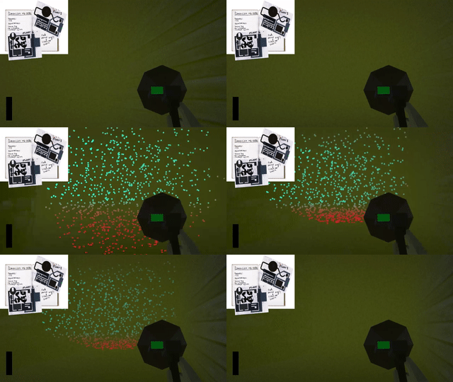
Our game uses sonar, which relies on echoes
What would you like feedback on?
Player experience
What assets did you use (if any)?
Unity Starter First Person Controller
Royalty Free Audio Tracks
Free Unity Assets
Leave a comment
Log in with itch.io to leave a comment.


Comments
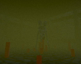
This game is amazing! I can't get enough of how you've incorporated the theme into the mechanics. It's such a unique concept that works brilliantly for a maze game. And that monster... It genuinely gave me chills! The first time I encountered it, my heart skipped a few beats. As someone who has played my fair share of horror games and rarely gets spooked, that thing managed to scare me! (I'm pretty sure my soul flew away from fear!)
Now, onto my two main points of feedback. Firstly, I felt that the AI could use some improvement. I found it relatively easy to maneuver around them without much consequence. Adding more challenging and dynamic behavior to the AI could enhance the overall experience. Secondly, and this is more of a personal preference, I wasn't a fan of the fog color. The greenish hue didn't quite appeal to me, and I think a more neutral gray or even black, with the sonar doubling as a light source, could create a more atmospheric and visually appealing setting. Of course, this is just my personal opinion, so take it with a grain of salt.
Despite these minor critiques, I want to emphasize how much I genuinely love this game. The fact that you managed to create such an enjoyable experience in just three days is truly impressive. My feedback should in no way diminish the fact that I had a fantastic time playing it. You guys should be immensely proud of your accomplishment. Well done! ^^
Thanks for playing and giving your feedback on the mechanics and your experience!
I'm glad we almost gave you a heart attack (not literally) and its great to see that someone who has previous experience with horror games has enjoyed our game so much, this really means a lot to us. we have gotten a lot of comments on our enemy AI so we know where to improve on it if/when we develop the game further. I will take note of your fog hue suggestion and play around with the colors during development.
thanks again!
I really love the asesthetic and the implementation of the lidar like scanning. It felt responsive to press, like I always had good control over the player. I also really enjoy the sound design, it helps create an uneasy atmosphere. Like some others said, I think the main thing to work on would be making the monster more lethal/more intelligent.
Thanks for playing and giving feedback!
I really like the sonar mechanic I think it was implemented in a really nice way, especially how the distance the object you are detecting is changes the color of the little pings. I will say though I escaped without actually ever seeing the monster so I don't know if I got lucky or something. Overall it was really nice and I liked it, kind of shocking to see what you could do in just 3 days
thanks for playing and giving feedback!
yeah there's a good chance you just missed the enemy because the AI isn't the best unfortunately, but we are planning on improving it.
Was very scary untill i actually saw the monster and simply just walked around it, i really like the distance-gun-thingy, how di you do that? just a bunch of random raycast and place Objects where they land?
In essence yes, it involved a bunch of raycasts that spawned sprites on a canvas in relation to camera screen space. It what the trickiest part of the project to try get working, but very happy with how it turned out
Thanks for playing!
Amazing work for such a short amount of time! First time encountering the monster I was scared shitless lol
XD, glad you got shit scared :) thanks for playing!
I did not understand anything, where as somewhere there were arrows, went some man, prrkolno was shooting and using it to navigate, but then I still do not understand, although I walked a long time, it was necessary to find the key, and I found it, and then, not for me such games, but I found nothing wrong, I myself did approximately one where it was probably difficult to find anything, although I had a path go and all
thanks for playing and giving feedback!
did you read the description? what did you not understand?
This was a very cool game! Just from seeing the screenshots and description I thought of the lidar game and It Steals. I did not finish the game because I am quite busy. But the user experience was great! I enjoyed the the ambiance of the environment and most of the sound design.
Now for if you would like small nitpicks and feedback
But in total, very good game! I gave it good ratings and I just wanted to share my bit of feedback
Thank you so much for your feedback :D
-We were actually wanting to increase the lethality of the monster, but were worried about making it too diffcult so we opted to lean on the easier side, however seeing everyones feedback I definetly do think we will make it more dangerous!
-I also really like the idea for the more transparent enemy, we will probably look at implementing that as well.
-Also thank you for your notes on the colors, we can definetly adjust them without too much issue, we kind of just went with colours that stood out initially.
We really appreciate your detailed feedback, its very helpful. and we are glad you enjoyed the game :
Thanks for playing and giving a lot of good feedback, its greatly appreciated!
I cant add much to what Alex already said, but I will say that I advocated to make the enemy easier, that was a mistake on my part :(
Thats all good! Dont worry too much about design decisions early on in development because that difficulty is subjective and its just about figuring out what kind of audience you want to market your game to and what makes it more fun(and fun is also subjective! Its a tough topic lol) :).
It's a good thing holding your breath makes you completely invincible because oh my god that monster is annoying. There are tons of case where it just stays with you for hours without moving and you're just stuck until it finally decide to let you go. Combined with the "hold space to hold your breath" pop up keep reappearing everytime he's around meaning you don't even have to keep track of where he is, and it completely ruin the creepy atmosphere that is otherwhise extremelly convincing.
The fog, the sounds, the low-res textures, all of it works really well ! Especially the sonar which is a really interesting mechanic ! I'd love to see a more polished version of the game with a better AI because this game has a lot of potential.
Thank you so much for your feedback!
We do want to overhaul the UI a bit so its less of a popup and more of a screen effect perhaps. we also want increase the lethality of the monster seeing as a lot of people found it too easy to avoid.
we are glad you found the experience interesting :)
Thanks for playing and giving feedback!
yep the enemy has a few issues and we are planning on making some major changes to it. I'm glad you think this game has potential because we are planning on polishing it into a more complete experience.
Very fun!
I will say that despite many close encounters with the monster it never actually killed me aside from when I intentionally let it do so, perhaps try increasing it's lethal capability through either a speed increase or more attack range. It also has some issues with its pathfinding, I'd often see it stuck on tables and walls, but that's always a nightmare to program especially in short jams like this one. Also I recommend having the key spawn in a random location along with the player as my second playthrough was much easier knowing where the key was.
That being said I absolutely loved the sound design and visuals. The area was fun to explore and the mechanic was extremely fun to use. I think if you all continued work on this past the jam you could have a wonderful product, great work to all of you!
Thanks for playing and giving your feedback!
the key and player do have random spawn locations, they probably spawned twice in the same location :( I didn't code the enemy ai but my teammate was putting a lot of work into it, unfortunately we had to move our focus to other things. glad you had fun :)
Oh after checking I can confirm I did just happen to get the same spot for both the player and key twice so you can ignore that portion of my feedback lol.
But yeah I totally understand the issues with the A.I., it can be quite a painful undertaking especially with strict time constraints. Best of luck in your future projects!