Play game
Bounty Bash's itch.io pageResults
| Criteria | Rank | Score* | Raw Score |
| Creativity | #30 | 2.571 | 2.571 |
| Adherence to Theme | #33 | 2.429 | 2.429 |
| Design | #37 | 1.929 | 1.929 |
Ranked from 14 ratings. Score is adjusted from raw score by the median number of ratings per game in the jam.
Leave a comment
Log in with itch.io to leave a comment.


Comments
Good start. I included your game in my Pirate Jam Pre-Jam Skirmish compilation video series, if you’d like to take a look. :)
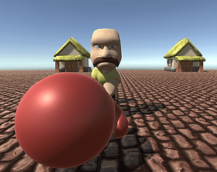
Punching pirates. What's not to love? Great character assets although controls and interface might have been better given more time I suspect. I think changing the camera position might help as well. Great job!
I like the mechanic, I would love if it was snappier. Also I think the bounty targets could be a bit clearer if you had more time! Cheers
good work. 👊
Bash them all!. Good job.
Nice models and punching was satisfying. As others have said easier movement would have been nice. Great work!
Punching the pirates was very satisfying! I enjoyed how the characters look. Congrats for making the game!
Agree with Steven's comments, I feel this game would be a lot more fun with a better control scheme and UI. I do like punching pirates though.
Thanks for playing!
An interesting game marred by less than great controls. Great character modeling.
Really feel like the base mechanic of running around with a puncher could be pretty fun if built more dynamically.
Thank you for taking the time to write such comprehensive feedback. I agree with all of your points. I made a huge mistake by spending a lot of time on the models and animation, which meant that I ended up submitting my testing level with UI that was hacked together within 20 minutes of the deadline.
The original plan for the bounties was actually a bit more complex and the world was meant to be much bigger, which I think will solve some of the "waiting around for a pirate that you're probably not going to reach" problem.
As for the UI and controls. Agree that in it's current state it's very uncomfortable, but I think the right click to move might still be a viable scheme. I think the discomfort is mostly being caused by the camera position, which is actually only where it is because I was testing animation and forgot to put it back. With the camera in a more Top-Down position and if the move speeds of the character, the punching glove and the pirates are balanced, I think the right click to move will play a lot like a MOBA. What do you think?
Also, great job on Crimson Soil!!
Maybe, but the moba genre relies on many different skills and a much bigger overview. This game has no focus on multiple skills and strategic maneuvering. It has one straightforward skill with a very small contact window and a pretty big delay. I really don't want to moba controls with these mechanics.
If you're trying to design a moba-like game, then start with moba-like premise in mind, I think.
And thanks! :)
The game is pretty simple, but done well enough for what it is. In the future I'd suggest trying to make your UI much clearer: since it's a reasonably quick game, the player doesn't have time to read all the text along the top while aiming their hits. Even something as simple as color-coded counters along the top would let the player know their current targets at a glance:
Keep working at it! :)
Great feedback. I couldn't agree more. I came right down to the wire on this one and the UI definitely suffered as a result. I have a long list of things I didn't get to on this game, and proper UI is right at the top. Your game Coconut Chocolate Bar Bonanza will definitely be in my inspiration list on my next jam to remind that execution trumps higher poly models and animations.