Play game
Mr Shadow's itch.io pageResults
| Criteria | Rank | Score* | Raw Score |
| Gameplay | #42 | 2.309 | 2.667 |
| Theme | #46 | 2.502 | 2.889 |
| Sound | #47 | 2.021 | 2.333 |
| Overall | #54 | 2.117 | 2.444 |
| Aesthetics | #65 | 1.636 | 1.889 |
Ranked from 9 ratings. Score is adjusted from raw score by the median number of ratings per game in the jam.
Leave a comment
Log in with itch.io to leave a comment.


Comments
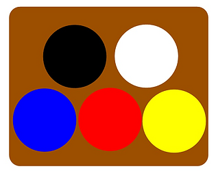
I did not see that the level name was the next color so it was quite hard, but still quite interesting! With enough time, it is not that hard to get the good color by trial and error even if we don't know the exact blend :)
thanks for the comment, in the future I'm planning to put more levels so to speak, and colors I wanted to do combinations of 3 colors too, however, due to some factors I had to leave it out but who knows in the future.
I am a big fan of color-based puzzle games, so this was definitely an interesting take on the theme. The bones of what you have here are pretty solid, but could definitely take a lot of polish and design iteration. One suggestion I have is to add a button to quickly clear the current color, as it can often be difficult to tell which state the player currently is in: whether a single click will mix colors, revert to white, or just select the color as is.
Thank you, I even thought of making a button like this, but due to time and incorrect mixing, it tends to turn white.
I intend to polish it in the future, thanks.
I don't understand why others are saying it has nothing to do with the team. Didn't they read the description of the game?
I first found it too hard, not enough time to mix the colours. But then I read your comment about the name of the current round being the colour for the next round. Then it became very easy. And with that also boring. I let myself die after I got to 42 points.
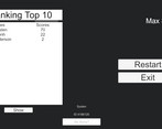
One issue I found: On the leader board the names and scores don't line up properly because the #1 name is too long.
Thanks for the comment, in the future when I can I will try to limit or grow the field of names a little more, because a very big name means that the scores are misaligned, in the case of difficulty due to the little time and not to make the game too difficult, I ended up choosing limit the colors and leave only one scam, but in the future I intend to do a rereading even with pixelated graphics, with a story but exemplified, because as you said many are not reading the game description.
Turned out more dificult than I expected but wtill interesting.
I'd suggest adding hotkeys for coler selection. I think that would make mixing easier to do.
thank you for the comments, in case you would have an idea of how you would like this shortcut keys so that I can study
I think anything would work just fine.
[Q,W,E] for main clolors; [R, T] or [A,S] for black and white. Even number keys [1-5] would be fine.
I understood
I liked the concept, it is not very theme related but I can see a lot of potential in this game !
I liked the concept, it is not very theme related but I can see a lot of potential in this game !
I like the concept but found it very hard, think it'd be better if there was a bit more time to figure out which colours to mix before you lose, I guess I'm not the best with colours maybe as I didn't always find it obvious which ones to mix lol
the colors to mix are, I believe if I didn't get it wrong, the same as in real life, I didn't put it in the description because I thought it would end up making the game too easy, I know that in the beginning it's difficult I ended up beating myself a little, that there wasn't recorded color blends.
Interesting game, I liked the animation of the spotlight!
Thank you, I'm very happy
It's monotonous, it's not clear what the next color will be, so you don't have time to react, you can add speed to each subsequent one, starting with a very slow one. Also, not exactly about stealth, but despite the criticism, the game is not bad.
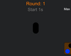
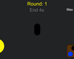
thanks, the color of the scan light is the color of the roun's letter, below there is the team saying the time for the start of the round and the time for the end, thanks for the comment, I did something minimalist similar to those escape lights from prison in the movies that locates the fugitive.