Play game
Kill The Alchemist's itch.io pageResults
| Criteria | Rank | Score* | Raw Score |
| Aesthetics | #16 | 3.793 | 3.793 |
| Sound | #29 | 3.034 | 3.034 |
| Overall | #31 | 3.103 | 3.103 |
| Theme | #44 | 2.828 | 2.828 |
| Gameplay | #64 | 2.759 | 2.759 |
Ranked from 29 ratings. Score is adjusted from raw score by the median number of ratings per game in the jam.
Leave a comment
Log in with itch.io to leave a comment.


Comments
Too easy to accidentally walk into the boss, but other than that, this was great. The idea of letting the player leave with their score or let the boss mutate and potentially get a higher score is a really cool take on the theme.
Fun game, great visual polish! It was a little hard for me and I only got to see a few mutations, but it felt pretty fair except for the player's dash attack which almost always seemed to damage me so I would never use it
Very cool idea and realization. As for me, too difficult in the beginning, but overall I liked it!
Definitely enjoyed the artstyle and the overall animations for the game, very satisfying game loop aswell!! Great job!!
Thanks for playing!
Super cool animation style!! Love the art direction for this game!
Oh, this slaps!
What a cool gameplay-loop! I'm sure I don't need to mention the difficulty. I would've loved to see some of the other mutations, but I'm just not good enough to see that content...
Personally, I think that while the animations are crispy, there needs to be more of a telegraph on the Alchemist's attacks. I'm sure with enough time you could learn what each pattern does, but given the fact that this is a short game, players need to be able to pick up on them quicker. The hitboxes also seem quite unforgiving.
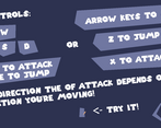
I was not a fan of attacking in the direction you're moving. I felt like I didn't have enough control of my character in an already movement-demanding game.
The aesthetics of the game are top-notch, but there needs to be more attention to the polish.
Thanks so much for the feedback! While making the game I thought the telegraphs were too easy, boy was I wrong, I forgot that because I literally made all of them, obviously I can see them coming. Attacking in the direction you move was something I thought I would try out to see if it works, and I agree that it probably doesn't. (It was also the easiest to implement given the state machine I was already using). yes the hitboxes are absolute bullcrap, I wish you could see them XD. Thanks again and thanks for playing!
The visuals are awesome, the animations too. As other comments mention, I believe the game just needs to be a bit easier and the alchemist movement slower.
Thanks for playing! Fs, just needs to be more balanced imo
Very cool game, the art style in very clean, same for animations
Thanks! The art is something Im pretty proud of :D
Cool arts style! As people mentioned: more i-frames a bigger sword attack hitbox or a small boss attack delay would make the game more enjoyable.
More i frames is probably a really good idea, and the boss definitely needs to be more telegraphed. Thanks for playing!
Kool game! Pretty difficult but still enjoyable! Really liked the gameplay and the art! Really kool way to add the theme as well! The sound is also quite good.
Im glad you had fun despite the brutally unfair difficulty lol. Thanks for playing!
Cool game! love the artstyle but it is quite difficult, I think more iframes and the boss only doing damage if they're attacking would go a long way
Thanks for playing and even more for the feedback! I will definitely be implementing the things you talked about in the future. Shame I didnt figure those out for the jam entry tho 😅.
Great game! Shame that the gameplay is too frustrating, the alchemist shouldn’t do damage if you touch him, only when he does he attack. (to allow the player to have time to react) Honestly, I think you are onto something here, definitely continue to iterate! :)
100% agree. I never thought about disabling the boss’s active hitbox until I got feedback tho, I thought it was necessary lol… definitely will be changing that in the future. Thanks for the encouragement to keep on developing!
This is badass game! The fact that there is like a combo system for the attacking and it feels like an anime style of fighting is so cool. Its a bit on the difficult side but I am sure if you play it long enough you should be able to kick that bosses but. The art also fits the game really good and the way you spaced the UI to look cartoony! Fabulous! Overall I loved this game!
THANKS A BUNCH! That all means a lot, Im glad you liked it!
Fun and challenging game with a simplistic art style that works quite well. Unfortunate I couldn't get far enough to see more mutations.
Yeah I made it a little too hard didnt I... Thanks for playing tho!
Really really fun and unique entry! Suuper hard though. It feels like sometimes the sword dash doesn't give you i-frames. Had a lot of fun with this one!
Thanks! I always make games too hard apparently… even though I thought I was being conscious about it this time :P, and yeah the dash is probably the buggiest thing about the game unfortunately. I assure you It probably does give i frames at some point lol
I've been struggling with the same thing for all my years of game development, lmao. Players always suck at your games more than you can ever plan for, that's what I've learned. ^^