Indie game storeFree gamesFun gamesHorror games
Game developmentAssetsComics
SalesBundles
Jobs
TagsGame Engines
A jam submission

Diary of a Recursive DreamView game page

"Recurser", the machine that makes you dream... But can you wake up?
Submitted by Flat White Canvas, psy_wombats (@psy_wombats), Frogge (@FroggeDev), Jamie Obeso (@GLJamie) โ€” 9 minutes, 4 seconds before the deadline
Add to collection

Play game

Diary of a Recursive Dream's itch.io page

Results

CriteriaRankScore*Raw Score
Story#33.9583.958
Aesthetics#143.8753.875
Sound Design#322.9172.917
Enjoyment (Best Game)#363.0003.000
Horror#452.6672.667

Ranked from 24 ratings. Score is adjusted from raw score by the median number of ratings per game in the jam.

Leave a comment

Log in with itch.io to leave a comment.

Comments

Submitted(+1)

oh my god this is insanely cool. kind of starstruck you played my silly game, now. how the hell did you complete this in time???

def the spookiest thing i've played in a while, and i loved it. my favorite i've played so far for this game jam -- would be surprised if anything beat it. 

the only criticisms i can offer are that the map was a nightmare (pun intended) to navigate and felt kind of inconvenient/irritating at points.  i also thought that while the music in the darker areas was really well-suited, the daytime track wasn't the best.

i only complain about anything because the rest was perfect. seriously kudos!!!

Submitted(+1)

i can't belive this was made in a week, pretty awesome!

Submitted(+1)

Great game and story! The art style and aesthetics were amazing, and the music was really good too! Really good for being made in a week!

The best part in my opinion was when I was trying to turn backwards, but it wouldn't let me and started pushing me forward. That was really cool!

Submitted(+1)

Very nice! awesome for a weeks work

Submitted(+2)

This images, atmosphere and aestetic is insane!
Theme also very good, this is neat for horror.
Plot is nice, as characters and dialogues.

In my opininon, contol is somehow tricky and sound is bit too loud.
But game is awesome.

Submitted(+2)

Very nice game overall, it reminded me of The Silver Case somehow, which is good, also nice Philip K Dick vibes from the plot. The visual style and music were good too. Unfortunately I still have to finish it, maybe I'll update my comment when I manage to. 


I only have 2 minor suggestions: maybe give the option to use a different movement system similar to The Silver Case in which you don't use the mouse and when you press left/right the character just turns 90 degrees: it would streamline exploration in my opinion. 

The other thing is just a nitpick I guess but, have you considered using a non-serif font for the dialogue? I think it would fit more with the atmosphere of the game.

Good work!


Developer(+1)

Thanks for the feedback! Yeah we weren't quite able to shore up some of emptier segments in the middle. More streamlined controls could certainly help -- we were also thinking something like fixed perspective and no movement within rooms.

I really like Silver Case, so I guess some of that influence shows haha. And the composer (Jamie) was directly going after a DanganRonpa feel, which was composed by Masafumi Takada, also behind Silver Case music.

Submitted(+1)

this is so sick!!!!! the art style made it feel nice n dreamlike. the premise and the characters were all very interesting. clean as hell for a jam game.

Submitted(+1)

Nice game! I really liked the story and the characters. The artwork is cool. The ambiance during the night scenes feels great. It felt like a visual novel version of some episode from black mirror. Great entry! ๐Ÿ‘๐Ÿป

Submitted(+2)

This was a really cool project! Loved all the hand drawn characters and textures. The highlight shaders were a nice touch and the atmosphere during the darker scenes was really well done. I can tell a lot of work was put into the story and progression of the scenes in the game too! 

Good work!

Submitted(+2)

The part that impressed me the most is the visuals! They are very appealing and beautiful, the intro scene was really well designer, the effects and the welcoming into the world. I think there was a sudden shift of tone with the music right after the entrance it was a bit jarring at the beginning, but then as the game begins to flow we are caught back on by the visual style. 

I think overall the game has potential! 

Suggestions: 

-I feel like the music at the beginning was a sudden shift, maybe a bit more somber or mysterious music would do better as a transition for the initial scene. 

-A bit less wandering would help as well, I found myself lost some times, is not bad to have some linear objectives right away. 

Overall with a bit more polish I think the game would be elevated quite a bit!

Developer(+1)

Thanks for playing and taking the time for feedback! I'm definitely going to be looking at some revision post-jam based on the info here (and a couple of other posts) with an aim to compact the story and get rid of most wandering. The art's my favorite part as well and I think merits the polish on the gameplay/story end.

Submitted (1 edit) (+2)

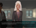
I love mysteries in general, so this was great. Love the Danganronpa-styled portraits in the 3D world as well as the setting. I think the deduction sequence is great and I like the ending a lot. It's a fun mystery title with some very nice music.

There's a few graphical glitches: in certain rooms like the Chemistry Room, the texture is really bright. Window lights flicker on and off. I got some minor headaches from the lighting. The text is also too small for me.

Also, I noticed that the game seems hard-coded for Left Mouse Button to advance. I use Right Mouse Button for my LMB, so it was awkward for me to use that. In general, I would've liked to use some options.

I also don't mind the exploration, but sometimes I feel like I'm wandering at random to see what the next flag is to trigger.

But really, it's a great game. Definitely impressed.

Developer

Thanks for the feedback and glad you enjoyed -- yeah it seems the middle segments are definitely the weakest with the whole semi-random wandering. Might be a good spot to condense in a post-jam version.

Submitted(+1)

I love the paintings. The whole 2D characters in 3D world was neat too. I feel some SFX would have been nice; maybe just sound when the text is written to the screen. The opening was super cool too.

Submitted(+2)

Holy shit, that was great. Firstly, the opening cutscene got me hooked on this, and while I don't have a heart to call it 100% a slow-burn story, it certainly is one of the ones you can't help but to stick around until the end. Story was great, even if I had some gripes about the deduction sequence, but that's just probably me not getting entirely everything. The foreshadowing, laying out mysteries and questions and getting some interesting concepts in there along the way. The concept overall is neat and I really liked how each character had unique role in that concept which made them memorable, like any good story really, but Noemi stuck with me. In other regards I do like the aesthetics and graphics, the style in 2D is amazing and 3D environment has personality in the textures. Some 3D places are janky tho, as in you can't really walk properly or get stuck easily, or I'd retouch textures, but that didn't much affect my experience, just something I noticed. Anyways, not trying to write an novel here, I really liked this story and art style, music is nothing to scoff at either it complimented it scenes well and brought out that atmosphere when needed. There were some bugs here and there (white box appearing in a character sprite's place  and few monitors being missing texture-purple) but at this point I honestly I'm not sure if they were bugs or cannon to the game :D 

Definitely was worth to take my time to look around! Oh, and I loved the static transition when you went somewhere you weren't supposed to go and in general. Great work on this!

Developer(+1)

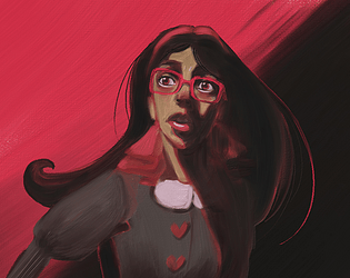
Thanks so much for the feedback. Glad the game in general was enjoyable! Noemi was my favorite to write and Canvas's favorite to illustrate as well -- there's a reason she's on all the page art I guess haha.

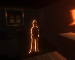
And the pink texture bugs weren't intentional but at some point were just left them in as they felt "right" haha. They mark the spawnpoint in nightmares.

Developer(+1)

Noemi is best girl โค๏ธ

Submitted(+1)

I like character's design and interesting concept with walking VN  

Submitted(+1)

I really liked the overall idea and concept of this game. Great cover art as well.

Submitted(+2)

Reminded me a lot of playing ace attorney especially the music which was bopping.

It was a bit hard to get through the game because every time I went into the elevator the dialogue would freeze but I was luckily able to use the bookmarks to progress.

I really liked the concept and twist.

Overall a pretty good atmospheric horror game.

Developer

Glad you enjoyed it. And thanks a ton for the bug report! will get right on that