Play game
Light Seeker Alpha's itch.io pageResults
| Criteria | Rank | Score* | Raw Score |
| Gameplay | #19 | 3.063 | 3.063 |
| Innovation | #19 | 2.688 | 2.688 |
| Overall | #24 | 2.766 | 2.766 |
| Fun | #26 | 2.625 | 2.625 |
| Theme | #30 | 2.688 | 2.688 |
Ranked from 16 ratings. Score is adjusted from raw score by the median number of ratings per game in the jam.
Discord Username(s)
Archadia#6664
Leave a comment
Log in with itch.io to leave a comment.



Comments
Cool game, though I do have a few complaints:
1) I feel like the player's sprite should be inverted based on the direction they're moving, not the direction of the mouse cursor, seeing as the mouse is barely used.
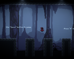
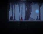
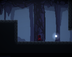
2) The tileset was a little wacky occasionally, like when platforms would jut out of a wall, they look a little off to me.
3) There were many areas in the game where the tileset wouldn't cover the full screen and I'd be able to see the background outside of the map (make sure you play test with the full resolution?).
4) I didn't really get the On/Off concept much, except for the 2 times in the entire game when you would activate something. Am I missing something?
5) The player controller felt wacky to me especially when moving in the air. Also, you can jump on the side of blocks and also get stuck sometimes on the side of blocks. Nothing too bad but it was a little weird.
Other than that, great job! The art was nice, the sfx/music were great, and the atmosphere was well done. With a little more polish, I'd be excited to see where this goes next!
a little bit of polish and you have an amazing platformer that i could see evolve into a metroidvania. great game nice sfx. good animations couldn't full screen the game i think i need to zoom out in my web browser but id look forward to seeing an update to this game if you plan on making one.
The art, the music, and the gameplay are something really well done! The game feel is amazing, although you could add sprite invention on the X-axis on your next build just to be perfect. The game concept is really solid!
Thank you for your feedback! I didn't understand the sprite invention part. If you are talking about how player should look at where he is going on keypress, in my infinite wisdom, ı somehow implemented that bu mouse location rather than A/D buttons. it was doing that before. but since ı was gonna shoot lights around ı assumed that would be better. Not sure right now though :D.
Glad you liked the game.
Oh ok, you're right! I just replayed your game and understand that the mouse controls the character, didn't even notice that yesterday :)
Nice game! It's really beautyful. I just couldn't see the window well framed and that made hard to me to advance in some parts.
Thanks! Can you elaborate on the problem for me ? Do you mean the camera position was bad or is it a viewport thing? Since the game was made for 1920x1080 which is my main screens sizes. It might look bad on other screens but ı hade it scale with height so it should fit any screen. in theory.
I think is about my explorer... but the game is higher than my explorer, so I have to scroll. At first I couln't scroll, don't know why, but on my other PC I could, so I saw the full screen button, and played it again :)
Platforming controls could be polished. Really love the the look and feel of the fragments.
Thanks for the feedback! I did spent lot more time on the fragments and how they feel since it was gonna be the main game mechanic. Honestly towards the end i mixed my own controller for brackeys and wasn't able to delve into it too much, also adding into the fact that i insisted on using the new input system. made it a bit janky. If I get enough feedback to continue this game i am gonna redo movement first.
Nice demo! I really like the way you introduce each mechanic in one after one instead of throwing in everything at once. (Could be because of my resolution) but I could see the outside of the tilemap in most of the areas (as if the camera is zoomed out). Other than that, good sound design, satisfying fragment mechanics :)
Thank you! My goal was to create an as polished demo/prototype as possible rather than creating a full game, i even touched timeline for the first time for the animations. The tilemap was actually done in the last hours before i submitted the game so its probably tilemaps and not your resolution. I am happy that you liked it. If you have any feedback/ideas that can make it a better experience for you, please do let me know.
Very atmospheric game! Really liked the fact that the fragments follow you around.
One thing I'd improve is the air movement, as it feels very unresponsive.
(Also I fell out of the world on the first jump :p)
Thank you for playing and giving your feedback! I am thinking of redoing the whole movement system. currently it is using brackeys CharacterController2D.cs file as a stopgap. Also can you elaborate on the falling out of world ? Did you kept falling or did player reset to its position?
I just kept on falling, although I think I hit some kind of barrier at the end and slid to the right. Probably missed a death barrier or something similar?
Nevermind, just did it again and I just kept on falling. It seems to happen on the right side of the first pit.
Thank you for pointing it out. Should be fixed on the new version.