Play game
Sword & Shield's itch.io pageResults
| Criteria | Rank | Score* | Raw Score |
| Innovation | #37 | 3.333 | 3.333 |
| Design | #42 | 3.417 | 3.417 |
| Overall | #46 | 3.333 | 3.333 |
| Relevance To Theme | #100 | 3.250 | 3.250 |
Ranked from 24 ratings. Score is adjusted from raw score by the median number of ratings per game in the jam.
Leave a comment
Log in with itch.io to leave a comment.


Comments
Addictive! Nice idea :)
i love the game. very addictive
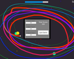
Wow, nice! I liked the core mechanics, controls are polished. It has this fruit ninja appeal with an animated cursor trace. I would love to see a more interesting enemy than just colorful orb, but from a design standpoint, the game is clear to the player from the very beginning, you are thrown right to the action. Very good job!
I loved this game, total score = 2k. So fun and addictive
I really like the game, my highest score was 285, which I have no idea if that is good or bad. I really like the particles and the mouse interaction. It was really nice to play your game :)
I kinda forgot that that was sword and shield during game : D. Really fun to play, nice design. It didn't feel that much harder with later phases.
Good game. Fun to try to manage both shield and cursor at once.
Nice little game ! I like this multicolored atmosphere that you tried to search for ! The gameplay responds well to the theme with the difficulty of handling two things at once :)
This was really hard to put down! Great example of simple gameplay mechanics done right
This game is addictive! Good mechanics, and the sound and visual effect make complement the simple art style very well. Nice job!
Thanks! I'm glad you enjoyed
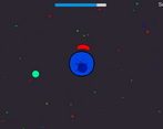
This is really fun. The gameplay feels fast and fun, while still being fairly simple. Tough the art isn't very good, the FX, like the trail for the cursor, are all really nice, the background and death animations are also amazing. Though it's really easy to get overwhelmed by the green guys if you don't take care of one, that's not a huge deal, and sometimes the cursor detection on the yellow guys can be glitchy. Great job!
Thanks for the feedback! Trying to scale the difficulty was tough for me, and my art definitely still needs practicing
The game is really good but the game gets too hard
Thanks! Trying to find a balance for the difficulty of the game as the waves went up was tough for me. It could definitely be tweaked a bit
The gameplay feels on point. Simple idea but well executed. I feel like this one could have benefitted from a more pronounced art direction and overall story/theme, but the mechanics are smooth af!
Thanks for playing! When I first started I only really had the concept of one plays defense and another is offense. My art isn't the best so I just stuck with simple circles for most of the effects and objects
Liked it The concept was Cool Keep it up hope you like my too
Thanks for playing and I'm glad you liked it! I'll definitely try yours too
Liked it The concept was Cool Keep it up hope you like my too
Very hard, I liked it. It takes real brain power to work it out and have your brain doing 2 things its not used to doing at once. Fun!
Thanks, I'm glad you liked it!
Fun and very different game. It fits the theme perfectly and is probably the most innovative game I've played out of the submissions.
Thanks for the feedback, I'm glad you enjoyed it!
Really fun game. The art can be improved, but other then that good job!
Yeah my art skills aren't really up there, but thanks for the feedback!
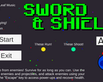
This game is super fun, I like it so much! I think the F key should be a lot more clear and not crammed into a corner with a lot of text. (also why f?) Awesome job!
Thanks for the feedback! It was escape before, but that would exit fullscreen too. I just kinda picked f cause it was close to d, so you wouldn't have to move as far to open the menu.