Play game
Chevron's itch.io pageResults
| Criteria | Rank | Score* | Raw Score |
| Visuals | #211 | 3.679 | 3.679 |
| Simplicity | #318 | 3.714 | 3.714 |
| Fun | #348 | 3.214 | 3.214 |
| WOWIE! | #376 | 3.071 | 3.071 |
| Topic | #413 | 3.143 | 3.143 |
| Sound | #598 | 2.536 | 2.536 |
| Creativity | #651 | 2.643 | 2.643 |
Ranked from 28 ratings. Score is adjusted from raw score by the median number of ratings per game in the jam.
Music Source
No music, just SFX, which I made myself
Leave a comment
Log in with itch.io to leave a comment.


Comments
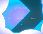
Really cool visuals and art style. Could have benefitted from some music. Also the blue enemies on blue backgrounds made it a bit hard to see them. I really liked the upgrade system.
Overall good job!
Really great art and color scheme! The firing noise got a little repetitive after a while. It was also not very hard so it was a little hard to die so it was not easy to get upgrades and the upgrades did not feel very impactful leading the rounds to feel a little samey. Check out my game if you can, it also has an interesting art style :)
I like the arcadey atmosphere to the game, it was super unique and fun to play. The color palette of the visuals look amazing too. Well done.
There's still a lot to work on, but I like the old-fashioned arcade vibe of this game. Good job!
Nice and solid gameplay! I can clearly see the theme application and how you give choice to the player.
Well done! Music could help indeed, but I know its is difficult to make yourself in this limited time!
fun idea and nice concept i liked it. Can u plz check out mine as well?
fun game, nice idea, but I didn't notice fire rate improvement, when picking it I noticed that my speed increased, so maybe there's a bug, but overall I liked it!
Firstly the idea of an upgrade is a good one, but I didn't notice much difference with the upgrade.
In general I like the game effects, but you had to create better enemy shapes since you took three days.
The art is really cool (the particle when you destroy an enemy is a great idea) and the movement is smooth.
Maybe you could add background music for more engagement (Zapslat is a good free audio/music source) and some camera shake.
Surprisingly fun, nice visuals, it would be nice with music, but good job!
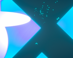
Love the game look and feel, It's really satisfying to blow up enemies! One thing I'd change is the purple-blue squares to be more opaque or darker, I thought they were walls and was trying to stay to the grey area. :D
I'd appreciate it if you would take a look at mine!
https://itch.io/jam/wowie-jam-3/rate/940590
Thanks for the feedback, that's something I'm getting from a lot of people - definitely something I'll have to work on.
Yours was actually the first one I played when the voting period started - really enjoyed it!
Thanks for enjoying it!
Thanks for the feedback, of course I'll play your game!
Great visuals, it turned out very well! The moment of death is a little incomprehensible, it seems like I'm dying from touching the walls, but it’s happens with a delay or, on the contrary, earlier than necessary.
Hmmm, that's weird....
I think maybe you're getting hit but aren't noticing because the enemies are a similar color to the background. Others have had the same issue, it's definitely something for me to change. Thanks for the feedback!
The game wasn't working for me. Just got a grey screen with shooting sounds when I clicked, so I just gave you high ratings. I do know that the graphics is like the sickest ever! Really cool!
Thanks ;)
I think someone else had the same issue, it turned out it was because they weren't using chrome.... don't know why that is or if that's why yours didn't work.
Really unfortunate, sorry about that.
Absolutely amazing visuals, really nice impact and fun firefights... the first time round at least. Then you die, go like oooh this relates to theme, neato dorito! And you continue on ur way, and it's like, hmmm, more damage would be nice. And this time, you batter enemies and get pretty far, and then one guy is like nuh uh, get slapped shitass, and you die and it is likes, I don't want to go alllllll the way back there! Ugh. And the game gets meh for a bit. BUT THEN, THE LORD JESUS BLESSES YOU WITH A GOOD RUN, and you are happy once more. Good job :D (sorry about this weird ass review)
Thanks very much, I'm super happy you enjoyed it. I definitely could add something to reward the player for making it farther.
Very polished game. Especially liked the visuals and aesthetics. Well done :)
I appreciate it, means a lot
I like the concept, there are some things to improve. First of all background, Enemies and Character are hard to see sometimes. I think you should also add something to encourage the player to not just instantly die to get the best upgrades. Also maybe a Scoresystem and a statbar where you can see your upgrades? I gotta admit i didnt like the sfx very well. The asthetic and style of the game was great though, you can definetly expand on that! Well Done!
Super cool concept, and it would be even cooler if the upgrades scaled compared to how far you got (so that people don't just kill themselves a few times to get quick upgrades). Nice!
Ah yeah, good idea!
I guess I thought players would want to beat it in as few tries as possible.
Thanks for the feedback!
I spent ages thinking that the shifting walls were going to kill me. Turns out they were the background. Controls are really tight, I get the theme, really very nice indeed. Love a good top-down shooter with some glowy art.
Damn, apparently this background needs some work....
Thanks for the feedback, I really appreciate it!
At the beginning i struggled to understand that the moving blocks in the background are not obstacles. But overall it's a good game. I love the visuals.
Ah, I never thought of that.....
Thanks for the feedback though!