Indie game storeFree gamesFun gamesHorror games
Game developmentAssetsComics
SalesBundles
Jobs
TagsGame Engines

alwaysawake

62
Posts
6
Topics
10
Followers
46
Following
A member registered May 21, 2020 · View creator page →

Creator of

Recent community posts

(2 edits)

I haven’t pressed it at all, but I saw reports of quite a few that did. I assumed there was confirmation dialog, so to be honest I’m surprised by accidental deletions. Thought I’d flag it in case it hadn’t been mentioned.

A dropdown menu sounds like a good move. Thanks for replying Leaf.

Edit: a few people tested it out and did not get the confirmation dialog.

(1 edit)

As the title states, it would be great if you relocated the “Remove this Submission” button to somewhere much less prominent (I’m thinking smaller font somewhere near the bottom). The styling and position make it far too easy to accidentally press, which I’ve seen result in the deletion of many games post-submission deadline.

Given the contrast between the background and the text, the “Remove this Submission” option is actually clearer and more intuitive to press than the edit button.

Edit: a word.

Thanks so much for playing and giving feedback! Glad you had fun. The frantic nature of the combat is what it’s all about! Definitely some colour changes and updates to the design are in need when I update. Appreciate the time you took to play, rate, and review. Cheers :D

I don’t have much more to add that hasn’t already been covered by others, just dropping in to say well done! You’ve got yourself a nice framework for a bigger game. I played for a good portion of time before I felt too OP with the dice roll spamming and the bombs, but I got to like wave 12 and it was pretty satisfying. It would be interesting to have a set up with limited moves per wave. If you do an update post-jam, add some more juice!

Glad you enjoyed your time playing my game! More to come after the jam :D

I think you’ve got plenty of feedback from others, so the best I can say is nice work! And top tunes too!

+1 for using FMOD!

Probably the best looking of all the games I played that used this mechanic. Good stuff, keep up the quality work!

I’ve learned my lesson on using red for pickups (unless they are health hearts!). Thanks so much for playing, glad you had fun. Keep an eye out for updates.

Not much to add feedback-wise as that’s been pretty much covered by others, however, I did want to let you know I had a blast. Interesting take on the theme and a refreshing change from the other dice rolling puzzle games I’ve been inundated with. Cheers!

Thank you for playing :D I’m glad you enjoyed the game! There is a trade off to being big, but it’s worth it for the extra range and the feeling of power. I really wanted the player to think about how to maneuver with their knives attached so it makes for some interesting battles. It’s got a long way to go as a mechanic (I’ve added guns btw), so we’ll see where it takes me.

For a game with strong musical themes, I was surprised that it was not a rhythm based game. The notes that you fire off feel like they should at least be on time or the same pitch as the background track. It’d be great if the game play fit the theme you went with because the music and presentation are top notch.

What a delightful little game, the character and world art is superb! Some of the respawn locations were unfair and those damn mosquitos put me in the slammer way quicker than I would have liked, but overall I dug the concept and execution. The back stories on the game page were a nice touch too. Beautiful work! And kudos to the music makers, the jams fit the vibe nicely.

Thanks for the feedback, I’m glad you enjoyed your play through! Good point on the colour for the red dice, originally the player die was red so it made a bit more sense to interact with them initially, but I switched it to black just before submission because it looked a bit more menacing (if that’s a word you can use to describe dice). I also ran out of primary colours for things lol, I might just play around with white/black tones and see how that translates.

Definitely noticed that the dash on the ‘F’ key is a bit janky without using two hands, so I’ve switched that on the post-jam update to the left shift. I’m still deciding whether or not I implement a jump or run so it might just end up on spacebar if I don’t include those abilities.

Appreciate you taking the time to play and review!

I’m so glad you had fun playing my game, I had fun making it! The dash and slash combo is so much fun, I really wanted to empower the player as soon as possible by not limiting the abilities and power ups. Just a smashing, dashing, and slashing action fueled time. Appreciate your comment and time playing, look out for a significant update post-jam!

Thanks for playing :D I wanted to really focus on smooth controls, effects, and sound for this jam. I’ve already fixed small bugs, added some UI sounds, and a new weapon. I’m also going to have some new levels completed, so when the jam ends, keep an eye out!

Thanks for playing! The coloured doors were to add a bit of variety to an otherwise pretty standard base game. Orange for automatic doors, pink for dashing through, and blue for destructible. They also act as barriers for triggering the AI, so you can either skirt around their interactions to avoid them or go all out. I’m really pleased you enjoyed the gameplay, the effects and audio really make a big difference to the game’s feel. I’ve already cleaned everything up and added a few extra features for after the jam. Appreciate your time playing and reviewing, cheers.

Lol yeah you can push it off the edge and it still lets you move, but you ultimately lose.

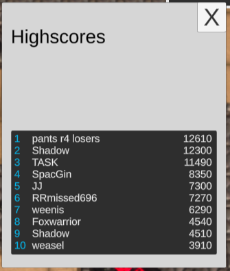
Needed a couple more enemies and bigger/badder waves but I still have fun. Kudos to the art and music department, those were some tasty jams. Also, pants are for losers.

Despite the bugs you’ve listed on the game page, I really enjoyed it! The music is baller, and the controls are nice and tight. Big fan of the camera zoom out, it was nice and smooth, and made for some epic chase scenes. My only wish is for pew pew sounds and camera shake. Keen for the next one!

I murdered the die.

Great idea and implementation! It was a delight to play :D I really dug the background effect, it gave a sense of danger to the humble die.

A nice little platformer with a great aesthetic. The jump could do with a little work, as it feels a little flat and makes of the platforming a little awkward. Definitely needs a little more juice. Some of the abilities didn’t work for me at all too. You’ve built yourself a nice foundation, good work.

Thanks for going to the effort of troubleshooting, I’m going to have a tinker and see if there’s anything I can find that’d cause this. As far I can tell the system is pretty robust but it might be my implementation of the new Unity input system :( Appreciate your time! Cheers

Fun little game, that octopus got was coming to them. I may or may not have taken too much time to figure out the arrow keys move my spaceship 😁 but we got there in the end.

It’s shame you got stuck, especially at the first level. You missed out on all the juicy goodness. Did you restart the level? There’s a pause menu to do that. Would love to know where or how it happened so I can fix it. Was a controller plugged in or controller mapping software running while you were playing?

Thanks so much for playing! I hope you had as much fun as I did making it. I’m pretty keen to keep adding to it as there’s quite a few interesting ways it could be improved. I only thought I was going to have enough time for the tutorial, and as you can tell from the last level it was just slapped together from bits that I made in like twenty minutes lol. I actually added more systems than I could implement in the allotted time including a jump ability, guns (which I really regret not getting into the submission), other enemies, and couch co-op. If not this game, then another very similar one. The combat mechanic was way more interesting than I thought it would be. Appreciate the feedback. Watch this space!

(1 edit)

Thanks for playing! Great point on the enemies. I spent most of my time making menus and thinking of ideas, so I had very little time to actually design levels, which lead me to being overzealous and giving them too much health and power. It does go from zero to one hundred pretty quickly after the tutorial, but that’s mostly because of time constraints and I’ve played one too many top down roguelikes recently. I wanted a more gradual introduction to enemies and different traps, I even have co-op ready to go and guns, but that’ll have to come in a later iteration or different form of game. Hope you had fun either way, much appreciated.

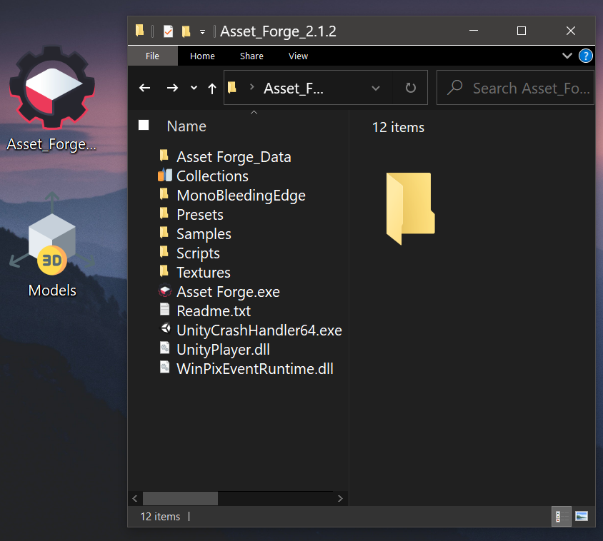
  • Close down Asset Forge before you do this.
  • Download the OBJ version of the pack you want. e.g. this Ultimate Modular Sci-Fi pack
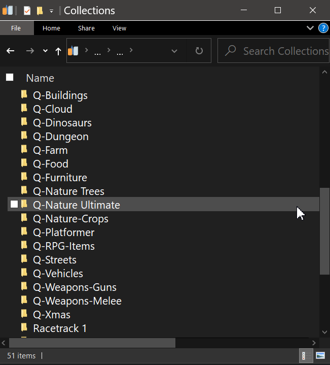
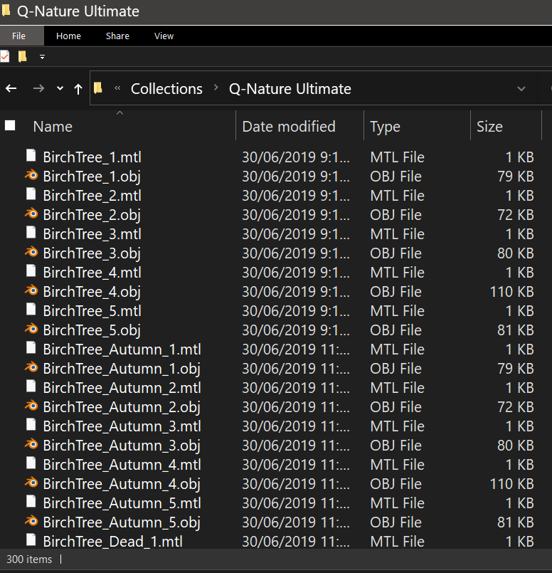
  • Unzip the folder and name it something meaningful, I use a letter to remember where I got the asset from (pictured).
  • Open the folder you installed Asset Forge into, and there should be a folder called "Collections".
  • Move the pack to that folder.
  • Relaunch Asset Forge.
  • Voila!


Thanks for the feedback! Lots to work on in this one. I think I will do some bug fixing and polish after the jam for sure. To pass the red room (after the toasters), check the windowsil out ;)

Really well programmed game. Could play more if you made another. Extra points for the grass sword reference.

There's only one mum in this iteration. Definitely room in the house for a couple more. I hope you appreciated the top quality animation of her excitement and yellow demon eyes.

For sure, makes me sad that I can't reupload an optimised version for the jam or even just the Windows version. Big mistake making a WebGL version we such a big 3D project. Hint: jump over the toasters. Check the windowsil in the red room.

Thanks for playing! Indeed it starts out a little laggy especially on slower/older computers (perfect on my new desktop overkill build). Next time I'll use less toaster. Don't let your mum die! Have a look on the windowsil in the red room.

Nice aesthetics but lacking in the gameplay and fun aspects. And is this perhaps Beautify from the Asset store? Would love for the theme to be explored with a bit more depth. great foundations for something epic.

This is my favorite game from the jam so far. Awesome work! Especially love the colour scheme and music.

Great style! And that music is fantastic. So many crying children sounds haha.  I have no idea what to do so I just put everyone in the fire. 10/10.

Was enjoying gameplay until the Pacman style level as the player kept snapping into dead ends and refused to move where I wanted it to go. Looking forward to seeing the polished version of this if ever happens. Nice work!

Found a fellow Aussie dev?
The intro text was tough to read but otherwise great graphics, music and sfx. I found the lack of controls frustrating and I didn't have the patience to persevere past the second page of the map. The cost of failure was too great. I will come back to it when I've had more sleep. Thanks for the game!

Nice little game.The spikes were frustrating as they don't really stand out clearly, some of the placements didn't feel right. Great effort though! Put in your own art and you've got something pretty neat.

Pretty standard gameplay but some great visuals. Well done all!