Cute game, will say you should add prompts for the ordering of clothing so reread the info, and all minigames should have a leave option to instead do a different one, for the clothes organization could be better,,, like i picked one by accident near the end and had to redo everything... and you could make it so it has 2 ways to complete light to dark/ dark to light, for the book ordering you could add it so the other mouse button brings the book to the front
BreadCrate
Creator of
Recent community posts
Really solid game!, my only complaint is that rolling doesn't give you more iframes (does it even give any?), and that you shouldn't take damage when touching a enemy in the back
And bellow the console sometimes the spike and knife end up in the same path and so you have to take 1 damage to kill both
rolling should also kill the knife ones from the back atleast
Cute game but having jump not space was hard, and during the glitch battle you should add more iframes because after hit or death its easy to get hit again.... when you reach a checkpoint the game should mention it, if you make movemets WASD you could make it so player can shoot with mouse button and aim with it (for full control of "gun") or make it when holding C you can use mouse
For the upload of a exe you gotta wait until the jam voting period ends, for the page settings under edit project go to embed options and change to fullscreen (this gives the listing page a play game button and after clicked it changes to fullscreen)
Minor edit: on android setting this feature turns it fullscreen, on web it takes the full screen except it will still show the top part of the browser (aka the tabs,searchbar,favorites) but a simple f11 makes it fullscreen
If you still prefer not fullscreen by default then consider setting the embeded in page dimensions Viewport dimensions to something smaller
Heres what one of my games has as default (Width 640 px × Height 360 px ) but that doesn't solve the problem for smaller devices tbh, so player would need to then click the fullscreen button in the corner for it to fit better
Funny looking but the ui could use some work (aka the changing of locations) and some of the interactions confused me does to lack of feedback (like the fries no idea if there out, the burger i felt i couldn't leave )
also change the window settings because i felt it should autofit to the screen of the person (it was a bit bigger that my screen so had to hide taskbar)
Like the game, did find the randomness of the keyboard making me question if i know were the keys are XD (interesting how some require 1-5 random keys, you could have made it so the player had to type a set word, like order, fix, out, etc)
liked the music and art style
The machines should have a icon to symbolize that there broken as well
And you could just skip the player interact with machine and just have it if player near rapair
Yea was going to have a how to play but scrapped it last minute due to time (added it to the games description on itch for now)
Deliveries are Randomized so its luck based
The map in the corner is a approximate to were the Npc are at (wanted a minimap but went with a basic were they at, might just put a copy of the tilemap shrink it and put it in the corner if i update the game)
For the theme its city broken + delivery
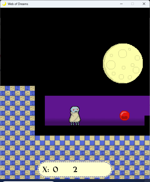
ok so with a lot of guessing and pain managed to move past the pink cube and did reach the spring
will say the robot by default i feel should be able to at least jump 1 block without a running start
upgrade system is neet on the fact you select what button you want, though it should tutorial to drag the item to the desired slot
Took me a bit to realize that space is used to continue dialog
Idk if its me or the game but it felt laggy moving
Some basic prompts for answering and open door could be good, and to have the controls preincluded in the game
i did like the art style
when chatting with a npc clicking mouse to skip would also be helpful
also its not super obvious that talking to ppl is only done in the lights zones (could have made the zones a bit bigger or placed them under the npc
camera around the bridge was a bit weird
one should be able to close the diles with esc
taking a photo is a bit weird
music was laggy (probably my device)
and didn't beat the level but while interesting no idea how it fits to the theme
Yea the dungeon was supposed to explore to find multiple keys and open different doors to reach the boss or find multiple keys to open multiple doors, but didn't manage to make it fully work so it became more of a try to find the key.
For the battle i think the main fix i could do is either try to see how to add more time so the action buttons don't apear to fast or add a animation so they slide down after a while when dialog is gone
For the run button, i did want it to if flee you would have teleported outside but didn't have time XD (had to scrap other enemy battles)
I did not consider that the door would permalock if flee and key grabbed tho
For movement i did follow a basic tutorial, and honestly would have liked to add more movement other than basic wasd
For the crash for space i didnt crash in my testing but for mouse its not a crash but i think an oversite of the pause screen, cuz its always there but hidden (i had someone play it and that happened and i didnt put 2:2 together)
Art style is cute
Controls are a bit weird....
Should have just had w for climbing not just space and then immediately move AD for a platform
The ESC menu the go home menu should be a different icon.
For the rope you should have included the fact you need to hold the mouse while in the air (did find something funny that when you reach the 3/4 rope if you swing to fast you can clip into the left wall, put spam clicking the mouse gets you free XD)
Music didn't play for me
If you end up having no momentum you have to click the mouse to go down again and its difficult to switch from one rope to another (should have have it so if nearby another rope pressing E just switches)
Odd choice to not make it so game could be full screen
Using the arrows for changing the size of the level was interesting but in some sizes the tiles don't spawn, there either black or just not there (collision is still there)
Art style is cute
I feel you should have had somewhere (either the settings or the ui) the level number
Odd that not all levels use <> scale and some only use ^v
And obviously the only sound was on death


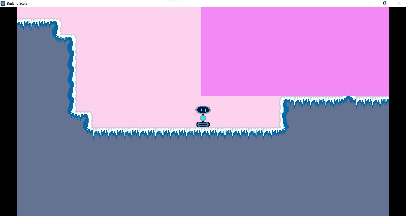 i think the start is bugged