This is so encouraging, and I am thrilled you liked it and enjoyed the levels. I am indeed considering creating new levels and improving many of the mechanics, including the jump, so thanks for the feedback. Any puzzle in particular that you enjoyed the most?
davidcode
Creator of
Recent community posts
Alright! It’s a classic survival; loved it! The inputs worked as expected, with nice mouse sensitivity and a good jump response. Visually on point, I recommend using the same font style for the onomatopoeia when you kill the zombie. I like that your camera shakes. I was planning to do the same every time my gun scaled an object, but I did not have the time. The lighting was also well-designed. Nonetheless, the crops and the fence are challenging to distinguish, and sometimes you get stuck.
I am not a huge fan of this genre. As you can see, I am on the FPS side. Nonetheless, in terms of visual identity, the game’s aesthetic is consistent, robust, and compelling. The attention to detail is highly appreciated. The music selection was on point, and it built tension in the battle. The sound effects and all the auditory feedback were well designed. I love the onomatopoeias on the attacks. It would have been interesting to have more scenarios. Also, beware of the divider under “knight;” it feels like the cards are divided in the middle instead of all of them being my deck of cards.
Unsettling, I loved it! I am going to save this in my collection of “Shaders I love.” This is the kind of PSX aesthetic I strive to reach one day. I tried to fake it using low-res texture in my game. It is so lovely! Well done! Also, create speed and inputs. Nonetheless, I was not sure if all of the other entities were enemies. Did they chase you at a certain point? Also, lowering the POV made me think it had a bug instead of the avatar dying.
Hahahahaha, I loved it. As you can see in my game, I also love the PSX aesthetic. Nonetheless, there were a few things that felt like bugs and were not by design, such as the rat’s maneuverability. Also, it gets too big at a certain point, and it is difficult to actually see the hazards falling. More rat sounds would be good as well.
Well done! In the beginning, I had trouble understanding how to control the robot. It was not as clear that you could jump directly from the leg to the forearm. In terms of UX, the smoke indicating the weapon’s cooldown was smart. Inputs work pretty well, and the theme music was on point. I would have liked to have more rounds of fights.
You nailed the light/dark interaction we were aiming for in our game. We also used the torches, but there was still too much light on the scene so they did not make that much sense.
Feedback on the snake character talking: Consider playing the audio clip once at the being; the loop is distracting.
Also, allowing the user to skip the story manually will give more control, I read faster.
Your dark effect is a good reference to improve our game


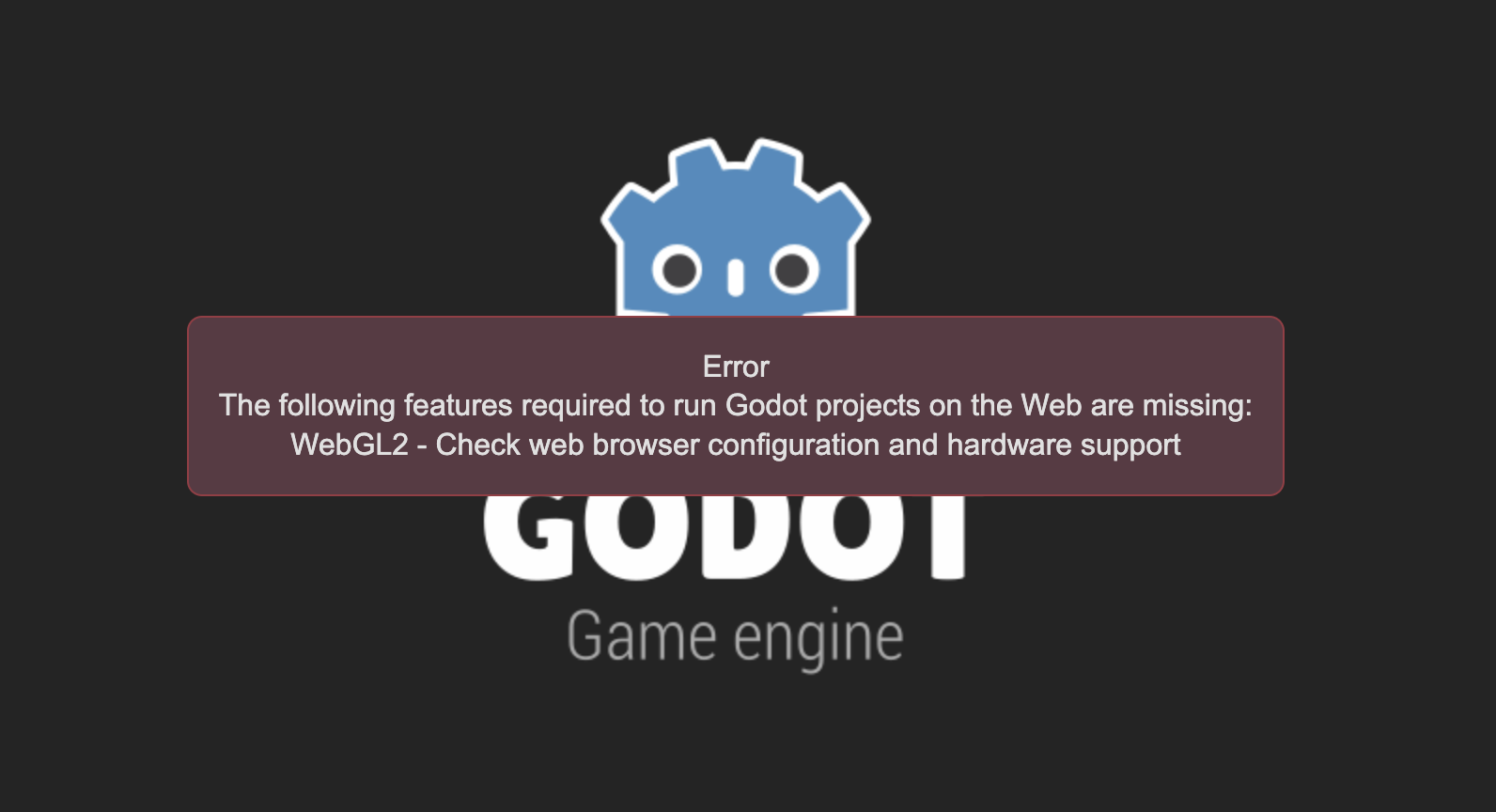 I am on a Mac using Chrome, any ideas? It keeps telling me that WebGL lost context and that I need to re-load. :( I really wanted to play it
 Its a shame, sorry. I will try to play it on a Windows soon.