Play game
Doom's Day's itch.io pageResults
| Criteria | Rank | Score* | Raw Score |
| Style | #1431 | 3.682 | 3.682 |
| Enjoyment | #1506 | 3.335 | 3.335 |
| Overall | #2651 | 3.125 | 3.125 |
| Creativity | #5418 | 2.358 | 2.358 |
Ranked from 179 ratings. Score is adjusted from raw score by the median number of ratings per game in the jam.
How does your game fit the theme?
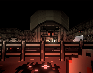
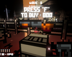
Damn look at all the guns and zombies on the map
Development Time
96 hours
(Optional) Please credit all assets you've used
https://ittaimanero.itch.io/zombie-apocalypse-tileset
Leave a comment
Log in with itch.io to leave a comment.


Comments
What a great, well-polished game! It looked fantastic(!) and the music fit the game perfectly. I don't know if there was some kind of melee/push functionality but I found myself desperately clicking the mouse-button I would normally bind to that when the zombies got too close. Great game!
I will try to add a melee weapon in a maj ! Thank you for your feedback !
the game looks nice, the 2D props are sometimes confusing as they go invisible from the side. also the pause menu didnt work, i was still moving the camera instead of being able to choose the options. i would have probably made the spawn a safe zone or made it wave based since I had no time to read what the upgrade in the shop was doing or shop in peace. other than those minor nitpicks, very impressive!
Very good feedback ! Having a safe area to buy stuff might be a good idea but it will break the dynamic hmm Thank you for your feedback ! :D
No idea how it fits the theme of "Built to Scale", but I had fun!
One comment I have is on the game over screen, it took ages to tick up to however much damage I did. If that could go faster it would be much appreciated!
i 100% agree and it’s noted !
4 days...wha
4 days of 24h of game dev 😭
MASHA2ALLAH
Cool game. I like the sound effects.
thbak youu!!
I found the differences between the first two guns a bit unclear. But the machine gun was a blast to use, if its bullet UI didn't take up half of the screen space. However loved the aesthetic of your game. Overall, it's a great game with fantastic visuals! I also really enjoyed your choice of music—it gave me strong DOOM vibes! Keep up the good work!
Thank you so much !! The heavy machine gun was a big troll with the bullets taking half your screen, i'm sorry ahah
There is style here, but it feels like all the effects were jacked to 11. It was all quite disorienting.
Hm what do you mean by "jacked to 11" ?
The boxy shapes along with the more boxy blood shed on the screen, the explosions using onomatopoeia, the shader on the ground made everything look like it was gliding on top of the surface. Set pieces also had some kind of panoramic effect happening with them.
It's a bit of a sensory overload. Hard to describe what specifically is the issue. It could just be how everything works together.
Ok i see
Very cool game, but not sure how it relates to the theme?
it’s complicated ahah
Very cool style and fun game!
oow thanks ! :D
Neat! Kinda hard to tell what you're looking at sometimes though.
Excellent use of the theme btw ;D
ahah i agree ! Thank you !
Nice game, love the art style. It would be better to spawn the first zombie in front of the player, because I died right away in my first run because zombie behind me killed me before I even noticed him.
My best run is: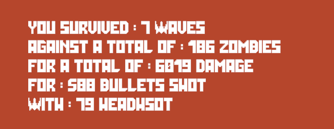
Good job with the game.
LMAO it happened to me as well yesterday but i didn't know when i playtested before the day of the release ^^' Good score !!
I love the art style! really fun stuff nicely done
Thank you !!
Amazing project. The game is dynamic and fun. Graphics, lightings and music are cool!
Really appreciate your feedback :D
I fell from the map by jumping over the fence lol
ahaha i forgot to add colliders there (also it was fun to be able to jump on the fences and be invincible)
Fun zombie survival game! It was satisfying to get headshots. Found it a bit hard to tell where they were coming from until they were on top of me from behind, but the player at full health can take a few hits so it wasn't a problem. Also very long end screen if you get a big score lol I was sitting there for over a minute waiting for the results. Very fun overall full marks here!
LMAO i know i trolled a bit with the end game screen upsi
Very cool game! I like both the music and the graphics, which were unique. I wish it was a little easier to see the zombies though. Anyway, the map is great and the idea that new weapons dropped from the sky is good too. The game is fun overall. Good job!
Than,k you so much for your great feedback ! i appreciate !
Such a fun game, such good artstyle. not gonna lie, it hooked me. Felt kinda spooked too
Woow, thank you sooo much !! (Spooking you was definitely not intended to ahah)
TO be fair, I get spooked easily
Reminded me a bit of minecraft when I played
A decent cod-zombie like game. Try to add your own twist, else it becomes a poor version of "cod zombie mode". The first things I can think of is more interesting weapons, different enemy than a zombie, power ups that player can pick up etc.
The style is very fitting for the game(well done). But I struggled to see where "built to scale" comes in?
Besides that, well done! I love when I instantly know when to do, and it was easy to know here :)
It was alright, but if I were you, I'd add a big fish that eats everything.
But that's just me.
Zombies are okay too I guess ♥
LMAO nice suggestion i had the same idea but i don't really remember why i decided not to add a fish ? Weird..
Yeah, kinda weird... I hope you don't intend to steal any fish in the future...? You wouldn't do that... would you...? Anyway, still 5/5 game! ♥
I love the style, a very creative use of that tileset! The game is a lovely combination of cod zombies and the classic doom. It's awesome! Only thing missing for me is more of an audio indicator where the zombies around you are. Besides that, great fun game!
Correct ! I should add a spatialized audio feedback to know where the zombies are !!