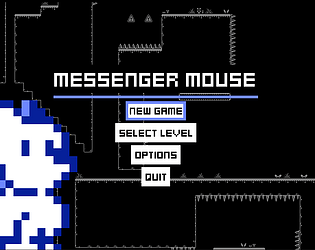
Thanks for playing! It was important to us to allow the player to skip story content. Really every game should allow that. It’s important to respect people’s time, but in a game jam especially - it allows people to get to the fun fast when they might not have time for reading (or maybe they just don’t care haha).
Troy Story Games
Creator of
Recent community posts
Thanks for playing! I think I know the section you’re referring to. Right at the end of the last level. Believe it or not that’s easier now compared to how it was when we first made it. We didn’t want any part of any level to rely on luck rather than skill so that one part of that level definitely stands out as something we should change since you’re right, the way the enemies spawn and move, they’re not guaranteed to be in the same place every time you respawn.
There is a secret path that allows you to skip that section after jumping off one of them, but I think we need to change that section to rely less on luck.
Thanks so much for playing and for the feedback! It’s appreciated! You’re not the only one with keyboard control critiques and I’m 100% with you. I prefer to play with a controller. Another valid layout on keyboard is to use the arrow keys and then use Z and X. Unfortunately the only way to play with a controller is to download the game. I think another round of polish on the controls would have been good. Maybe a way to remap them.
Thanks for playing! The keyboard controls were not my favorite part to figure out. The game REALLY is meant to be played with a controller despite my partner swearing by the keyboard. So J and K…the thinking there was: 1. There is no reason to have your hand on the mouse for this game and 2. J and K are part of the home row. So the thought was if you’re using WASD that J and K would be natural. But you’re not the only one to feel it’s non-intuitive. Definitely not a you problem.
The other control option on keyboard was using the arrow keys and then z and x which maybe would have been better to highlight in the tutorial…but we kindof had to pick one to display in the tutorial and we decided most people in a game jam would likely be looking to use the WASD layout.
If you download the game it works great with any Bluetooth or USB controller and then the tutorial will actually update to teach the controller controls rather than keyboard and the experience with a controller in my opinion is much better. I wish there was some way to have the web version pick-up controllers. I feel like there has to be some browser plugin or extension but I didn’t have time to dig in and figure it out.
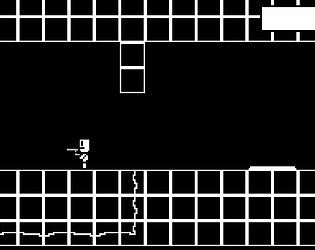
Thanks for the awesome feedback! Ya know, the camera blur/smoothness/whatever to call it, is something I noticed. I kinda thought it was an artifact of the one bit tile set we were using on the black background. Could also have something to do with sub pixel nonsense or resolution scale or something. But you’re 100% right it is kind of annoying and I plan to look into fixing it. Thanks again for playing and for the kind words. We appreciate it!
Thanks for the awesome feedback! It’s really appreciated! I’m guessing you were playing in browser - we noticed that bug too - but not every single time. It was something we found in testing, then I fixed it (or thought I did) and then at one point we thought it had come back but then couldn’t reproduce it. So thanks for confirming we def. still have this bug. I created an issue internally and I’ll try to track it down. I know the bug doesn’t exist with controller support on desktop - which I honestly feel is the best way to play the game.
Thanks again for playing!
Thanks for playing and for the awesome feedback! It’s really appreciated. We plan to continue working on some version of this, so I’ve made a note about the climb speed. I think you’re 100% right. It always felt slow to me - and I always would just jump a bunch to speed it up - don’t know why I didn’t think to make that literal one line change to speed it up though…
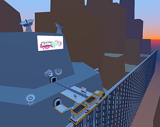
This was really cool. It felt like a blend of sonic and mega-man kindof. Kinda got mega-man vibes from the character but sonic vibes from the level design and movement. Love being able to grind on rails that’s always cool and getting up to speed felt good too. Enemy auto-targeting felt really good and allowed me to easily maintain my speed.
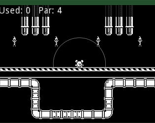
This is a cool submission. I was skeptical of the 3D environment for a maze puzzle but it’s clear there’s a lot more here than I thought. I don’t wanna spoil it for others but it’s def a cool game. I didn’t have time to figure it all out yet but I’m going to come back to this later and try again. I got through a few levels the normal way though. Overall good stuff!
I actually went back and played it a bit more and made it a bit farther. The trick for me was playing in full screen. Everything being bigger made it easier and I was able to use the potions. I think if you mapped the button to get into boxes to more than one button maybe something like space bar or “j” “k” then it would feel more natural to use two hands while playing. I think part of my issue was I’m frantically running away from these guys shooting at me - and pressing shift with the same hand made it a bit more difficult. I would propose: WASD movement, J to get into boxes, K to use left-most potion…or something like that. The boosts being applied instantly is perfect. I can’t imagine also having to manage applying the boosts myself.
This was fun and very challenging. I really like the crate search/suffocation mechanic. That’s very clever. I liked that it’s fast paced too. I found running from the wizards was enough of a challenge that I couldn’t really find the time to even look at my inventory bar to see if I had potions, but I was able to get through a couple rooms okay. Good job on this and great creative use of the theme.


